asimpleframe

Ampersand NYC: Michael Johnson & Mark Boulton

This article is the first in a special series covering my notes from Ampersand NYC: The Web Typography Conference.
See also: Part 2, Part 3 & Part 4

Last Saturday I attended Ampersand NYC: The Web Typography Conference. Being a "one-day event for knowledgable web designers and type enthusiasts," it felt like a conference designed just for me. I couldn't have been more excited to attend (a big thanks to Scripps for sending me) and nerd out with fellow type geeks.

Ampersand NYC Design class: narrow

The conference was held at The TimesCenter, an upscale venue in the heart of the Times Square District. The lineup was comprised of eight speakers, all well-respected names in web and type design. Each speaker had a slot of forty-five minutes, bringing the day's total lecture time to about six hours. The talks were diverse and interesting – full of helpful information and thought-provoking ideas. It was a lot to absorb in one day.

The purpose of this series of articles (of which this is the first) is to distill the conference into some key takeaway points. I'll write about two speakers per article, following the order and structure of the conference. These notes are in no way comprehensive. Rather, I will briefly summarize each presentation and list several highlights that I found particularly relevant or interesting.

Type as Brand, Brand as Type Design class: narrow

Michael Johnson: Type as Brand, Brand as Type

The first speaker of the day was Michael Johnson of johnson banks. Johnson's talk served as an introduction to the day, exploring in broad strokes the relationship between type and brand, while showcasing examples of his own work. Be sure to check out the summary of his talk on Thought for the Week. His key point was that webfont technology now enables brand and type to live on the web as never before. To use his words: “The gate is now open…”

Verbal and Visual Brands

Johnson views brands as both verbal and visual. They are verbal – meaning tone of voice (i.e. the words that are used). They are visual – meaning how they look (i.e. typography, color, photography, etc.). Focusing on the words a brand uses to communicate (tone of voice) and the way those words visually appear (typography) shapes the brand at its core.

Linking Brand and Type

Historically, the typography of a logo often had little or no relation to a brand’s general typography. Johnson’s approach is to unify them. Linking them together “takes some of the heat off the logo to do everything.” It allows brands to speak consistently across today’s many channels. While the web used to limit this form of expression (as Verdana, Georgia, or Arial), webfonts now allow brand and type to be linked together online.

Do Your Best Now

Though brand and type can now be linked as never before, it doesn't mean conditions are perfect. There are still limitations and areas where compromise must be made (such as kerning). To this, Johnson offered some sage advice: use what you've got to do your best now.

Typography in Responsive Design class: narrow

Mark Boulton: Typography in Responsive Design

The second speaker of the day was Mark Boulton, founder of Mark Boulton Design and co-founder of Five Simple Steps. In his talk, Boulton discussed his approach to selecting and using webfonts. He offered many practical insights on how to go about the process, citing his studio's work for CERN as a primary example.

CMS's and Typography

To begin, Boulton described how "responsive design has fundamentally changed our process." Instead of creating pictures of websites (Photoshop comps), work centers around building prototypes in the actual environment (the browser). This directly impacts typographic decision making. In his words:

You can't make good decisions about typography if you don't understand where it's coming from and how it's structured … The CMS has quite a bit to do with typography.

Real content inevitably reveals problems with a design that lorem ipsum obscures. By focusing on real content earlier in the process, it "brings the worry forward," revealing issues when they can still be quickly and easily addressed.

Pressure-Testing a Font

See how a font performs in real situations where you will need to use it. Boulton’s preference is to start with the paragraph element and move on from there. What is your most critical content? Where does your type need to work the hardest? Make sure your font works well there first.

Find the Sweet Spot

It’s also important to find the sweet spot of a font. Where does it really sing? For example, Verdana sings at small sizes for body copy (because that’s what it was designed for) but doesn’t look good as a large headline font.

Many vs Few Typefaces

One small point that Boulton made stood out to me. With the advent of webfonts, we now have infinitely more choice. When there were only a few choices, we became very familiar with those typefaces and learned to do a lot with a little. Now, with a plethora of typefaces at our disposal, will we lose this knowledge? My takeaway from this is to remember to impose limits. Choose a few high-quality webfonts and get to know them really well.

Up Next

The subsequent pair of presentations at the conference examined webfonts through the eyes of two type designers – namely, Jonathan Hoefler and Luc(as) de Groot. Continue reading.
Why and How I Use TeuxDeux

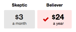
I'm a believer, not a skeptic. At least that's what I was told when I started paying for TeuxDeux last week. My free trial (of the neux version) was finally over, and I had two paid subscription options to choose from: skeptic ($3/month) or believer ($24/year).

Skeptic or Believer? class: narrow

Having used this "simple designy to-do app" for the past three years, the decisions was easy. I'm officially a TeuxDeux believer, making it an appropriate time to share why and how I use it.

Why I Use TeuxDeux

Before I dive in to the details of how I use TeuxDeux, allow me to share some of the reasons why I like it so much:

  • Just enough. TeuxDeux is simple enough to not get in the way. It's just enough of an app to enhance my work and "compete with a piece of paper."
  • Adaptable. Simplicity makes it flexible. It adapts to my methods of organization, not the other way around.
  • Easy on the eyes. It's minimal and beautiful – characteristics I appreciate in something I look at all day.
  • Consistent. On its purpose page, TeuxDeux asks, "Can't something on the Web be more or less finished?" This is a welcome philosophy for a product I use and depend on every day.
  • Bird's Eye View. Seeing the whole week at one time allows my brain to comprehend to-dos in a unique way. Other apps show smaller amounts of information. Perhaps this is what makes TeuxDeux so brilliant.
  • Rollovers. Today's unfinished to-dos automatically appear on tomorrow's list. The only way to shorten the list is get something done and cross it off. Now that's motivation.

How I Use TeuxDeux

The way I use TeuxDeux is an ever-evolving process. My current system is the result of years of use and will often look a bit different a few months from now. Here are some of the finer points of my method:

Pinned TeuxDeux tab class: narrow

First Position

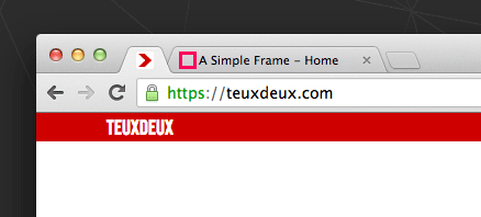
TeuxDeux is the first "pinned" tab in my web browser (Chrome). Though I used TeuxDeux as a Fluid app for a while, keeping it in the browser – where I see it more – helps me stay on task. [1]

Writing action steps class: narrow

All To-dos are Action Steps

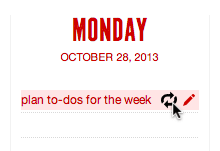
Every to-do must start with a verb (an idea borrowed from 99u's Action Method). "Trash" is not actionable and, therefore, not an acceptable to-do. "Take out the trash" is more like it.

Planning for the week class: narrow

Weekly Planning Ritual

I begin every Monday morning by taking some time to plan and prioritize the week's tasks. Prioritizing helps ensure that my time will be spent on the most important to-dos and not just the easiest or most appealing to-dos. Also, I find positive motivational pressure in feeling the weight of the many to-dos queued up for the week.

Breaking down time class: narrow

Small Chunks of Time

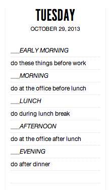
TeuxDeux is structured over the framework of a calendar. Each day has it's own list of to-dos. Doing weekly planning, I discovered that it was helpful to break down each day into smaller, more comprehensible chunks. These smaller time segments allow me to get a better handle on what can be accomplished in a given day. If a segment is unavailable for to-do work, I fill it in with a note in brackets.

To-do inbox class: narrow

Inbox

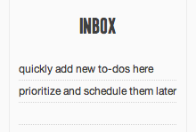
I reserve the first column of the bottom row as an inbox for new to-dos. Instead of disrupting my flow of work to prioritize or schedule a new to-do that comes to mind, I simply add it to the inbox. Later, I can consider where it fits within my plan for the week.

To-do inbox class:

Setting Priority

The remaining four visible columns of the bottom row are organized by priority (another idea from Action Method). From week to week, I move projects and to-dos between these columns, which helps me focus on what is most important. Working on to-dos from left to right keeps me accountable to working on what matters most.

Starred to-do class: narrow

Mission Critical Tasks

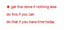
I sometimes copy and paste a star character before a task that is mission-critical for the day. This helps be focus in on the one thing that I really need to get done, even if nothing else gets crossed off the list.

Backburners class: narrow

Backburners

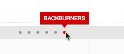
Backburners are action steps that are not yet actionable (yet another idea from Action Method). I store them in hidden columns on the bottom row. (You can add as many extra columns as you need.) As I used to keep backburner items in separate text files, this greatly reduces the complexity of my system. As a bonus, it doesn't clutter the system, as they stay out of view in the hidden columns until needed.

Organizing projects class: narrow

Projects

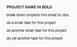
Within the prioritized columns of the bottom row, to-dos are organized by project. Project names are bold with to-dos for each project listed directly below the project titles.

Quick dividers class: narrow

Quick Dividers

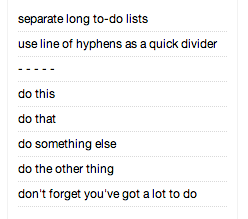
To tame unruly to-dos, I sometimes use a divider of spaced dashes as a quick and simple way to break up long lists.

Personal vs work to-dos class: narrow

Work + Life

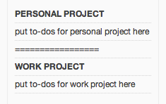
I used to maintain two separate TeuxDeux accounts – work and personal – stemming from a pursuit of work-life balance. This proved cumbersome and unhelpful. Both work and personal to-dos are now unified in one account, which keeps things simple and helps me see the big picture. I use a line made of equal signs in each column of the bottom row to mark the separation between work and personal projects. All personal projects go above the line, all work projects go below it.

Focus line class: narrow

Line of Focus

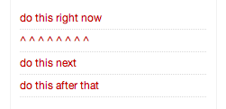
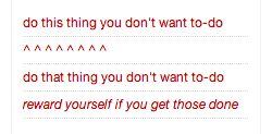
Perhaps the silliest, but nonetheless helpful, way I use TeuxDeux is with a line of up carets. I use this line at the top of the current day column to denote the one to-do I'm currently working on. Before I start working on a to-do, I drag it above the line, which helps me unitask.

Rewards class: narrow

Setting Rewards

Another somewhat silly tactic I've tried with some success is adding explicit rewards or distractions to my to-do list in italics. When I'm feeling distractible, the reward "task" gets added to the list after the work I should be doing. This silly mind trick helps motivate me to stop procrastinating and get the work done quickly in order to reach the reward.

How Do You Use TeuxDeux?

As already stated, one of the things that makes TeuxDeux great is its flexibility. The way I use it is likely very different than how you use it. Hopefully, these details of my method will help spark ideas to refine your own workflow. Do you have any TeuxDeux tips you can't live without? I'd love to hear them.


  1. Tina Roth Eisenberg, TeuxDeux's founder, described using it in a similar way when the original TeuxDeux app was released: "As I pretty much ‘live’ in the browser, I have it set to be my homepage, so, every time I open a browser window (which is every few minutes) I am being hit over the head with what I need to get done, which has proven to be very effective." ↩︎

Is Good User Experience a Luxury?

Consider the scenario of two tools. Each accomplishes the same task or job. The first tool, though it will complete the task, is frustrating to use and takes a longer time. The second tool, on the other hand, is easy – even fun – to use and accomplishes the task in less time. It is also more beautiful. Which tool is better designed? Which tool is used more? Which tool would you choose if given the choice?

No one would choose to use the first tool if they had the option to use the second. In the real world, however, choice is often dependent on means. Only an ascetic would choose to fly coach if there was no cost difference to fly first-class. Both seats in the airplane go to the same destination, but one is more enjoyable. Higher cost often equals a better experience (assuming that the option of air travel can be afforded in the first place).

Does it follow that good user experience is a luxury? Yes and no. The answer is partly dependent on the task or job at hand. Is that task or job a necessity or a luxury to complete? What constitutes a necessary task? In moments of true necessity – when need is present and options are scarce – user experience doesn't matter. Anything that will meet the need will be used. As the Proverbs say: "to one who is hungry everything bitter is sweet." [1]

But what constitutes true necessity? Food, shelter and water are certainly the most basic of human needs. Beyond survival, is all else luxury? Perhaps the answer is yes in the strictest of senses. However, there is a difference between mere human survival and human flourishing. What does it take for a human being to flourish? Is it intrinsically human to need experiences of joy and beauty?

As designers in affluent western society, where does the responsibility of our design rest? Is it to design necessities or luxuries? We certainly have designed a lot of toys, but is this wrong? I'm uncertain of the answers. However, I do have a deep conviction that designing for the joy, beauty and good experience of our fellow human beings is a worthwhile endeavor. When the goal of our efforts is to see other people flourish – even if only in some small way – it's effort well spent. It's an effort of love.


  1. Proverbs 27:7 ↩︎

Quick Tip: Using Rems to Control Vertical Spacing

Vertical rhythm is an important element of typographic design on the web. Specifically, setting consistent increments of spacing between lines of text and other elements provides an underlying sense of order and structure. When designing A Simple Frame, I developed a method for setting consistent vertical spacing using rems that is easy, effective, and helps maintain consistency.

This is how it works: define the font-size of the html element as the basic unit of your vertical grid and then set all vertical spacing values (e.g. line heights, top and bottom margins/padding) in rems.[1] This not only simplifies the math of your css values, but it aligns your code more clearly with the concept and structure of your vertical grid, thus helping to ensure vertical spacing consistency.

For example, the basic vertical grid unit (and, thus, the font-size value of the html element) on A Simple Frame is 9px. This number was based on the line-height of 27px used for the main body text.[2] Thus, the default line-height value is 3rem (3 × 9). When adding vertical space, I simply add in increments of 3 rems. For large spaces, I can quickly add 6, 9, or 12 rems (instead of doing the pixel math) and know that the vertical grid will be maintained. Likewise, 1rem of top margin and 2 rems of bottom margin can be added to a heading (as long as the line-height of the heading is 3rem) and the overall vertical grid is preserved.

With this approach, I really like how the code values clearly reflect the grid structure. Seemingly arbitrary pixel values are replaced in favor of rem values that represent grid units. As an added bonus, the vertical spacing for the entire site can be changed proportionally by changing the font-size value of the html element. Of course, no approach is perfect, but this makes a lot of sense from my point of a view as a designer. I'd love to hear your thoughts.


  1. I am intentionally using the term "vertical grid" rather than "baseline grid," as true baseline grids (where the baseline of each line of type aligns to the grid line) is difficult, if not impossible, to achieve on the web. ↩︎

  2. Practically speaking, 27px is the main vertical grid unit. However, I chose 9px as the most basic unit in order to easily and simply accommodate smaller measurements when needed. For example, instead of writing ".333333333rem" if 9px is needed (a subdivision of 27px), "1rem" is all that is required. ↩︎

Getting All Your Work Done

"If you get all your work done, then you can go outside and play." These are the words that motivated my work as a child in grade school. They challenged me to complete my work as well as I could (being a perfectionist even then) and as fast as I could. The sooner I finished the task at hand, the sooner – and longer – I could go outside and play. Rewards don't get much better. I never procrastinated.

Fast forward to present day. I procrastinate. "If you wait until the last minute, it only takes a minute to do" is procrastination's chief maxim, and it's true. The force of an impending deadline has the ability to focus one's attention like nothing else. Writing papers in college the night before saved a lot of time, and invariably resulted in A's – not too bad a result in exchange for a little stress and loss of sleep.

Why is it so hard to start working on something early, when all the proverbial time in the world is at your disposal? Perhaps it's because there's no "go outside and play" waiting at the end of "If you get all your work done." Getting all your work done as an adult just means more work – not very motivating.

I've read about rewarding yourself for work completed, and that's helped to a degree. However, I also realize that real motivation lies in deeper things such as autonomy, mastery and purpose. At the end of the day, I want to do good work that I can be proud of for something that matters. That's truly motivating.

Perhaps if I was working on the ultimate project that fulfilled these deeper needs, I wouldn't procrastinate, but I doubt it. Work is inherently good and necessary, but it will always be frustrated in this life. As such, imperfection, though certainly not the goal, must be accepted to a degree, and the limitation of time must be embraced. These concessions, though difficult and unpleasant, are necessary to thwart inaction.

All that said, sometimes I just want to go outside and play.

Responsible Use

Over the past year, I've had numerous people tell me that they or someone they know deleted the Facebook app from their phone. Why? Were they removing an app that they never used? No. In each case the reason was the same – "I use it too much."

Deleting an app we "use too much" is an interesting phenomenon. It's an acknowledgement that we think we spend too much time with our phones (or more specifically, a certain app). We want to be spending our time doing other things, but have trouble modifying our behavior. It's a common issue, and the evidence of our collective awareness – and increasing guilt and frustration – is everywhere.

For example, in a sermon I heard recently, the pastor referred to his iPhone as "my precious." Everyone in the congregation laughed at the joke, no doubt because intense feelings of attachment to our phones is common. A friend's honest confession sums it up best: "I know I'm addicted to my iPhone. I know it."

Jonathan Ive, Senior Vice President of Design at Apple, describes the "unique relationship that people have with their iPhone:"

It's probably the object you use most in your life. It's the product that you have with you all the time.

Having our most-used object with us all the time can make it difficult to give our attention to anything, or anyone, else. In fact, in addition to deleting apps from our phones, we are designing other ways to force a separation between ourselves and our devices in order to reconnect with other people.

For example, a tablecloth has been designed with zippered, built-in phone pockets to keep our devices from interfering with conversation while dining. A beer mug has been designed that stands upright only when rested on a phone, ensuring it stays out of commission. To the same end, a restaurant now pays customers to check their phones at the door. And in a new dinner game, the first person to reach for their phone wins the prize of footing the bill.

As we invent new ways to separate ourselves from our phones, we must realize that our device attachment is more than skin deep. Philosopher James K.A. Smith points out how touch-screen devices appeal to – and even shape – our desires for control and power:

The technology affords and invites rituals of interaction. … The material rituals of simply handling and mastering an iPhone are loaded with an implicit social imaginary. To become habituated to an iPhone is to implicitly treat the world as “available” to me and at my disposal – to constitute the world as “at-hand” for me, to be selected, scaled, scanned, tapped, and enjoyed.

Comedian Louis C.K. goes further. He observes that we constantly interact with our phones in order to mask our deep-down feelings of loneliness and emptiness:

You know, underneath everything in your life is that thing – that empty, forever empty. … that knowledge that it's all for nothing, and you're alone. … and sometimes when things clear away, you're not watching anything, you're in your car and you start going "oh no, here it comes – that I am alone," it starts to visit on you – you know, just this sadness. Life is tremendously sad. … That's why we text and drive. … People are willing to risk taking a life and ruining their own because they don't want to be alone for a second.

In addition to our own motivations, we must also realize that our phones and apps are designed with the specific goal of eliciting our constant use. Jonathan Ive, commenting on his work as a designer, said:

I guess it's one of the curses of what you do. You're constantly looking at something and thinking, "Why is it like that? Why is it like that and not like this?"

When we ask these questions of our devices, the answers can be telling. For example, why are notifications always set to "on" by default? How does this default preference, designed into the system, affect my behavior?

In the case of digital products like Facebook, what are the designers trying to achieve? What are the actions they would like us (the users) to take? Why is it the way it is? Most often, the answer involves the goal of fostering as much engagement (use) as possible. Why? The more people use a digital product or service (especially those that are "free"), the more money the company makes (usually via data-driven advertising). Writing of Twitter's upcoming ipo, The Verge's Casey Newton writes:

Like any social network, Twitter’s top priorities include increasing its number of active users and – just as importantly – increasing the time they spend using the network.

Simply put, most digital products are designed with a bias towards eliciting as much use as possible.

This brings us full circle – to deleting Facebook in order to use it less. It begs the question of responsibility. As consumers and users, what is the measure of our responsibility to self-control and self-discipline in our use of digital devices? As digital product designers, what is the measure of our responsibility to encourage moderation (not just maximum use and profit) in the way we design our products to be used? Both are topics I wish to explore further. For now, however, I just want to raise the questions – as I'm not sure they're even being asked.

The First Time I Saw an iMac

The first time I saw an iMac, I didn't know what it was, but I vividly remember the moment. I was at the mall in the small Maryland town where I grew up, inside the Sears store. I'm pretty sure I was there with my mom, but I don't remember what we were shopping for. I was about fifteen years old. I didn't notice the iMac because I was interested in computers at the time. I noticed it because of the design – specifically, the translucent color.

Of course, the iMac I'm remembering is the iMac G3. This is the computer which Steve Jobs envisioned and Jony Ive designed when Jobs returned to Apple. He bet the company on it and won. At the time I saw this computer as a teenager, I wasn't even aware of Apple. (We always had pcs growing up.) But I clearly remember the moment of encountering that computer. I can still picture the inside of the store. The candy-colored iMac jumped off the beige shelves filled with beige and black consumer electronics. I was intrigued.

Looking back, it's funny to realize that it made such a lasting impression on me. I think this was because it was unlike any other computer I had seen before. I didn't know anything about it, but I was attracted to it. It was just cool.

About four years later, I encountered the same iMac G3 at the Design Museum in London. I was there with fellow college students on an art tour of England. The featured exhibit was for the Design Museum's first Designer of the Year Award. One of the nominated designers (and winner of the award) was Jonathan Ive. There, behind the glass exhibit walls, was the iMac G3. It sat alongside the iPod and Ive's other iconic Apple designs up to that point. At the time, I didn't make the connection between that moment and when I had encountered the iMac in Sears years earlier. However, seeing Ive's work on display also left a big impression in my mind.

What is it about that iMac design that was so remarkable? What is it about the design of objects that can make such an impression? I think the answer has something to do with raw emotional appeal. Both times, I reacted to the design of the iMac more from intuition and feeling than anything else.

Today, I tend to eschew unnecessary visual styling – and even color – added to products. I prefer designs that are modern and simple – designs unswayed by fashion trends. With the release of the iPhone 5c, much was again made of Apple's use of color in product design. Though I would probably choose white if I were to buy one, the undeniable attraction of the colors is still there for me. Perhaps it's a reminder to not forget the most powerful element in design, however elusive and abstract it may be: emotion.

Focusing on Beauty

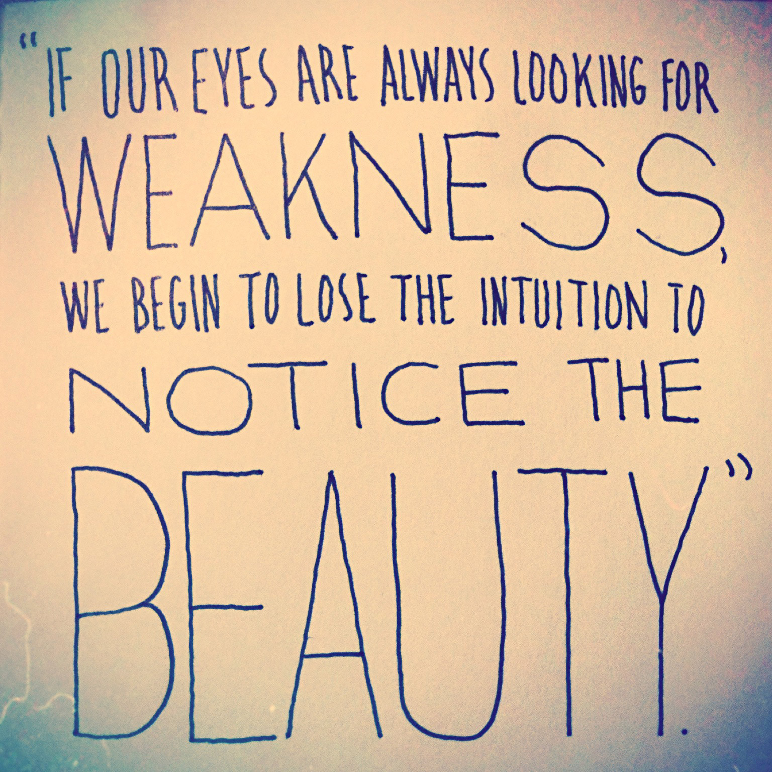
This week, I finished reading Making Ideas Happen by Scott Belsky, the founder of Behance. In one of the last sections of the book, he talks about an experience he had at a storytelling workshop lead by master storyteller Jay O'Callahan. Each participant would tell a story, receive feedback, and then tell it again in order to improve their craft. This sounds standard enough, but there was a catch: constructive criticism was not allowed.

Instead of pointing out the weaknesses in another person's storytelling, participants were instructed to only point out specific strengths.[1] The method proved effective. After receiving positive feedback, participants would improve their storytelling in the next round. Strengths would get stronger and weaknesses naturally faded away.

O'Callahan explains the motivation behind this method:

Weakness & Beauty Quotation class: narrow

If our eyes are always looking for weakness, we begin to lose the intuition to notice the beauty.

His reasoning gives me pause for two reasons. One, it provides a deeper motivation for positive feedback. As one who defaults to criticism, my efforts at pointing out positives in a design are often shallow. I do it because I think I should. But O'Callahan is not talking about a false buoying of self-esteem. He's concerned that we don't lose the heart and soul of the art we create. With this motivation, positive feedback becomes genuine and enriching.

Two, O'Callahan's method sends a gentle but somewhat startling warning. By definition, focusing on something other than beauty excludes our attention from it. If we only look at weakness, will we stop noticing beauty all together? This is the great danger. Blindness to beauty deadens our souls and, ironically, prevents us from reaching the goal of criticism – making something great. I don't believe that critique is unnecessary, but honing an adoration of a beauty is essential, not only for great design – but for our hearts.


  1. O'Callahan calls this "Appreciations." ↩︎

The Setup: Pocket Note-taking Tools

In Making Ideas Happen, Scott Belsky argues that the design of tools matters. If a tool is well-designed and beautiful, you are more likely to use it. This doesn't necessarily mean it has to be expensive or elitist. A good, beautiful tool can be common yet often-used and loved. Ultimately, the right tool for the job is subjective and a matter of personal choice. Even so, it can be helpful to learn about the tools others use and the qualities for which they are valued. In this spirit, here are some thoughts on some tools I've come to use often and love – my pocket pen and notebook.

The Need

Nothing beats pen and paper when an idea needs to be quickly jotted down or sketched. Ideas can come at anytime and capturing them in the moment is essential, lest they be forgotten. Thus, having pen and paper handy at all times is paramount. The obvious solution is to keep a small notebook and pen in one's pocket at all times.

The Notebook

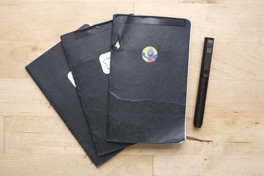
Choosing a notebook was fairly easy. It needed to be small and flexible enough to fit comfortably in my pocket. It also needed to be relatively cheap. Expensive notebooks can feel too precious to the point that they discourage use. One shouldn't question whether or not an idea is worthy enough to take up space in a fancy notebook. It simply needs to be used.

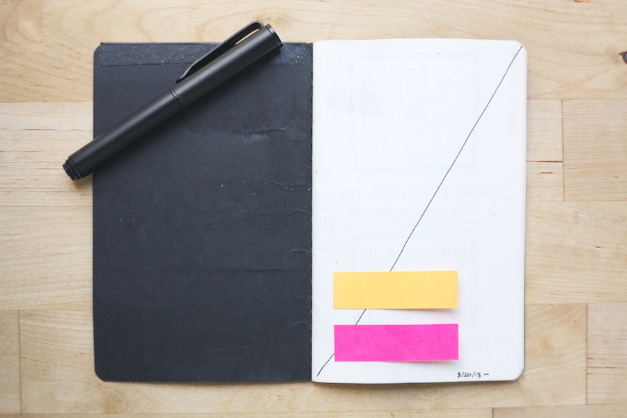
I keep some sticky notes handy on the inside front cover of my notebook. [I always draw a line through the first page.](http://asimpleframe.com/writing/the-first-blank-page)

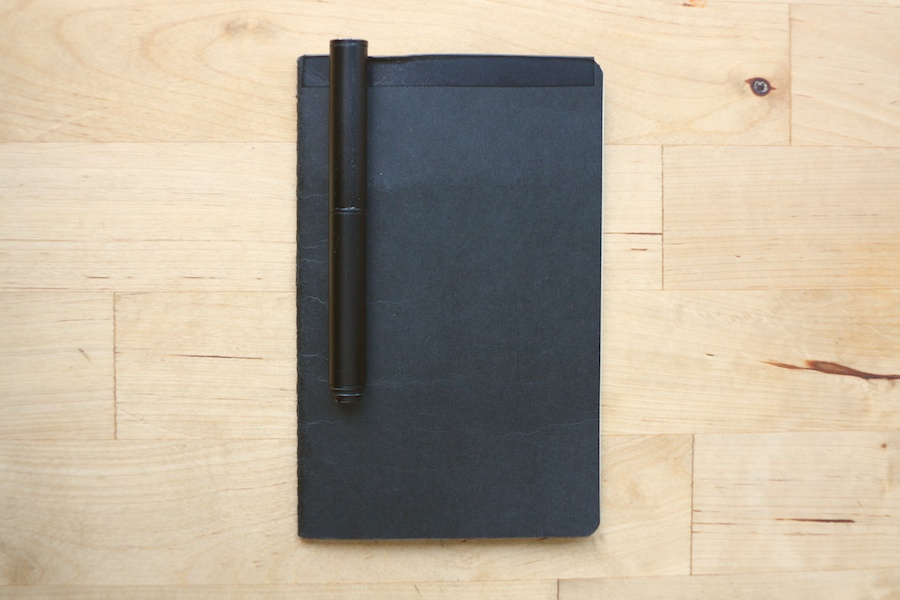
Paper, page count, perforations and pockets were of secondary concern. Plainness, however, was important. A notebook should be a simple frame for thoughts and ideas. It shouldn't scream out ideas, text and logos of its own. Both the cover and the pages needed to be plain.

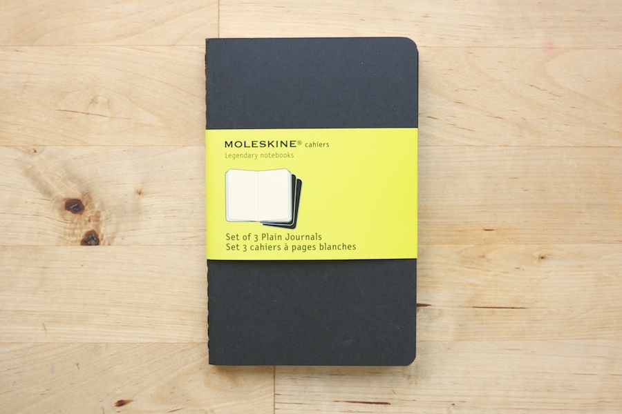
Moleskine packaging

The Moleskine cahier plain journal fit the bill. Relatively inexpensive, three can be purchased for less than ten dollars. The board covers and inside pages feel great. There is a pocket for loose papers in the back, and the last sixteen pages are perforated. The plain cover is interrupted only by a tastefully small, blind deboss of the Moleskine logotype on the back. As pen ink shows through the somewhat thin pages, I write on only one side of each page.

The Pen

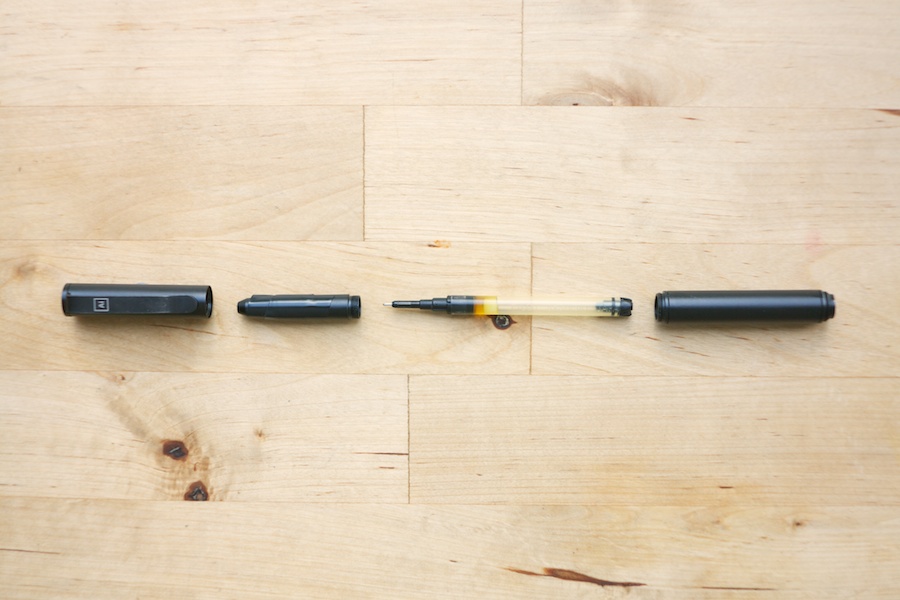
My favorite pen is the Pilot Precise V5 RT. Though ugly, it is inexpensive and writes incredibly well. However, it is not pocket-sized. Being retractable, it can also accidentally be extended once inside a pocket and bleed ink onto your clothes. Thus, my criteria for a pocket pen was set. I wanted a pocketable, unbreakable version of the Pilot Precise V5 RT.

Fortunately, the V5 RT uses a replaceable ink cartridge. All I needed to find was a pocketable, unbreakable pen body that could be hacked to accept it. The first serious candidate was the Fisher Bullet Space Pen. Thought it has a great form factor and finish, the V5 RT's ink cartridge simply didn't fit.

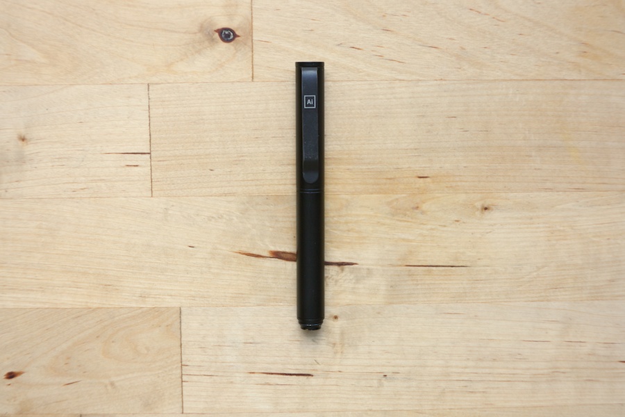
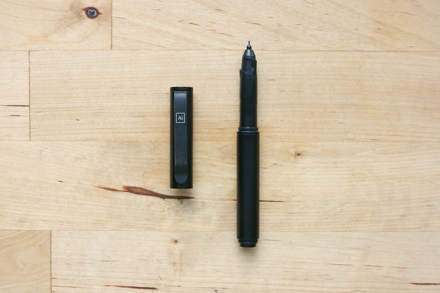
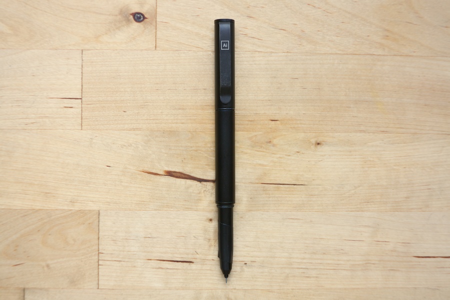
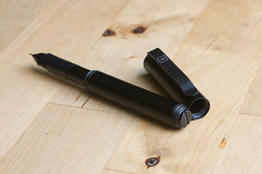
The next candidate, however, ended up working. Thanks to the power of Google, I stumbled across a completed Kickstarter page for the Solid Titanium Pen + Stylus – a minimal, titanium pen designed to accept over 30 different ink cartridges, including the V5 RT. Though this was a standard-size pen, I quickly discovered a pocket-sized version – the XTS, which accepts cut-down V5 RT ink cartridges. [1]

The XTS fit my requirements. It is a very nice pen, but not perfect. On the pro side, it is virtually unbreakable, pocketable, minimal, and accepts the V5 RT cartridge. It feels solid and well-made. On the con side, it is relatively expensive. The aluminum XTS I purchased cost $40. Secondly, it's pieces connect (when opened or closed) by screwing them together. This is a great feature in a pocket pen, making it very unlikely for the pen to come apart in your pocket. Unfortunately, the threads stripped out on the first day I started using it. I'm happy to report that the maker's of the pen, BIGiDESIGN, replaced it quickly at no charge, and I haven't had a problem since. However, revisiting their site leads me to believe I wasn't the only one to encounter this problem. As of this writing, the aluminum XTS is not being sold and the full-size version has been updated to include "newly improved, stronger threads."

Threading on the ends of the XTS

The Cost of Choice

In Barry Schwartz's TED talk on the paradox of choice, he says that “Some choice is better than none. But it doesn't follow that more choice is better than some choice.” It's incredible that I could find most everything I wanted in these tools, including a pocketable pen body made of a metal that accepted my favorite ink cartridge.

However, as Schwartz argues, having this incredible choice has a downside. Arguably, I've wasted too much time and brain power on finding a pen from the available choices. More significantly, the incredible number of choices leads me to believe that a tool that is a little bit more perfect is still out there, waiting to be found. Even though the tools I have are truly great, I can easily become dissatisfied with them or disappointed in the choices I've made when something isn't exactly as I want it to be.

It's a great thing to find tools that are enjoyable to use. At the end of the day, however, the most important thing is what the tools accomplish – capturing ideas and doing creative work. Though I love my current pen and notebook setup, I could get by with almost any piece of paper and a pen or pencil. Just like the best camera is the one that you have on you, the best tool is the one that gets the job done.


  1. I purchased the XTS Aluminum pen. As of this writing, the XTS Aluminum was not being sold on BIGiDESIGN’s website. ↩︎

The Internet, Distraction and Sticky Notes

Revealing the hidden Rdio window, I check the name of the band that's caught my ear. "Who are they? Where are they from?" I wonder. I recall the furniture exhibit I visited earlier in the day. "How much does that chair cost? Who makes it? How is it made?" I remember an email that I need to send, a quote to write down and a book to purchase. These thoughts run through my mind as I sit at my work desk. Seemingly benign, they have significant power to disrupt and distract my focus.

These thoughts are given their power of distraction by the multi-purpose tool sitting on my work desk: a computer. The internet is but a click away. Out of Photoshop and into Chrome, I quickly find myself deeply entrenched in a band's Wikipedia page or a furniture manufacturer's website. Not only has the last ten minutes been spent reading information of dubious usefulness, my concentration has been broken. I must now refocus my attention to begin anew on the task at hand, any previous momentum squandered and lost.

Today, the satisfaction of every fleeting curiosity can be reached in seconds. Thanks to our phones, we need not even be sitting in front of a computer. A question arises in conversation. No one knows the answer. A phone appears. Google is searched. The answer is found. What were we talking about again?

The price we pay for this convenience and abundance of information is subtle but real. As Herbert Simon stated, "A wealth of information creates a poverty of attention." In conversation, our private screens often win our attention more fully than the person sitting across from us. In our minds, we are deprived of what it is to remember, ponder and wonder. At work, we are robbed of productivity and focus – which brings me back to my desk.

Satisfying the whims of trivial curiosity is now second nature. Searching instinctively comes before thinking. The implication for those who do their work on computers? Distraction is second nature. I don't have all the answers, but I have found one simple weapon to be effective in reprogramming my response. All that is required is pen, paper and a slight diversion. Instead of typing into Google's search box, I write interrupting thoughts on a sticky note. My mind's impulse to act is satisfied. I'm left with a bulleted list – an inbox if you will – of disparate thoughts, unintelligible to anyone but me.

Focus is the real goal. Productivity, thoughtfulness, and creativity don't exist without it. Having unloaded stray thoughts, my mind is cleared to focus on the task at hand, uninterrupted. Upon completing the task, taking time to revisit the list becomes a reward for work well done.

This process has one peculiar side effect. As I begin typing the contents of my list into a search box, it suddenly becomes shorter. Thoughts once so urgent to warrant interruption are viewed in a new light. Feigned importance fades to triviality, a waste of even my free time.