Contour
Contour is a desktop-class web app for top-down data visualization and analysis in Palantir Foundry. I worked on iteratively improving Contour for over a year and a half, working as both an IC and a lead on the team. This is what the product looked like around the time I stopped working on it:
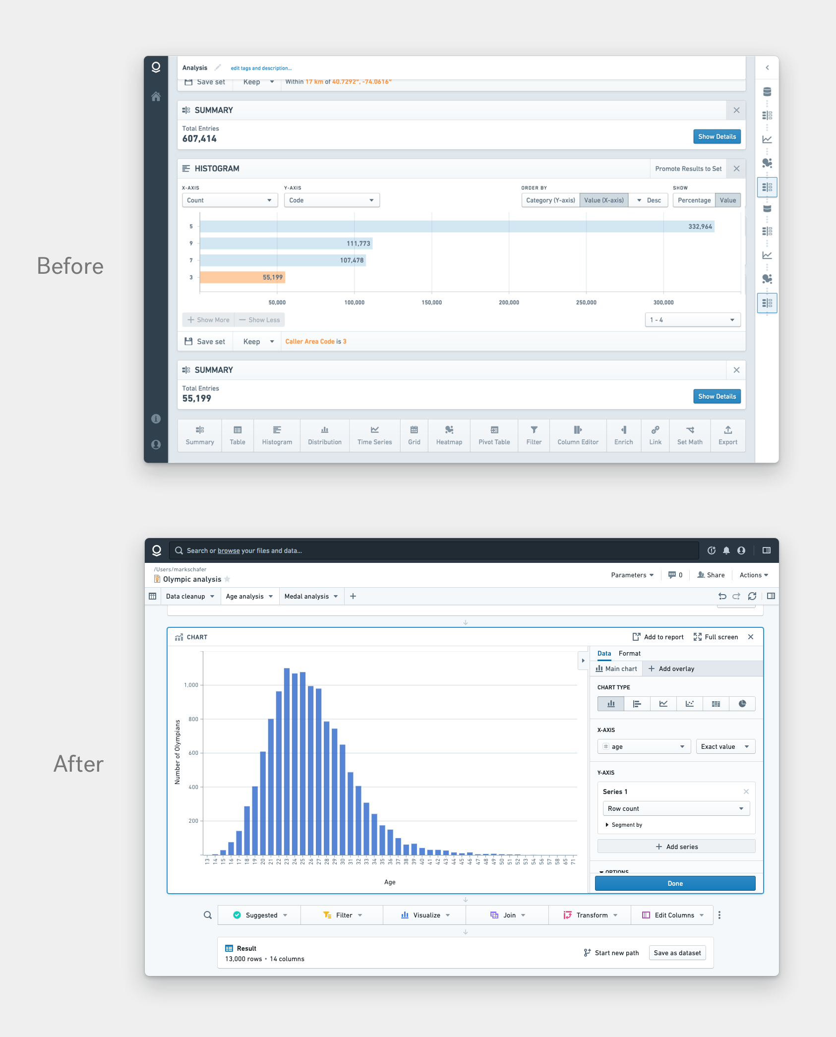
Below is a before/after of Contour over the time I worked on it. Top shows what it looked like when I began working on it. Bottom shows what it looked like when I stopped.
In the beginning, the work comprised of two main things:
- Converting Contour from a stand-alone application to being integrated in the nascent Foundry platform
- Clarifying the product vision
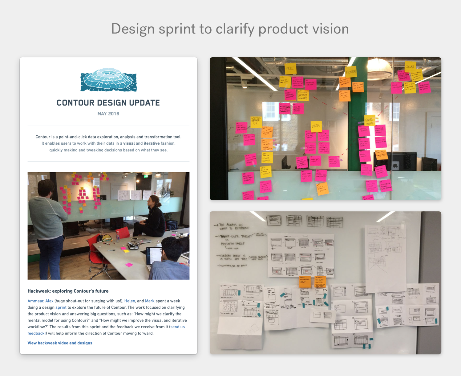
To help clarify the product vision, I facilitated a design sprint with Contour’s product manager and two other designers. Below are some artifacts from the sprint, including an email update I sent out afterwards, sharing the prototypes that were designed during the sprint.
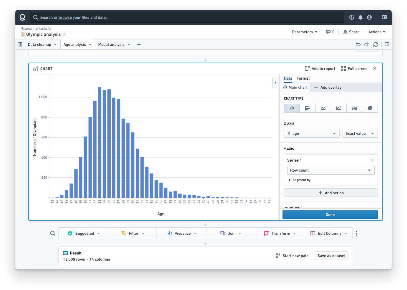
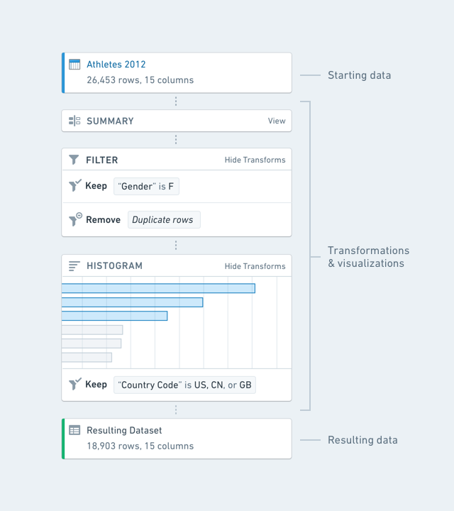
One of the large changes we made was introducing the concept of paths. A path has a starting set of data at the top, a series of transformations and visualizations in the middle, and a resulting set of data at the bottom:
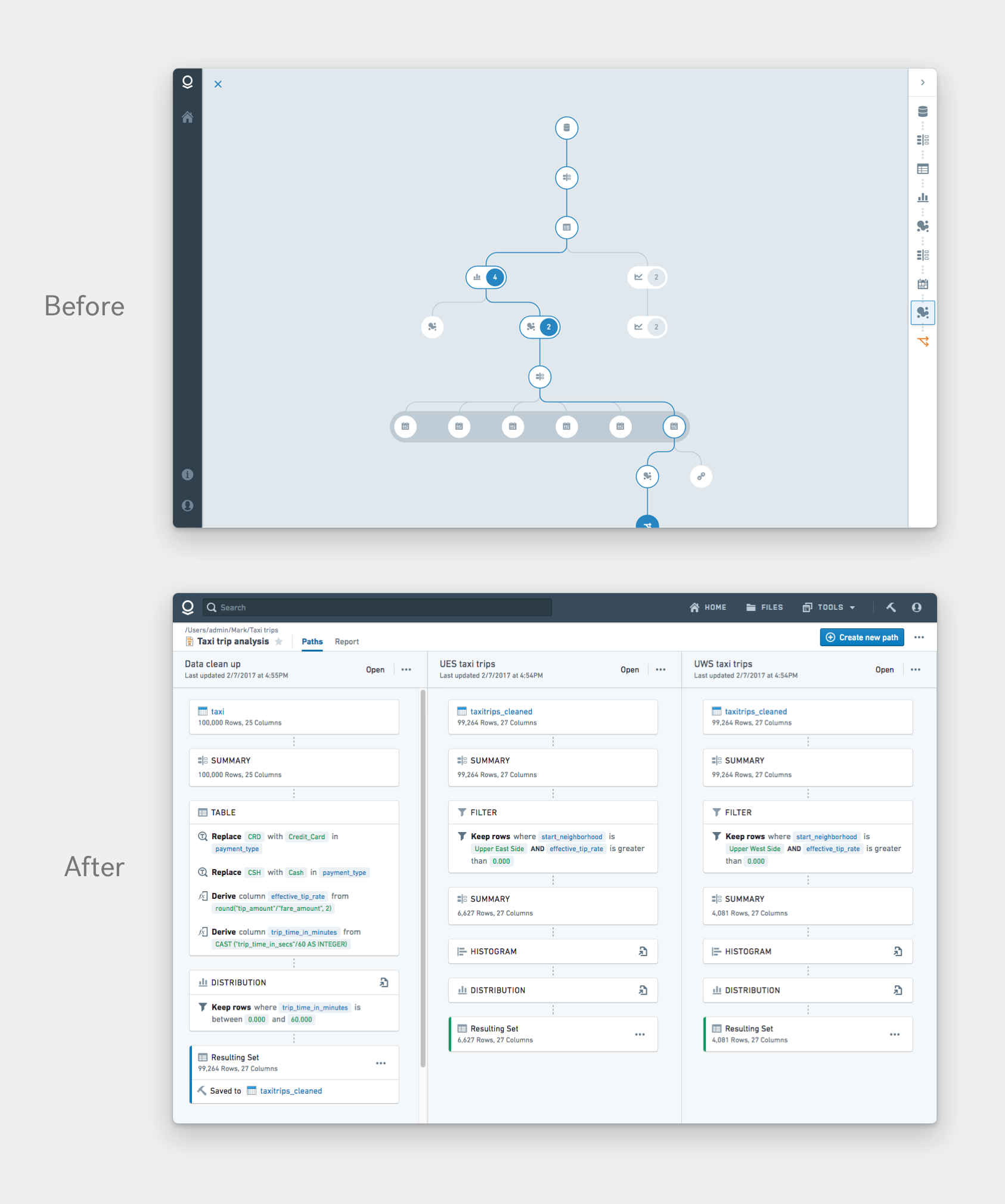
Before paths, there was no way to organize an analysis. There was a confusing view (see below) that displayed the way analyses were stored on the backend, as an immutable graph consisting of every state of every data query. Users found it confusing. After paths, we introduced a paths overview, which provides a birds-eye view of all paths in an analysis. I led the designer who worked on this view.
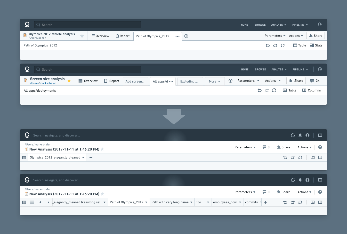
Another significant project was introducing tabs – making it possible to easily switch between the different paths in an analysis. Below is the first and second iteration of the tabs which I designed.
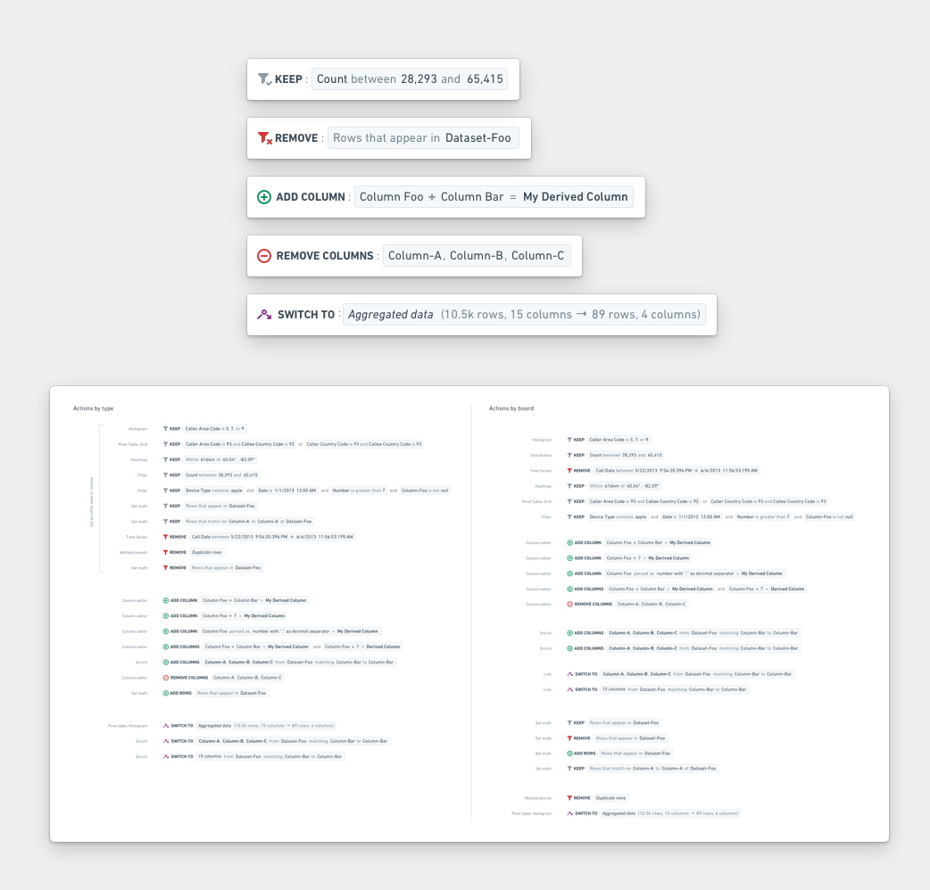
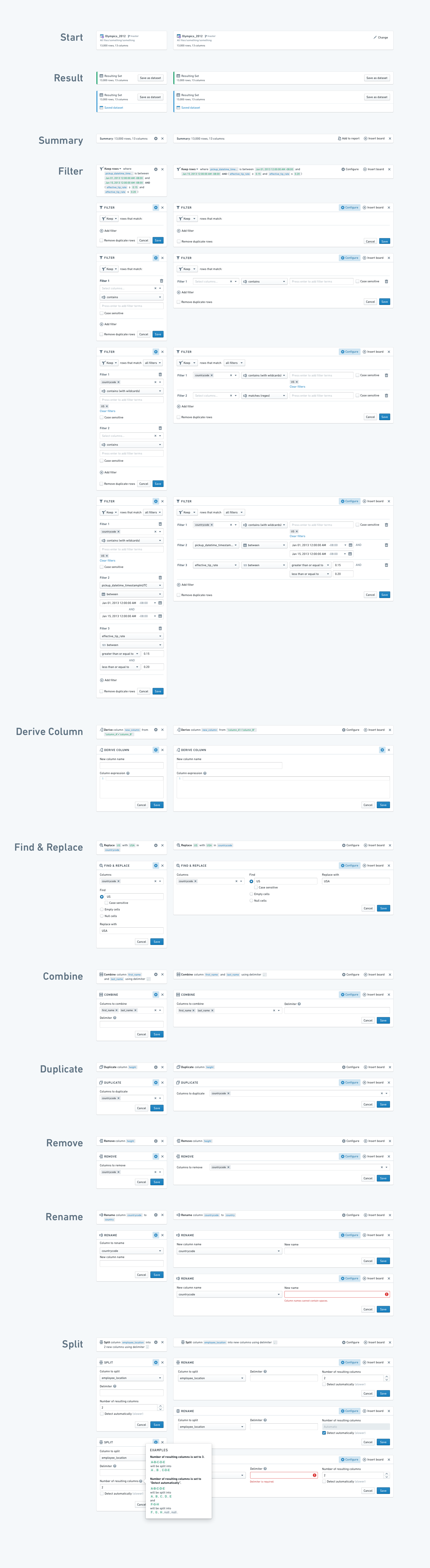
I also created a visual system to clearly and consistently display data transformations. This stemmed from a need to make it easier to understand how the data had been transformed at each step of the analysis. I audited every type of transformation in every board, and composed a system that accommodated every type and variation of transformation.
Each data transformation or visualization in Contour is represented by a board. Most had been designed at different times by different people, so they felt incohesive and lacked consistent interaction patterns.
I began by cleaning up one of the most-used and complicated boards: the filter board.
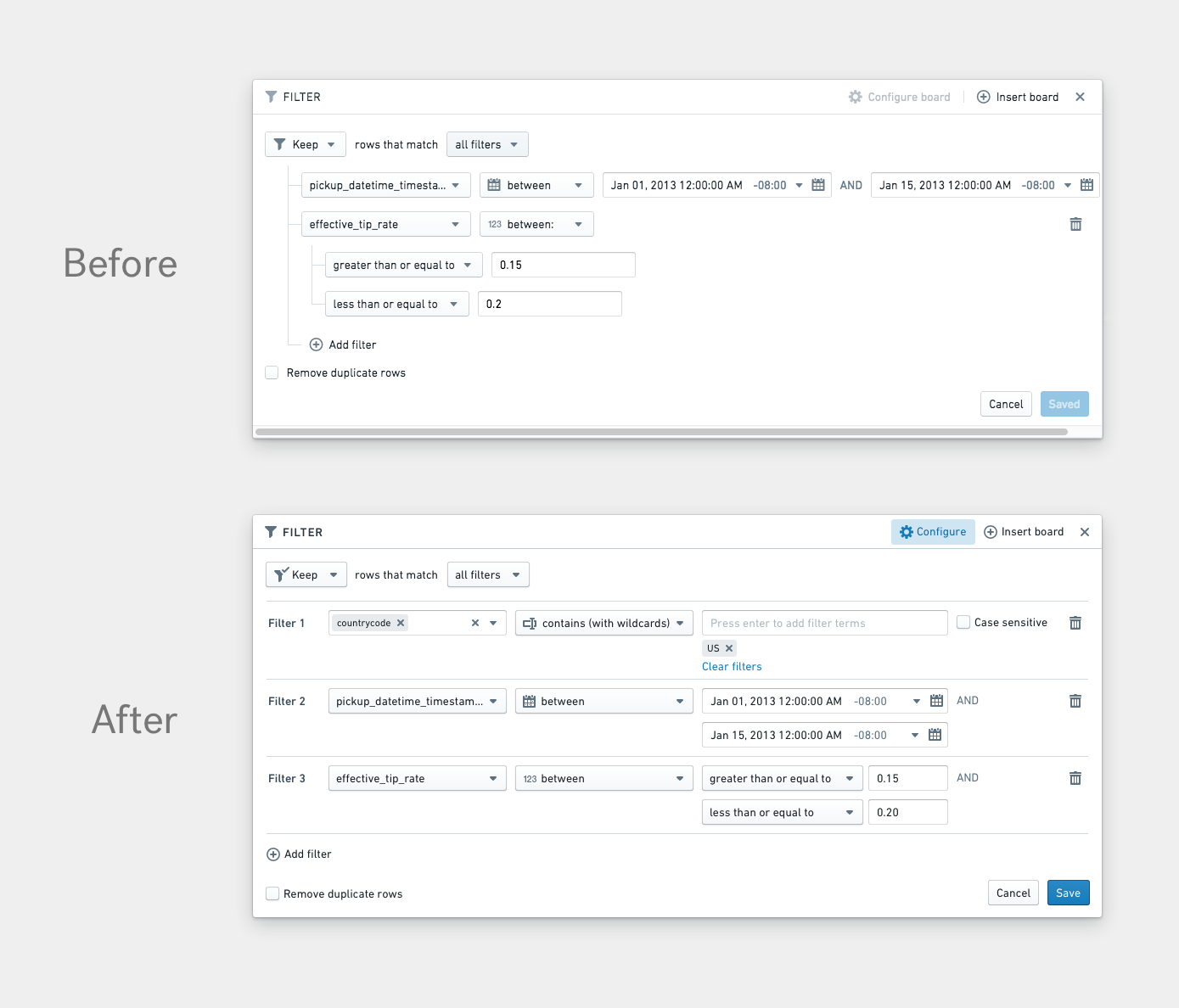
After designing the filter board, I began creating a visual and interaction system that all boards could follow.
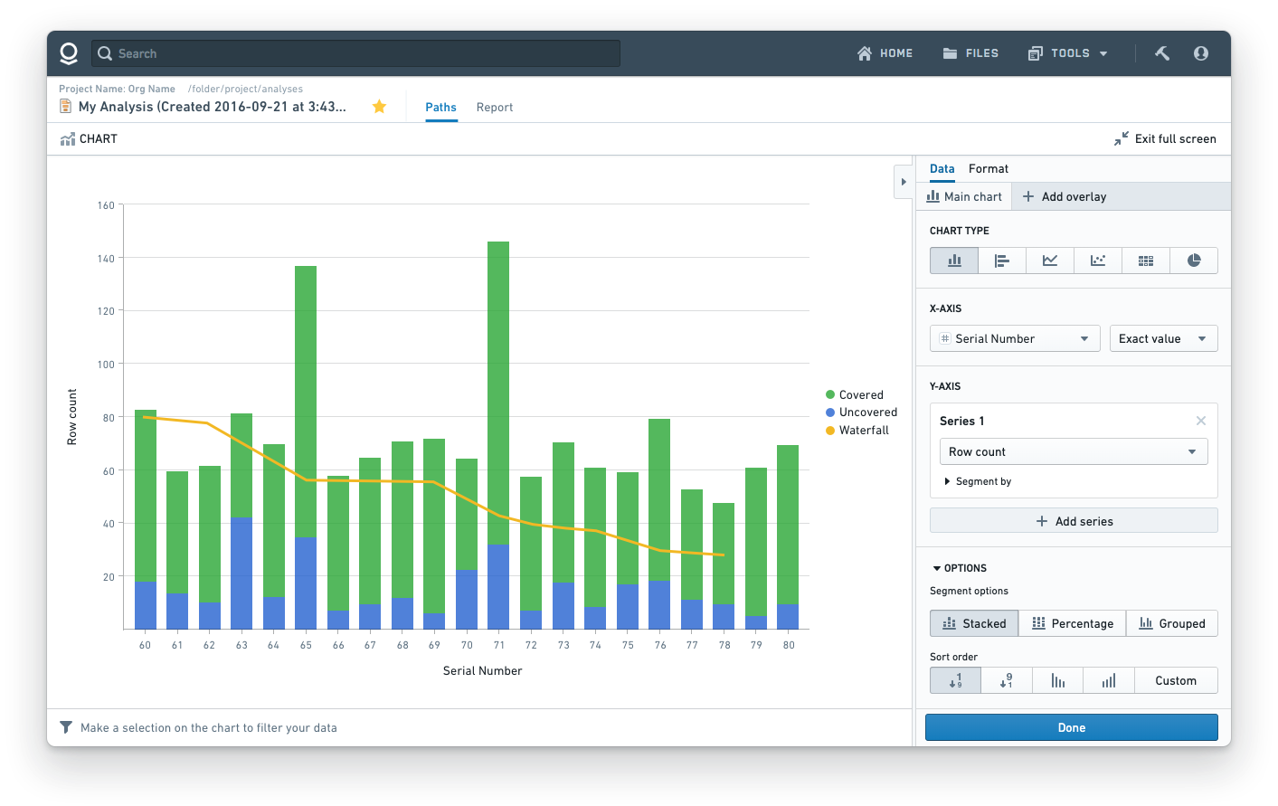
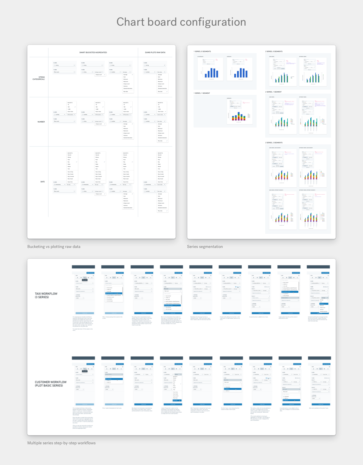
Another major feature we worked on was to bring robust charting to Contour. To do this we added a configurable chart board. I both directed other designers’ work and worked through the states for various complex configuration workflows.
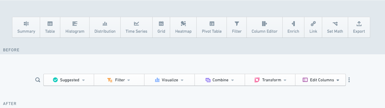
I also directed the redesign of Contour’s toolbar, which had become too overwhelming for users. I collaborated with the toolbar designer by whiteboarding, coaching, and providing feedback.