Scroll → Twitter
In the course of a year and a half, I helped Scroll go from public launch to acquisition to shipping in Twitter Blue. Below is the Scroll iOS app prior to acquisition.
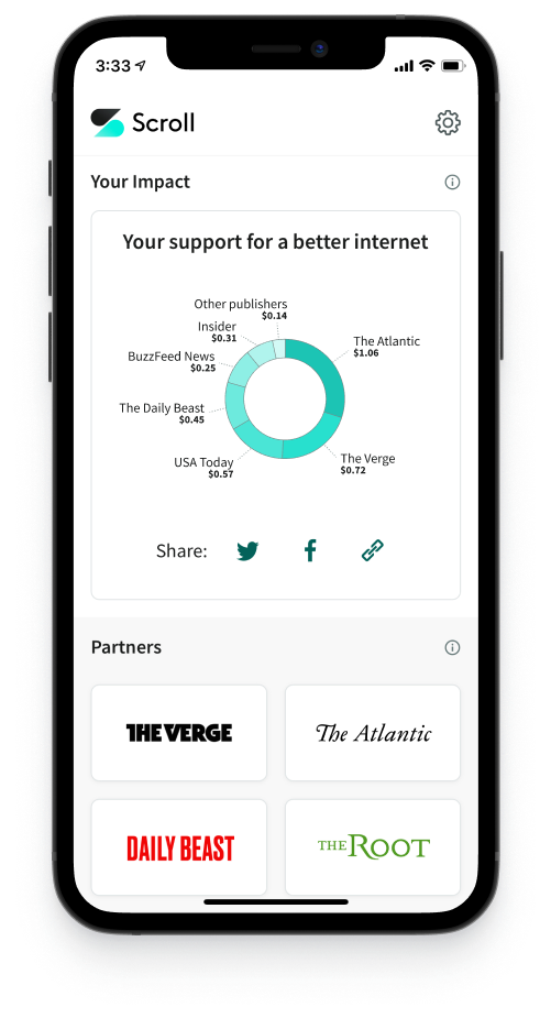
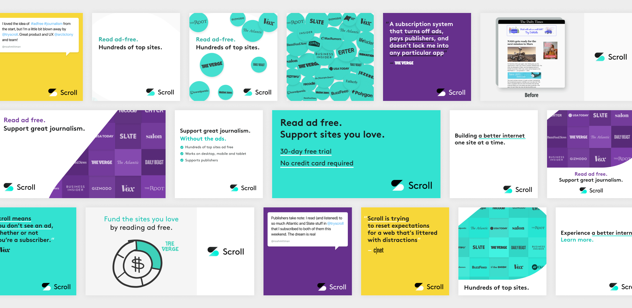
Scroll provided ad-free reading across a network of top websites. Ironically, I designed a lot of ads to help market the service to potential subscribers.
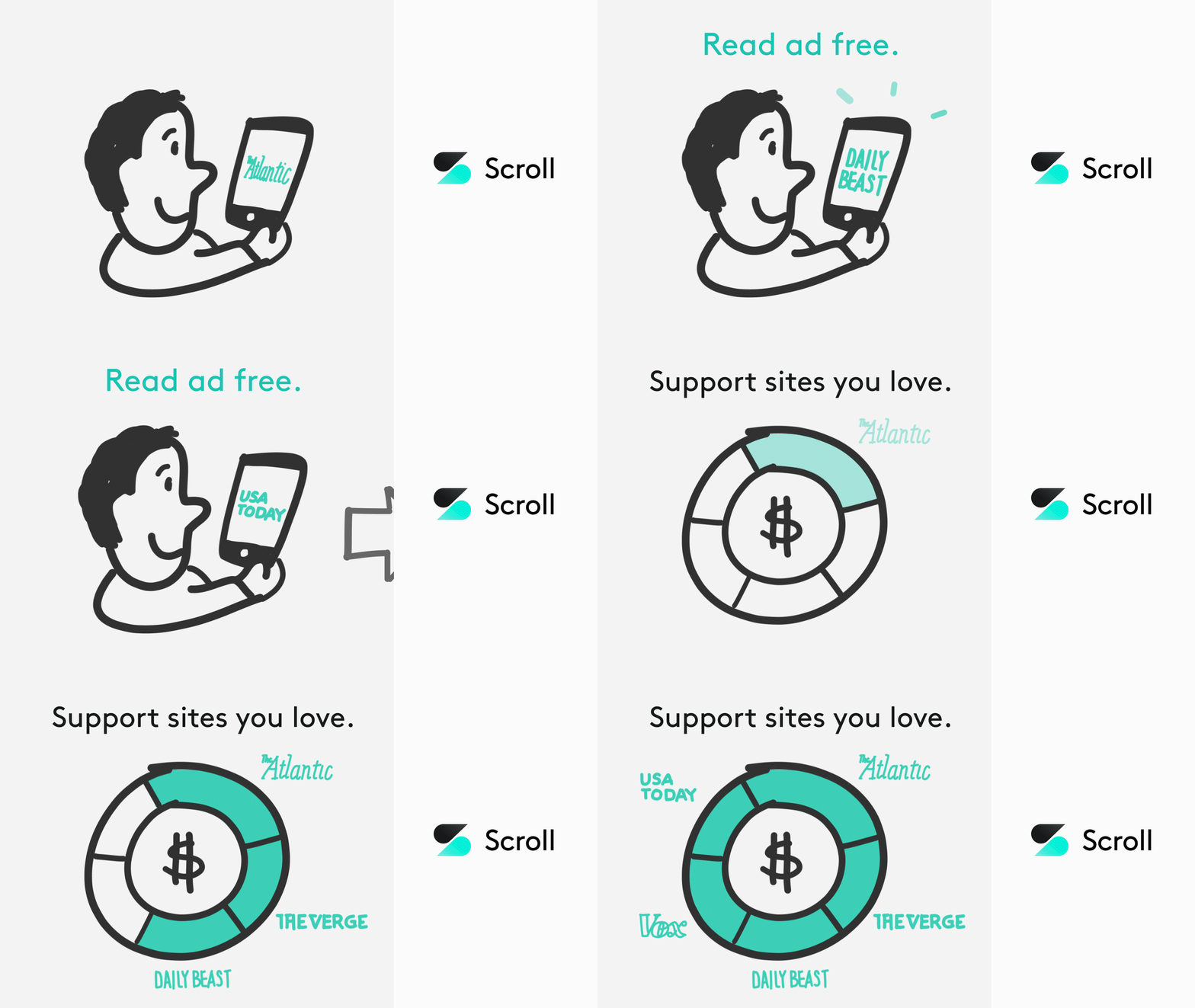
Scroll's mission was to fund journalism while creating a better experience for readers. As a reader, you could log in to Scroll, read ad-free, and feel good knowing that your reading funded the sites where you spent time.
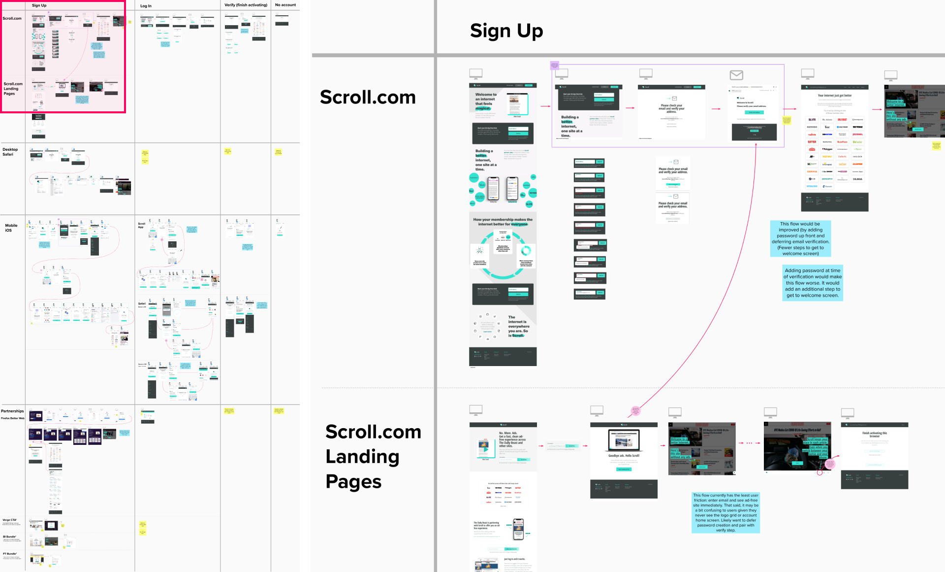
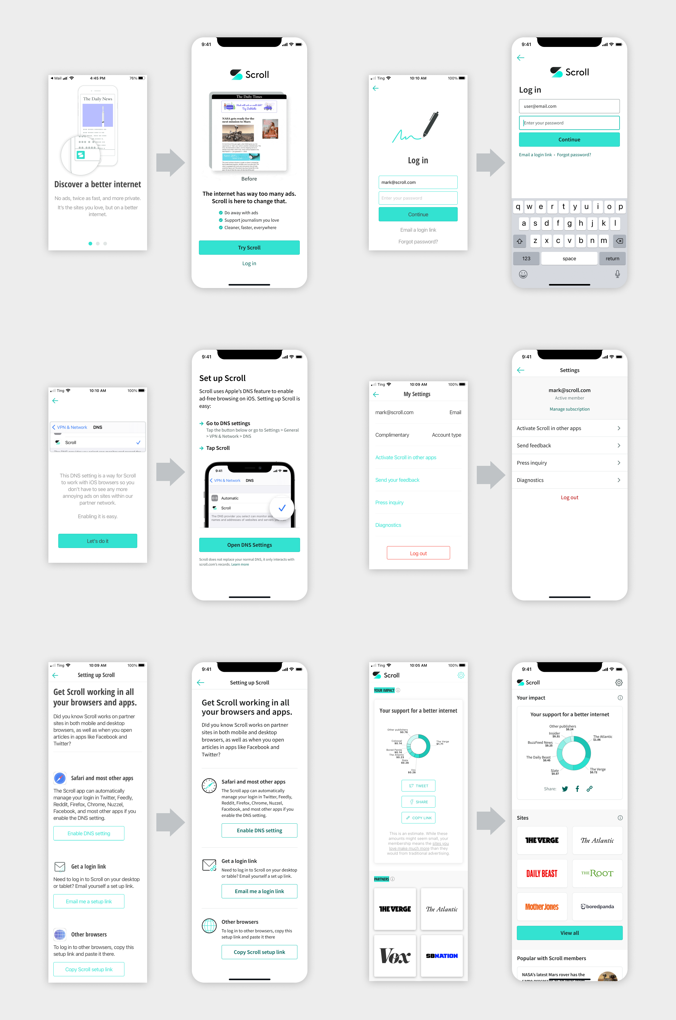
I began my work at Scroll by auditing the user experience. It was deceptively complex, due to variations in sign up and log in across different flows and platforms.
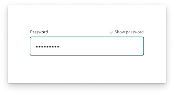
One way we improved the experience was adding passwords. Due to changes in how browsers handled third-party cookies, Scroll members had to log in more frequently than initially expected. To make this easier, we added the option to log in with a password (instead of magic link only).
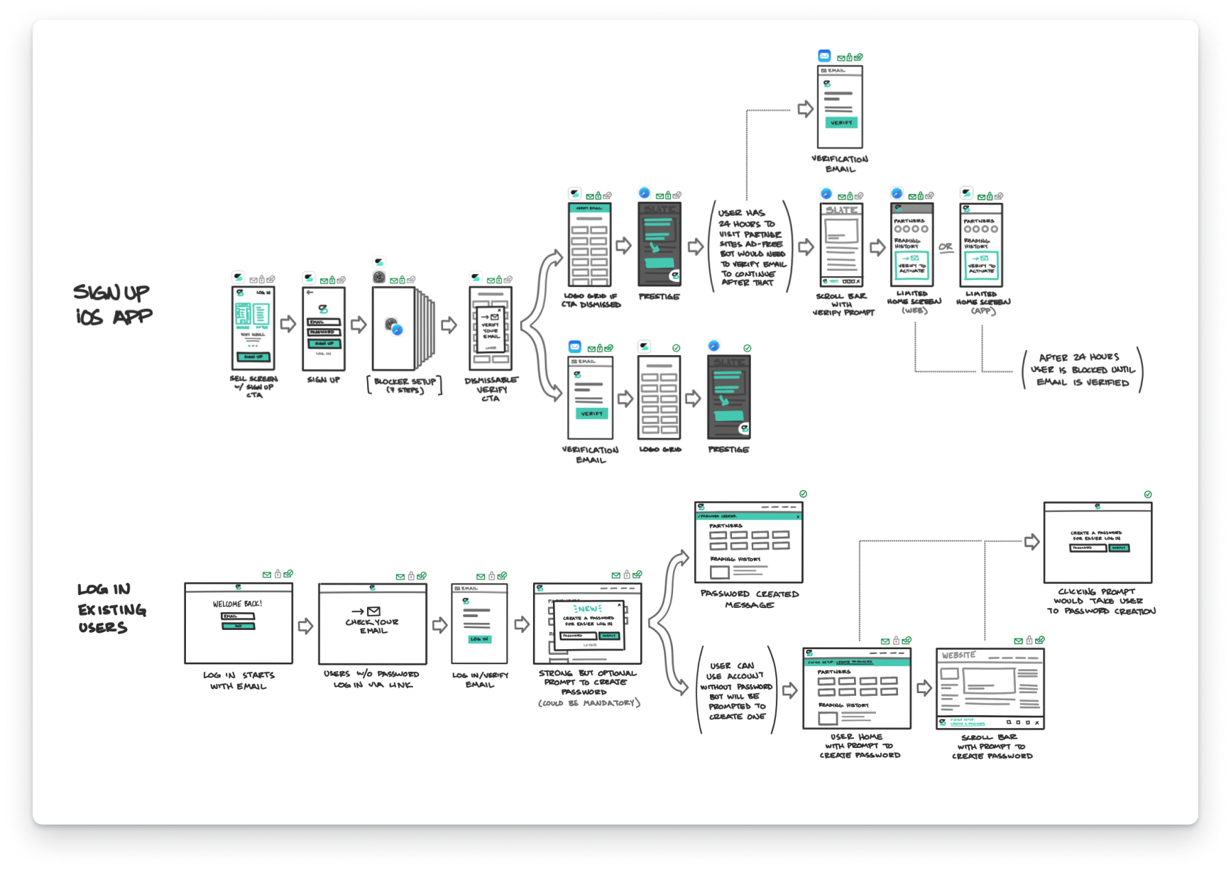
While the UI design was relatively straightforward, the user flows were more complex. Visualizing the changes with sketches and prototypes helped get the whole team on board.
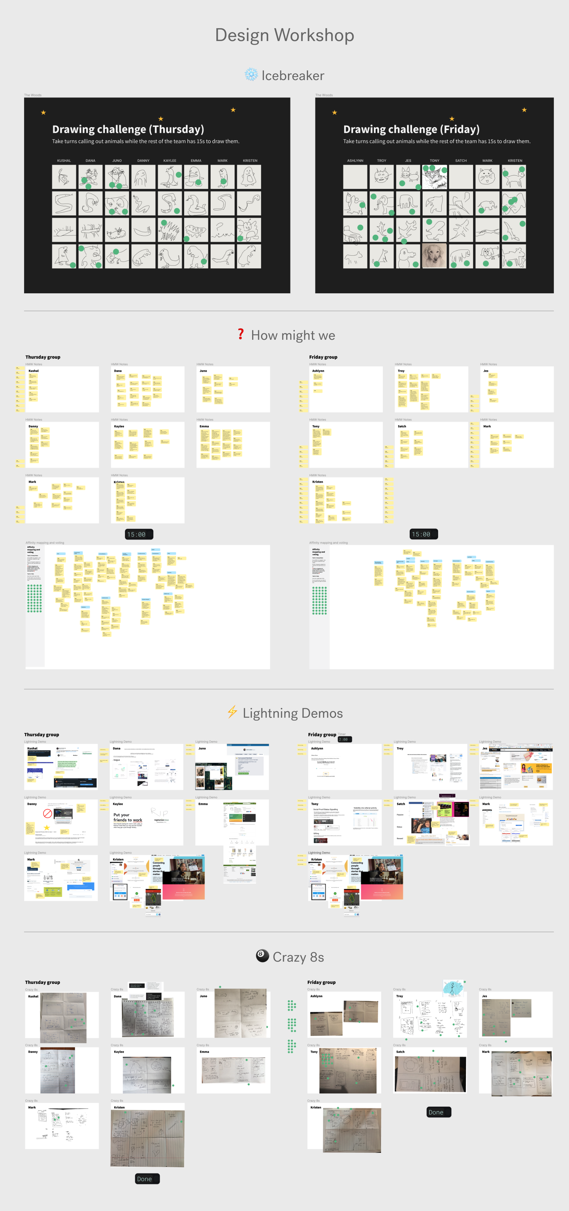
When the exec team wanted to focus product on user acquisition, I led a remote design workshop to help generate ideas and align the team. We split the team into two groups, and I led each group through a series of exercises to generate a broad range of product ideas.
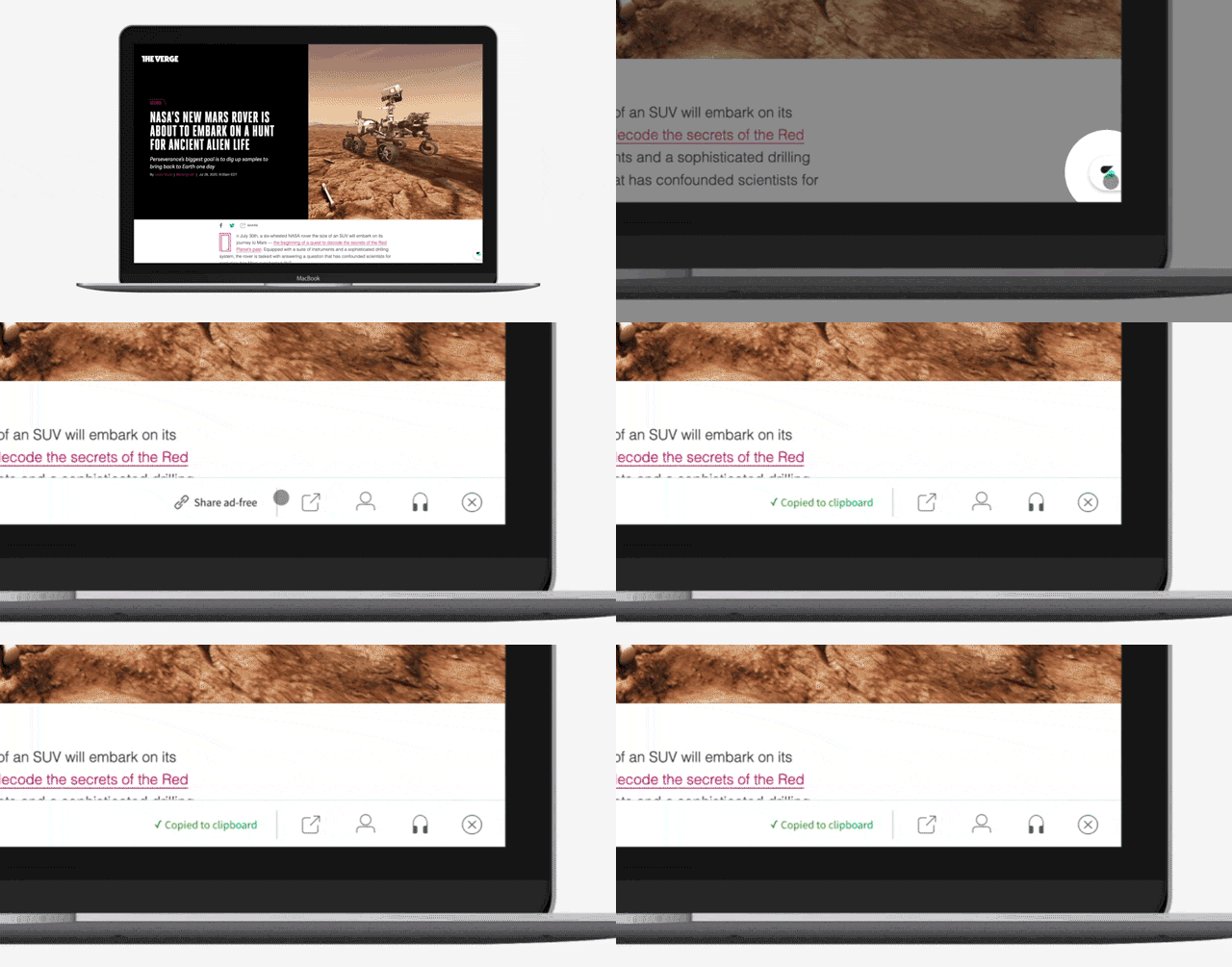
We narrowed the ideas from the workshop into a number of projects, one of which was allowing Scroll members to share ad-free links.
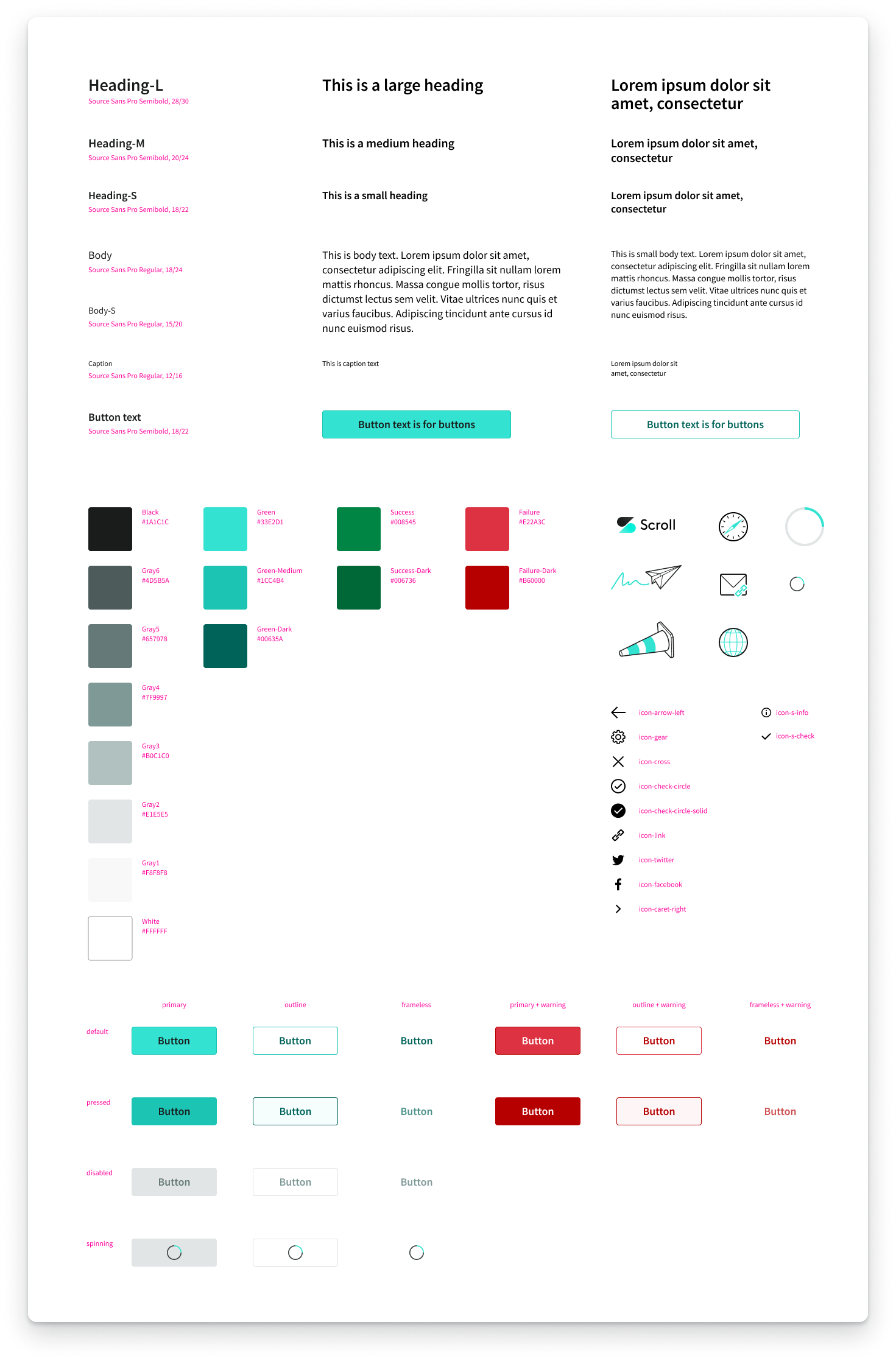
I also updated Scroll's existing design system. The main design goals were to moderize the app's look and feel, make it more consistent, and fix issues such as low contrast colors. Technically, the goal was to reduce the number of elements to a minimum so we could remove cruft and have a solid foundation for future iterations.
In May 2021, Twitter acquired Scroll. This shifted the focus from user acquisition to translating Scroll's product into Twitter.

I transitioned the Scroll product into an experience that made sense inside of Twitter. Scroll became Ad-free Articles, a feature of Twitter Blue.
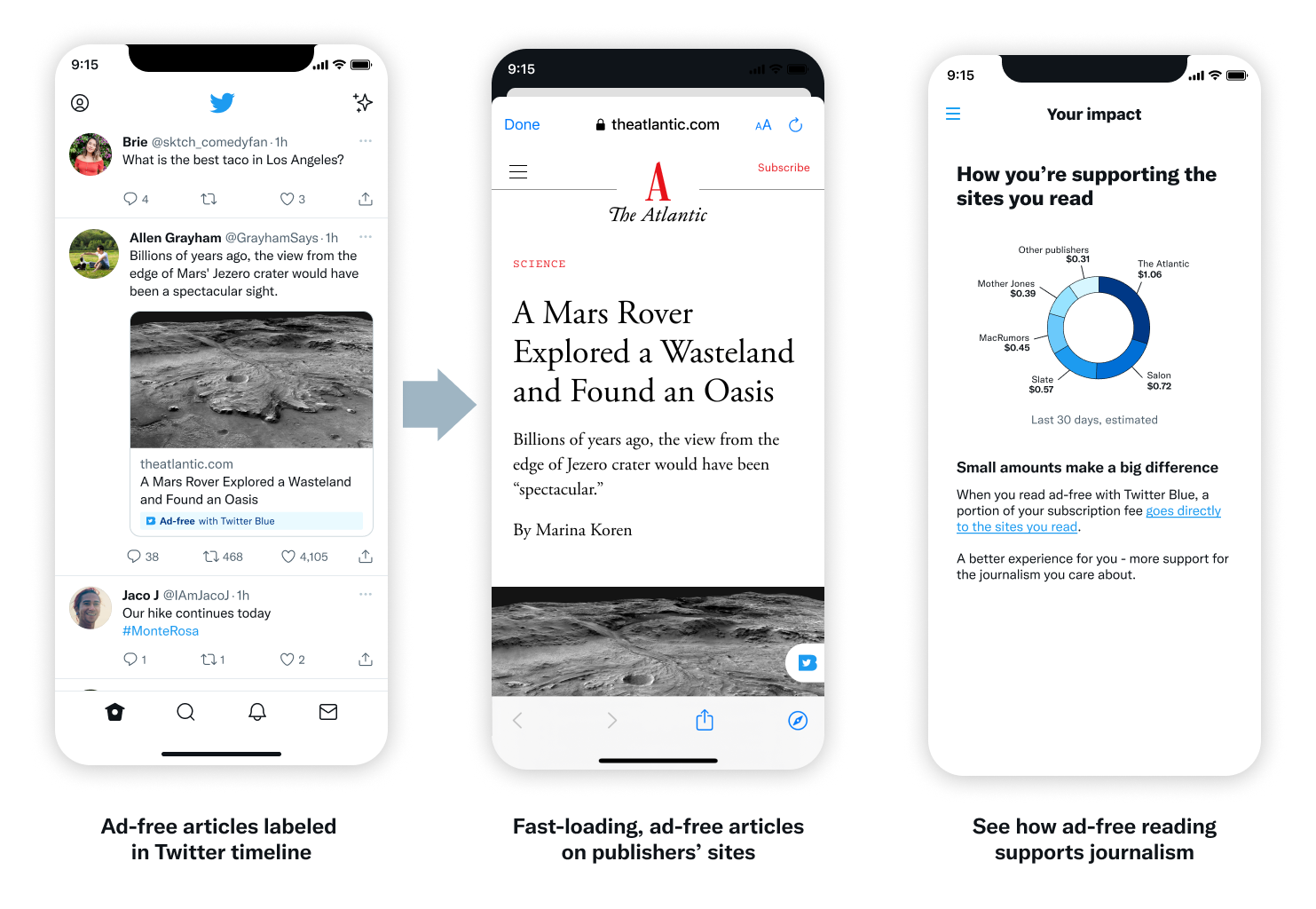
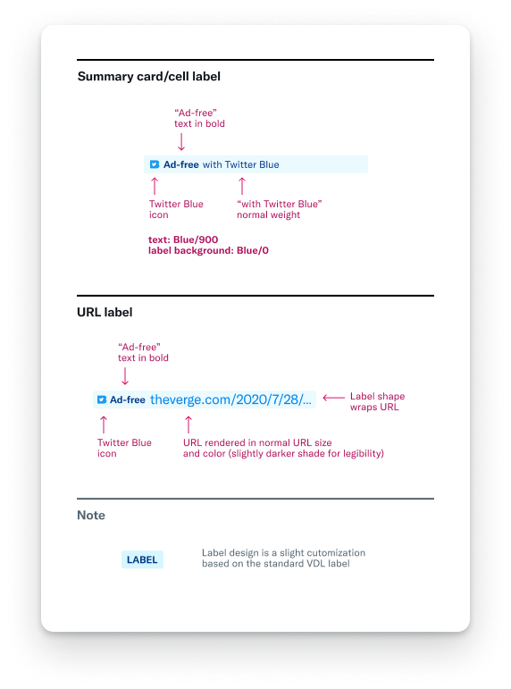
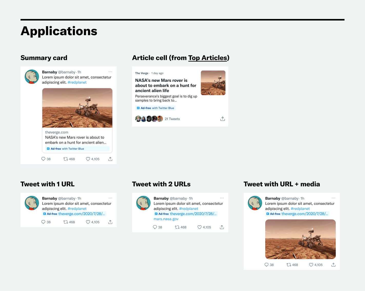
This involved designing a label system to identify ad-free links throughout Twitter. The goal for this label was to enable users to easily identify ad-free articles without being overly distracting.
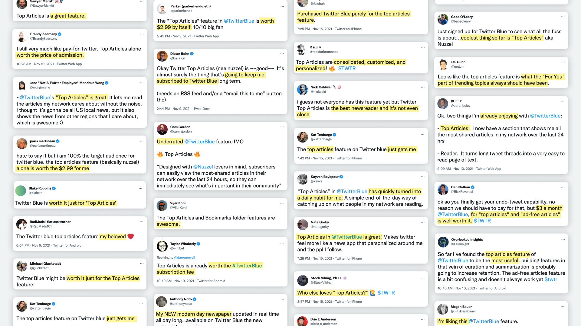
I also designed a brand new Twitter surface: Top Articles. Inspired by 🦔 Nuzzel, Top Articles aggregates the most-shared articles from the people you follow.
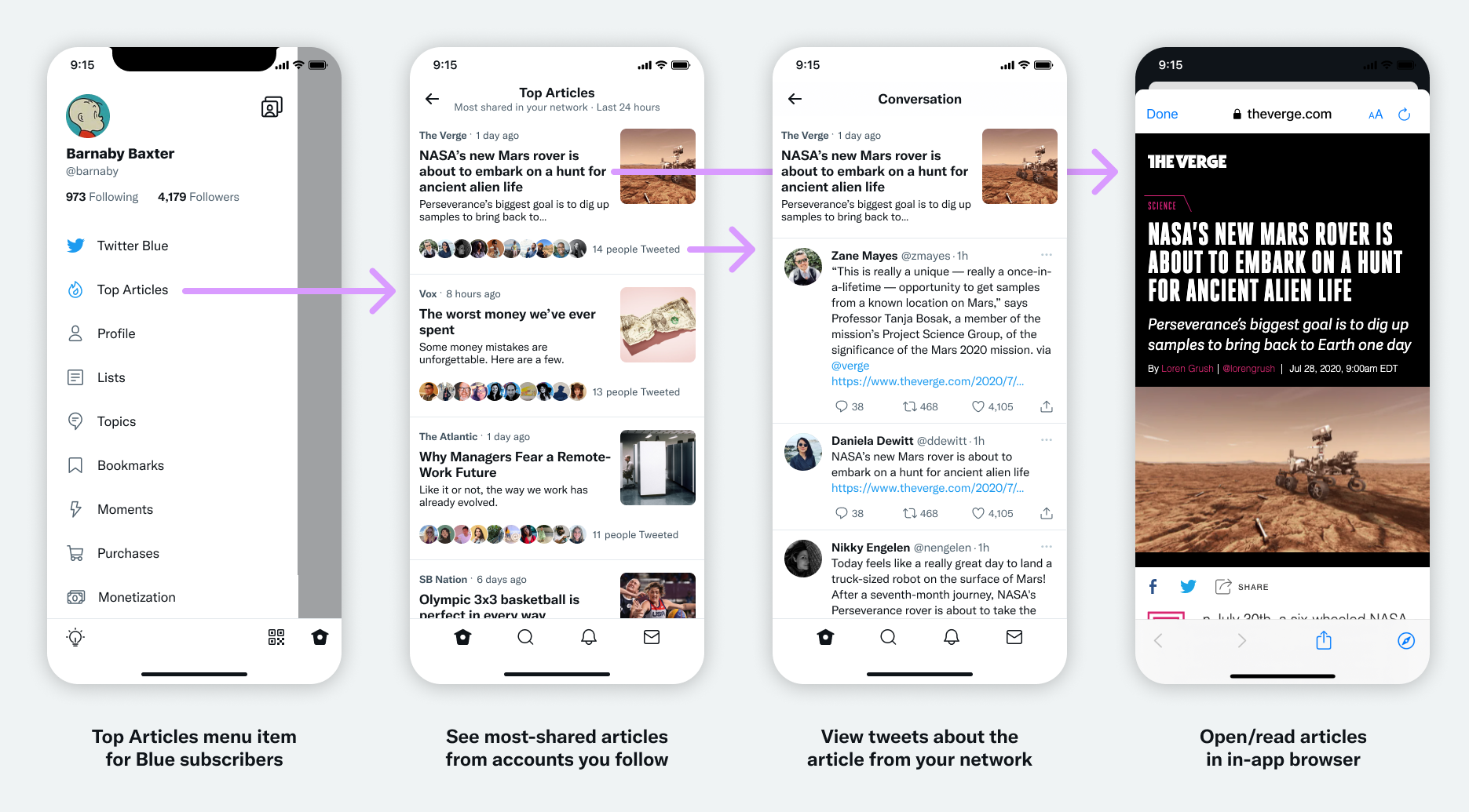
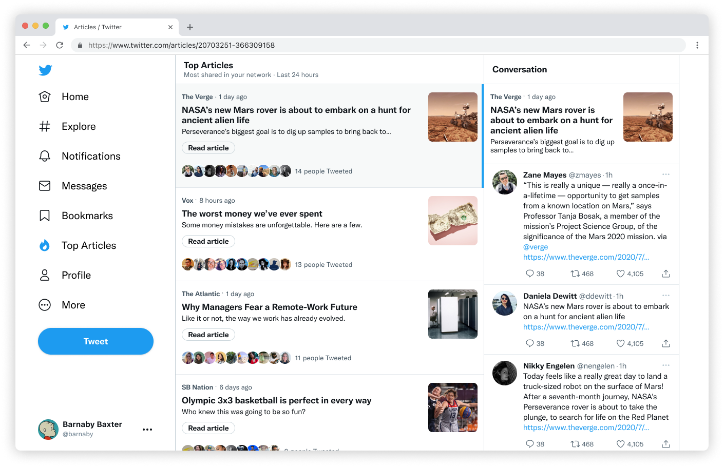
It was very well-received and generated a lot of buzz for Twitter Blue. This was gratifying, as a PM and I worked hard to have it included in the Blue subscription.
