Scroll → Twitter
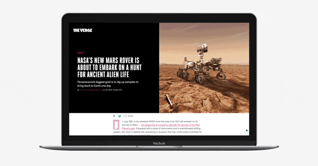
In the course of a year and a half, I helped Scroll go from public launch to acquisition by Twitter to shipping as a headline feature of Twitter Blue. Here’s the Scroll iOS app before acquisition:
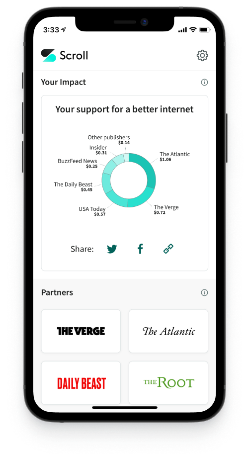
Scroll’s mission was to sustainably fund journalism while creating a better experience for readers. Readers could log in to Scroll, read ad-free, and feel good knowing that their reading funded the sites they read. At the same time, publishers received more money from Scroll than they would have from display ads.
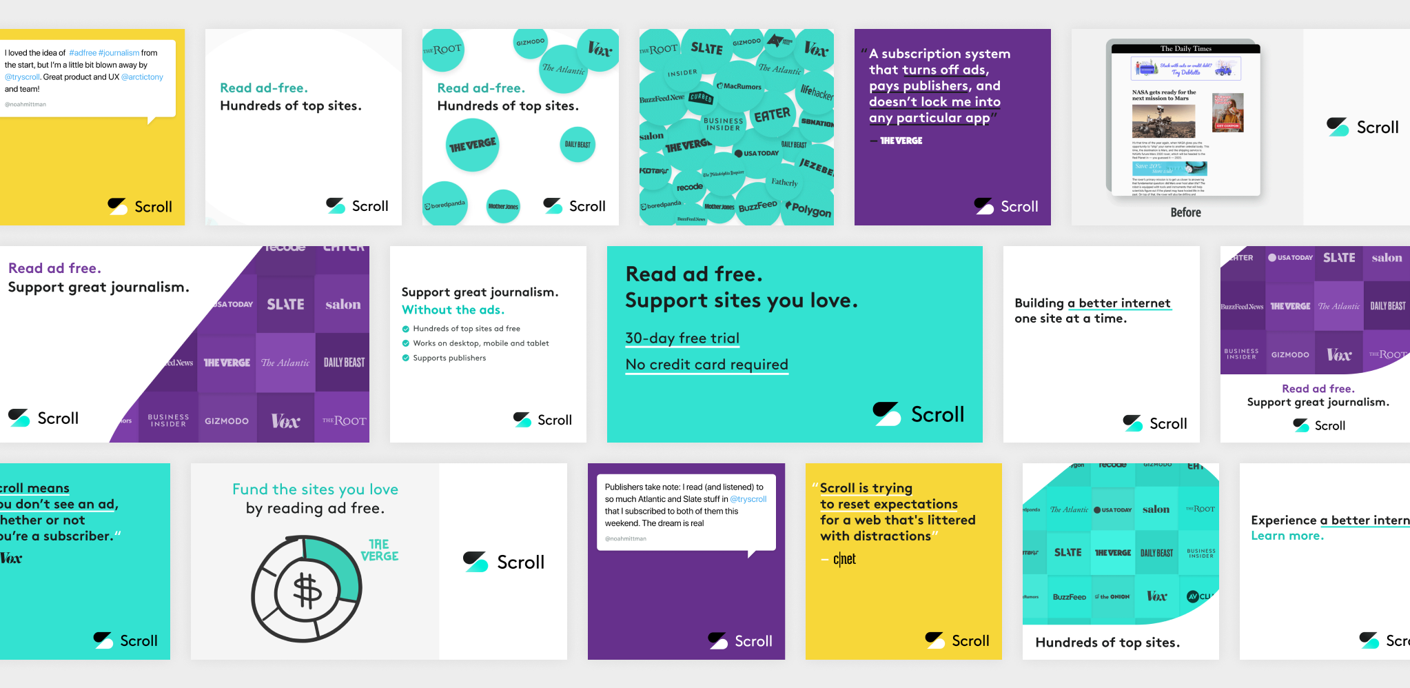
One challenge was explaining this new model to potential subscribers. Given Scroll was an ad-free reading service, it was ironic that I designed quite a few ads for user acquisition campaigns. Here’s a sampling:
When I joined as lead designer, I inherited a lot of design debt. It was March 2020. Scroll was about 15 people, and the product had just launched publicly. Their only designer had left months earlier, and they had been relying on contractors to fill the gap. No one was looking at the end-to-end experience.
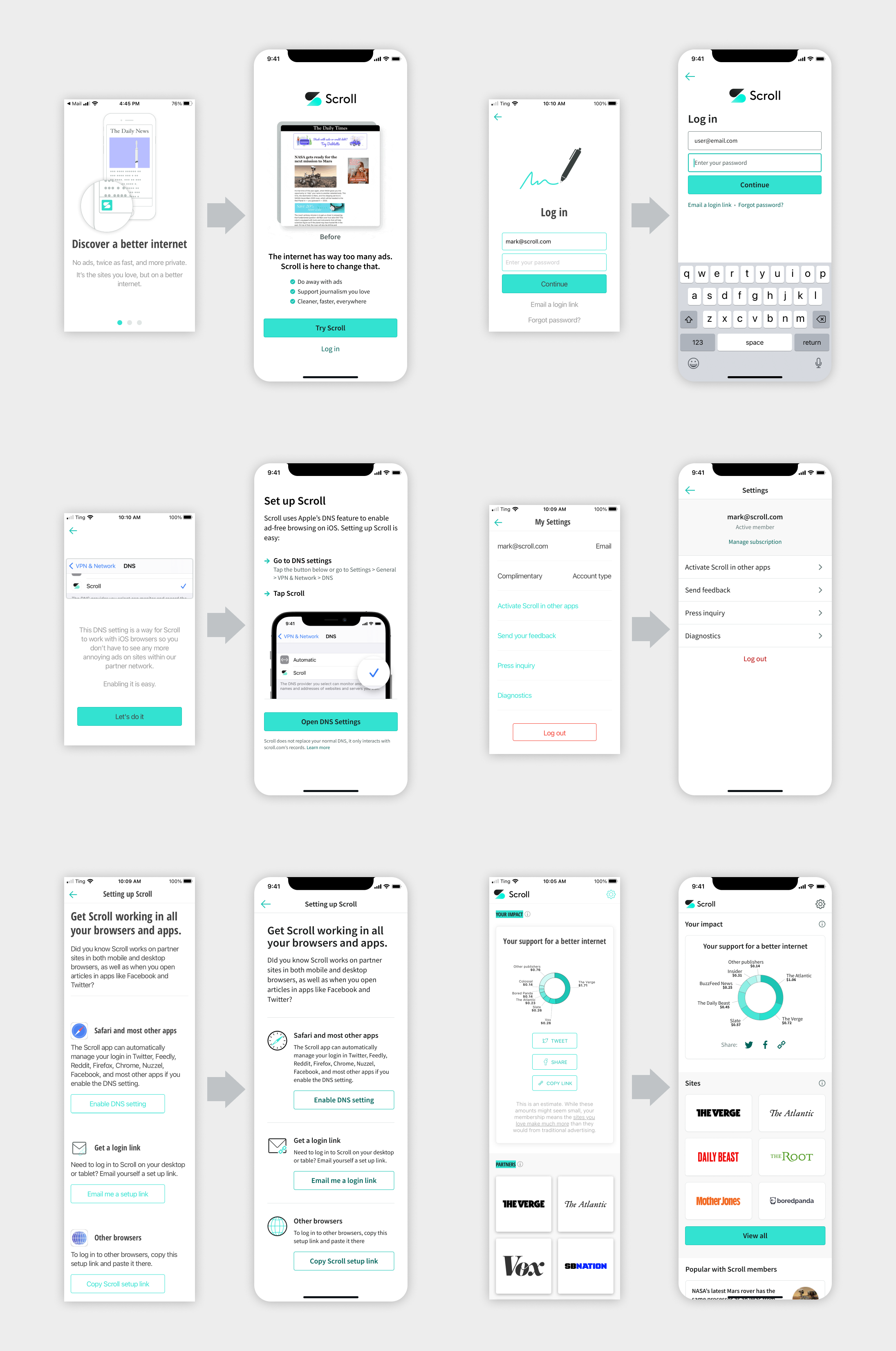
I began my work by auditing the user experience. It was deceptively complex, due to variations in user flows on different platforms. I created a large canvas to document each flow on each platform, making the actual user experience visible to everyone at the company.
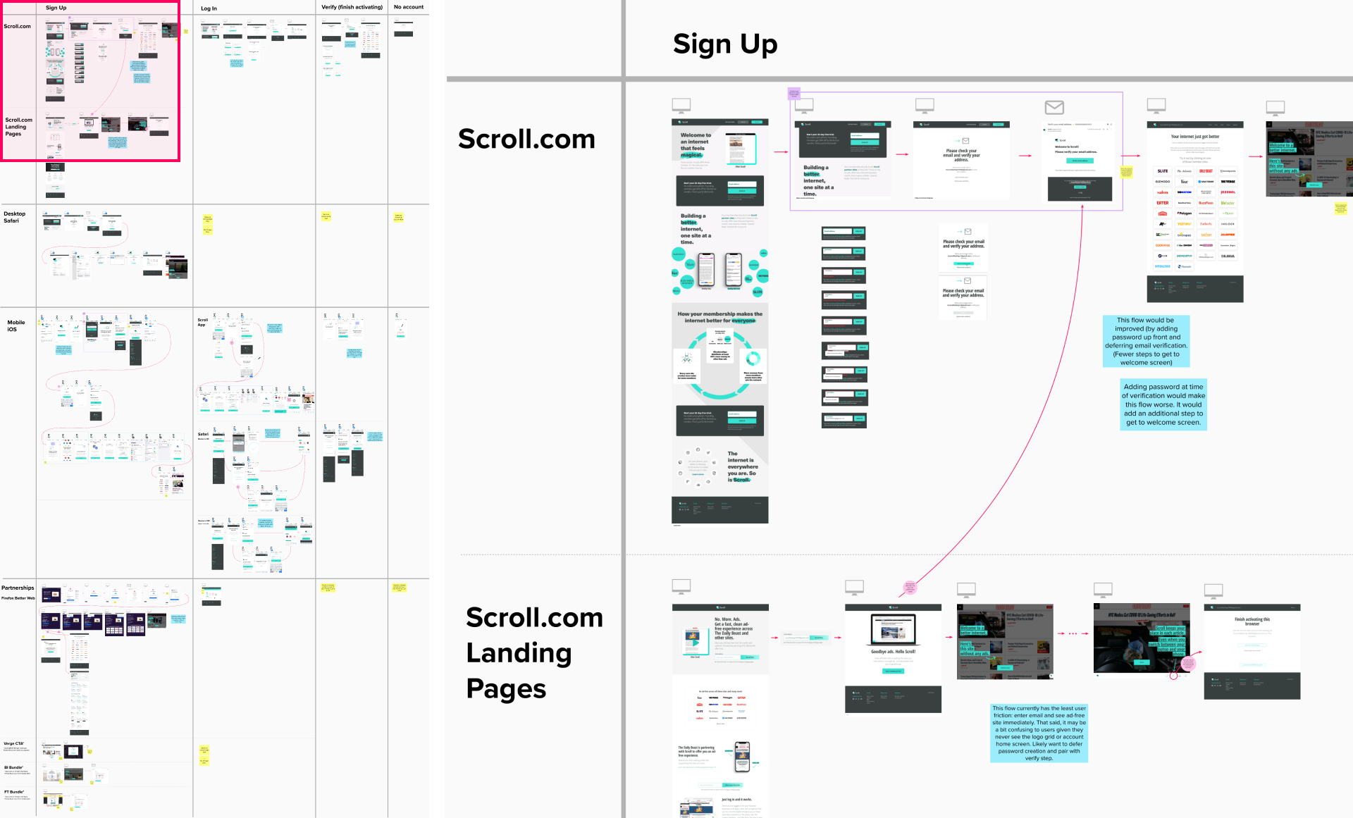
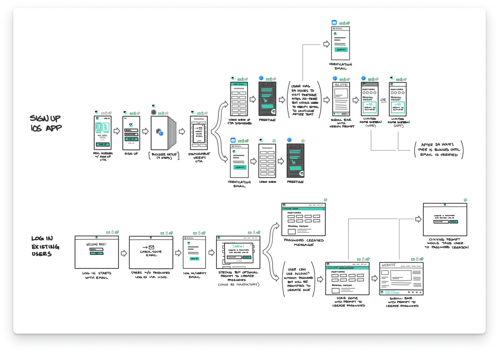
One problem identified in the audit was a fractured login experience. Due to changes in how browsers handled third-party cookies, Scroll members had to log in more frequently than initially expected, especially on iOS. This caused friction for users, as the only login option – magic links – required the user to navigate away from Scroll to their email. To make this easier, we added the option to log in with a password.
While the UI design was relatively straightforward, the user flows were complex. Visualizing the changes with sketches and prototypes helped get the whole team on the same page.
When the CEO wanted to focus the product team on user acquisition work, I led a remote design workshop to help generate ideas and align the team. We split the team into two groups, and I led each group through a series of exercises to generate a broad range of product ideas.
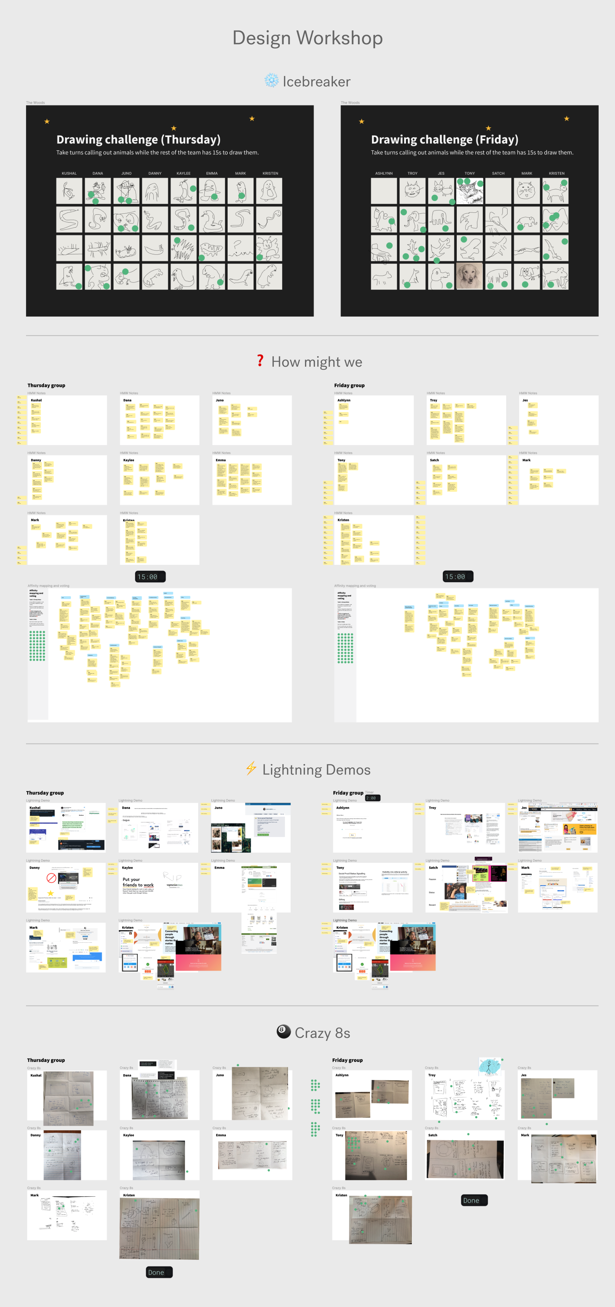
I synthesized and shared the output from the workshops, which informed the company’s product roadmap. As a result, everyone at the company was aligned on what work we were doing and why.
One of the many projects that resulted was adding a “Share ad-free” feature. It gave Scroll members the ability to share links to ad-free versions of articles with their friends. This allowed non-Scroll members to experience the benefits of the service before signing up.
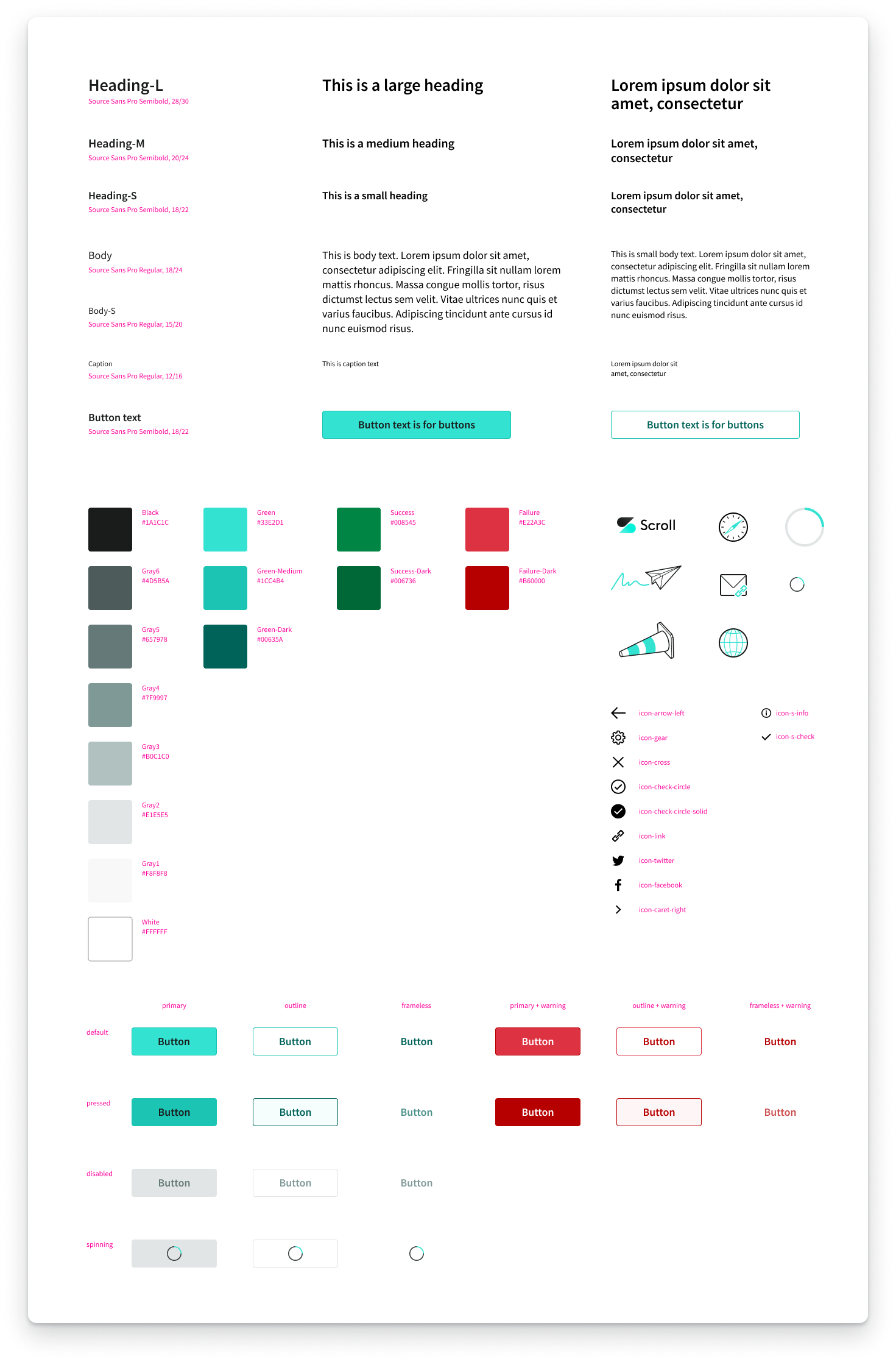
I also refreshed Scroll’s design system. The main design goals were to modernize the app’s look and feel, improve consistency, and fix issues such as low-contrast colors. The main technical goal was to reduce the number of elements to a minimum so we could remove cruft and have a solid foundation for future iterations.
Here are individual screens before and after the design system refresh:
In May 2021, Twitter acquired Scroll. The main focus became transitioning Scroll’s product into Twitter.

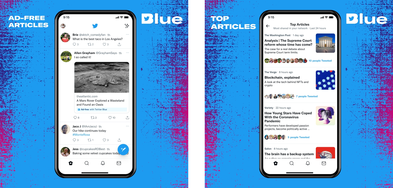
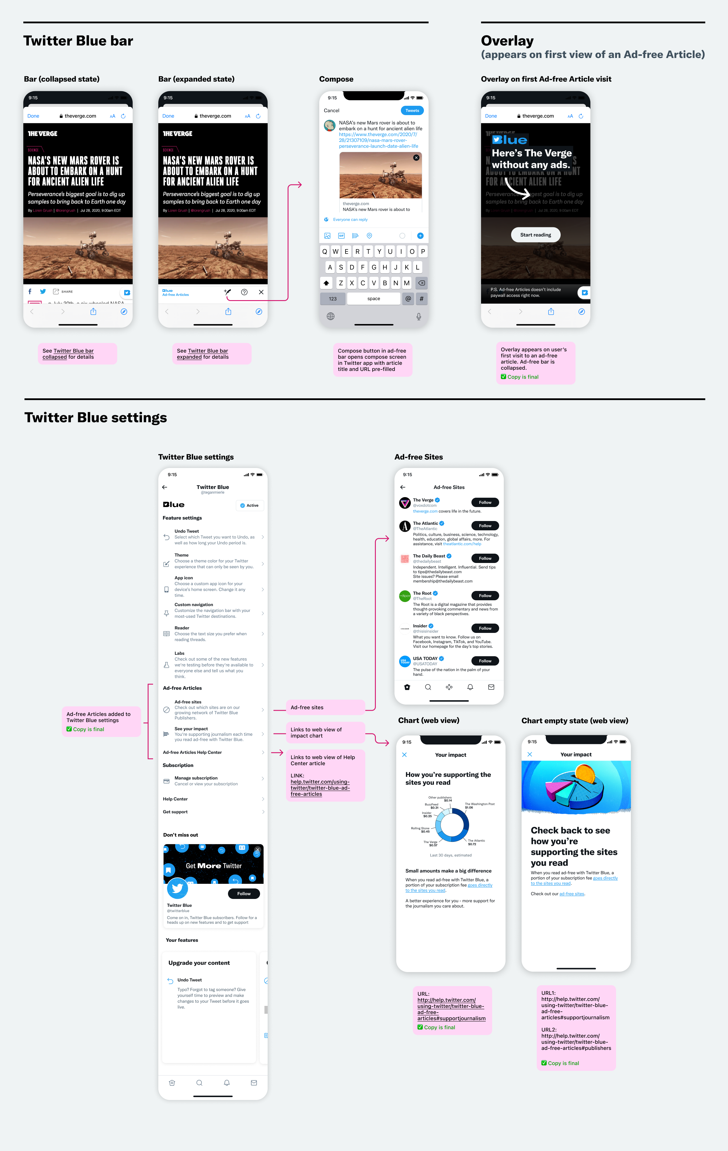
I transitioned the Scroll product into an experience that was seamless for Twitter users. Scroll became Ad-free Articles, a headline feature of Twitter Blue.
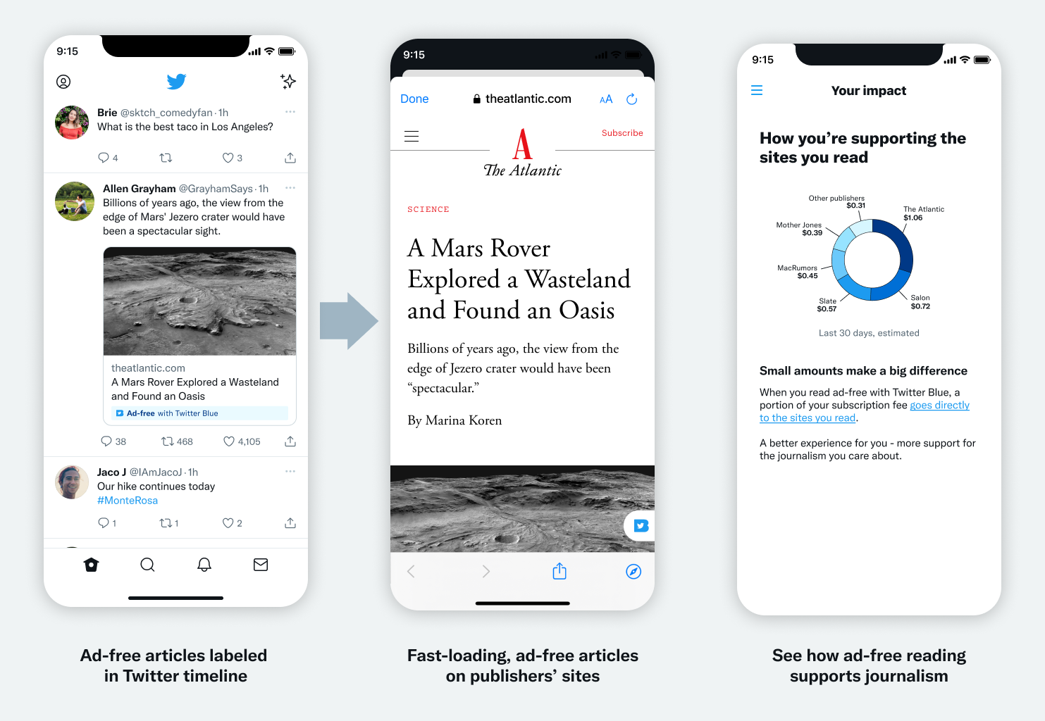
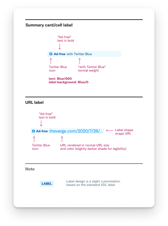
The main UI challenge was to create a visual indicator system that enabled users to identify Ad-free Articles across Twitter. To do this, I designed a label that would be visually consistent across different contexts, from summary cards to Tweet URLs.
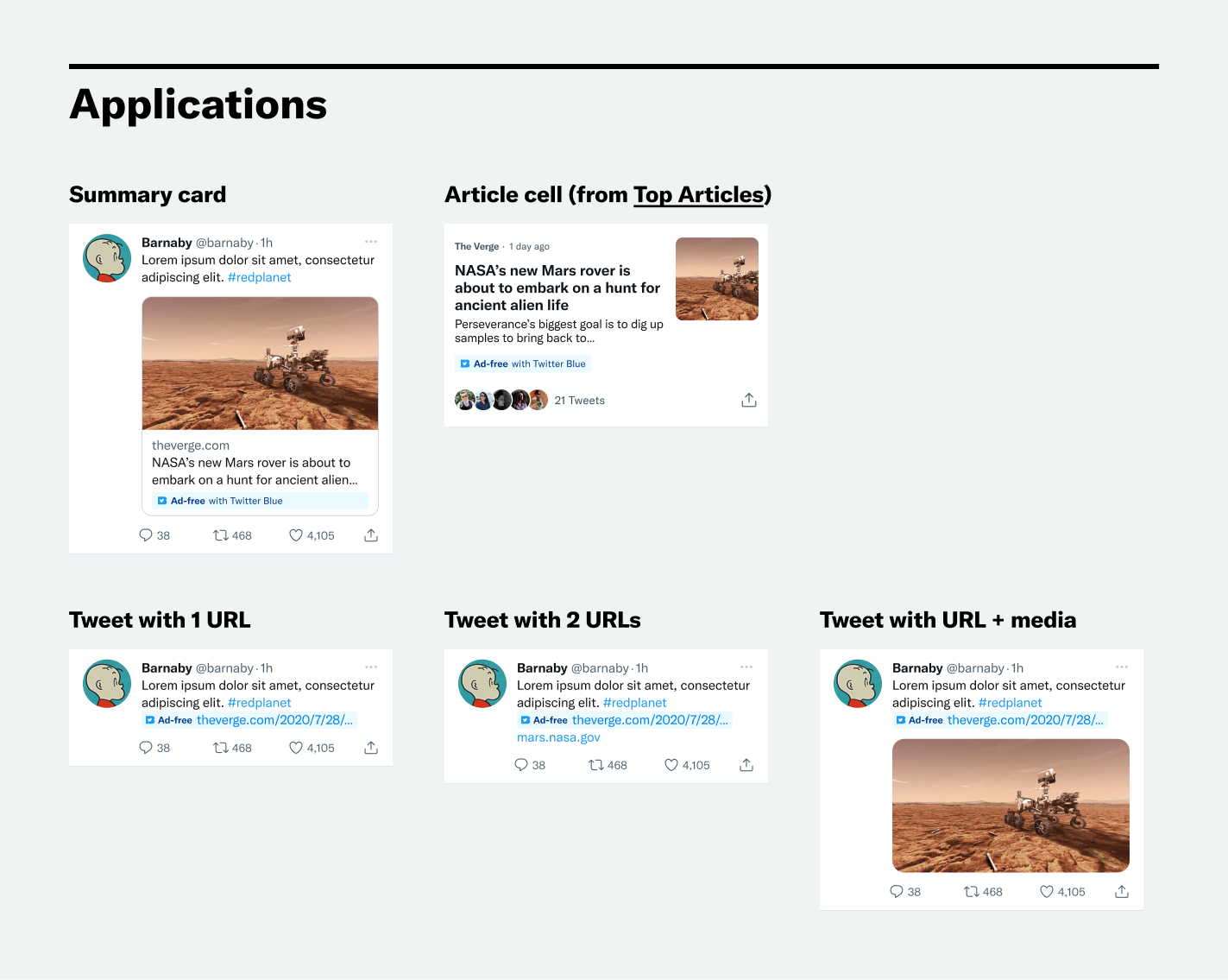
In addition to the label, the whole UX was considered. This involved how to seamlessly integrate the feature into the new Twitter Blue experience on all platforms.
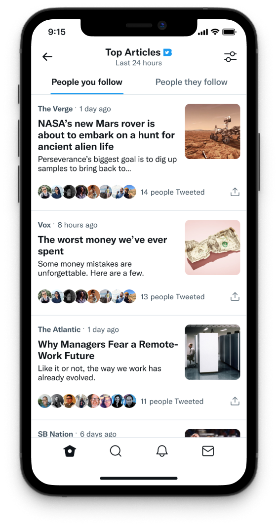
I also designed a brand new Twitter surface: Top Articles. Inspired by 🦔 Nuzzel, Top Articles aggregates the most-shared articles from the people you follow.
The challenge was to deliver a complete and lovable experience, despite tight engineering constraints. To do this, I worked closely with the PM to interview users and make sure we were building the right features.
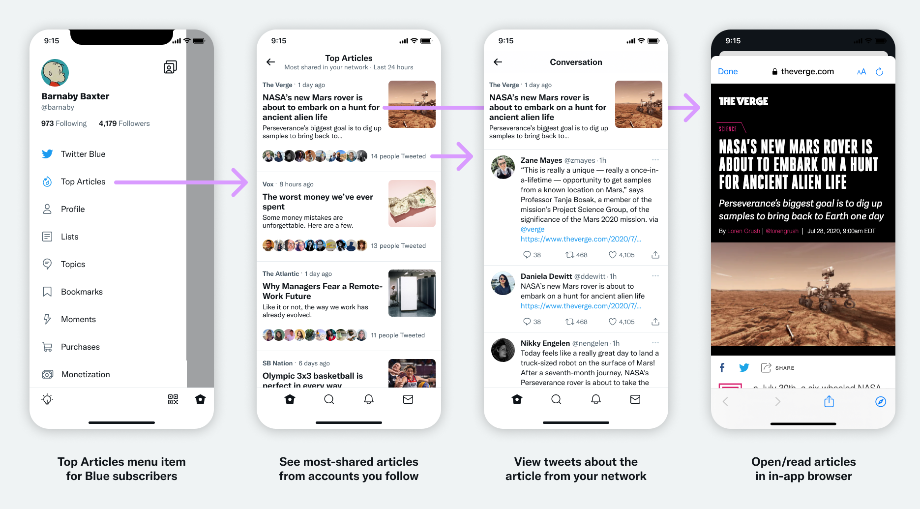
We designed with standard components and layouts to lower development costs. For the web, a layout pattern was reused from Messages, which helped save development time.
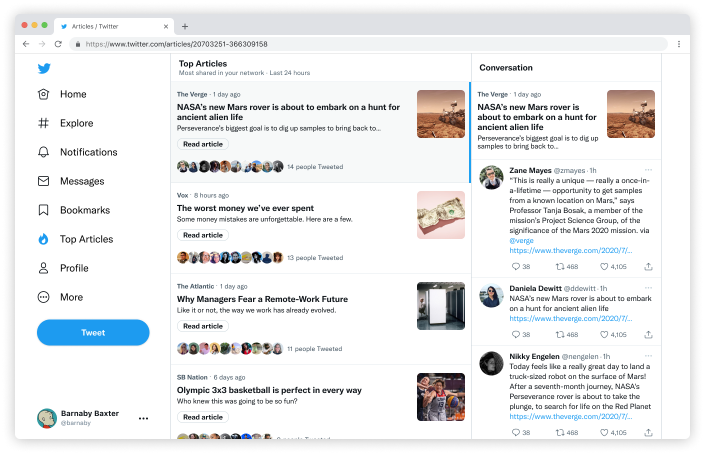
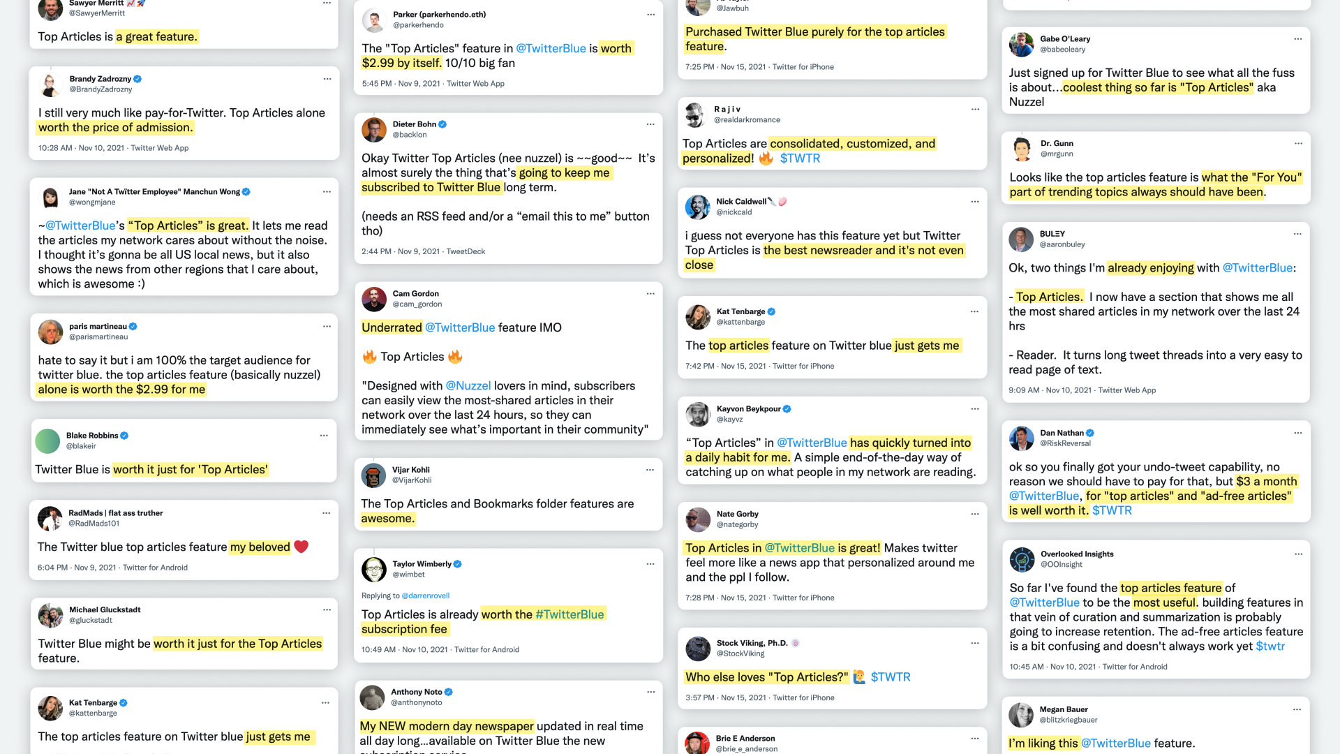
Despite the limited feature set, Top Articles was very well-received and generated a lot of buzz in the press and on social media. This was a signal that we had successfully chosen the right limited feature set to deliver a complete experience.
The impact of Ad-Free Articles and Top Articles was evident in the Twitter Blue launch announcement. Both were headline features, delivering significant value (and buzz) to Twitter’s new subscription offering.