At Twitter, I owned design for Ad-free Articles and Top Articles, two headline features of Twitter Blue’s launch. Both of these features originated from Scroll. Scroll became Ad-free Articles. Nuzzel (an app Scroll had acquired but never developed) became Top Articles. My role was shepherding this transition, ensuring seamless integration into Twitter’s UI/UX.
Ad-free Articles
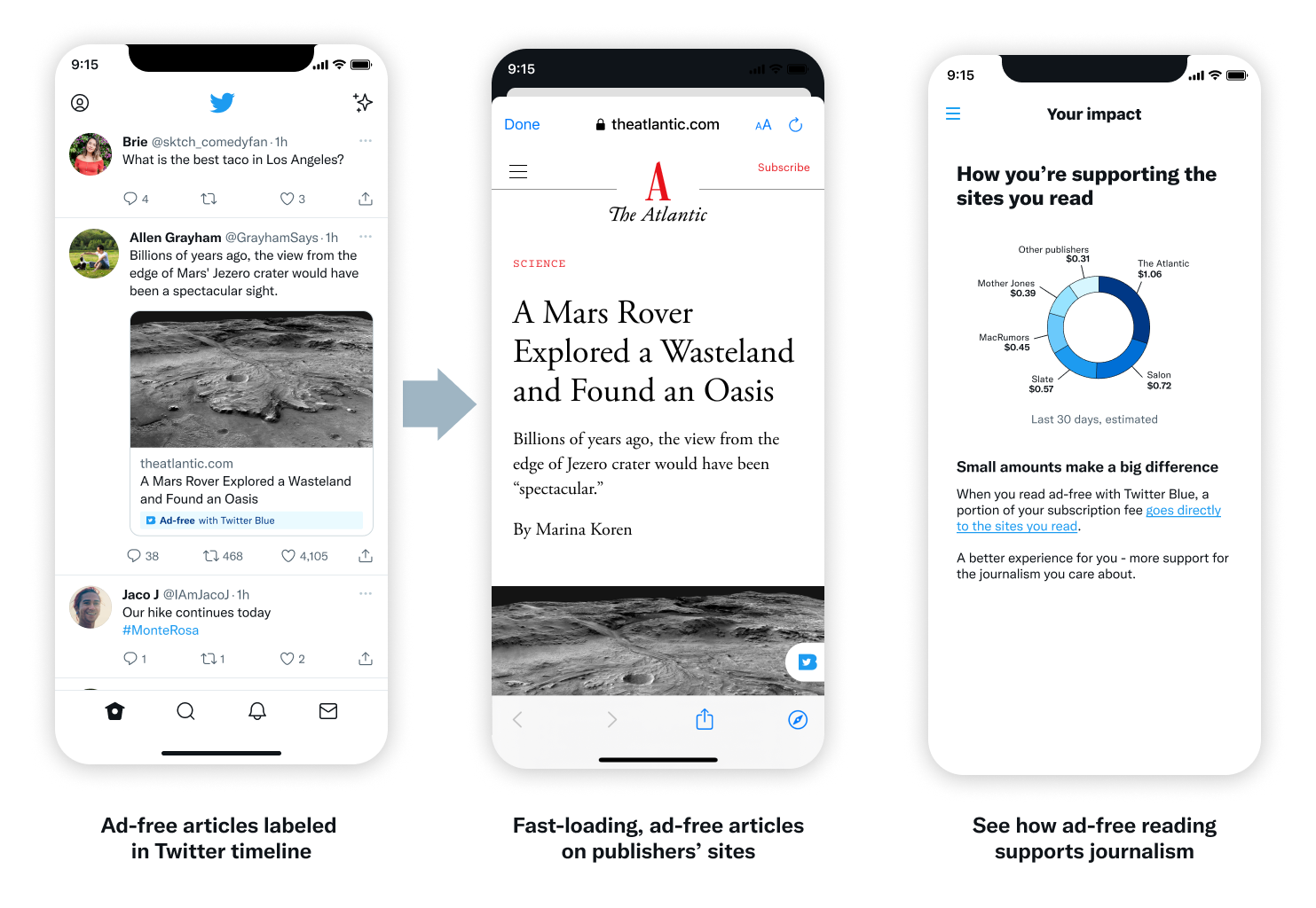
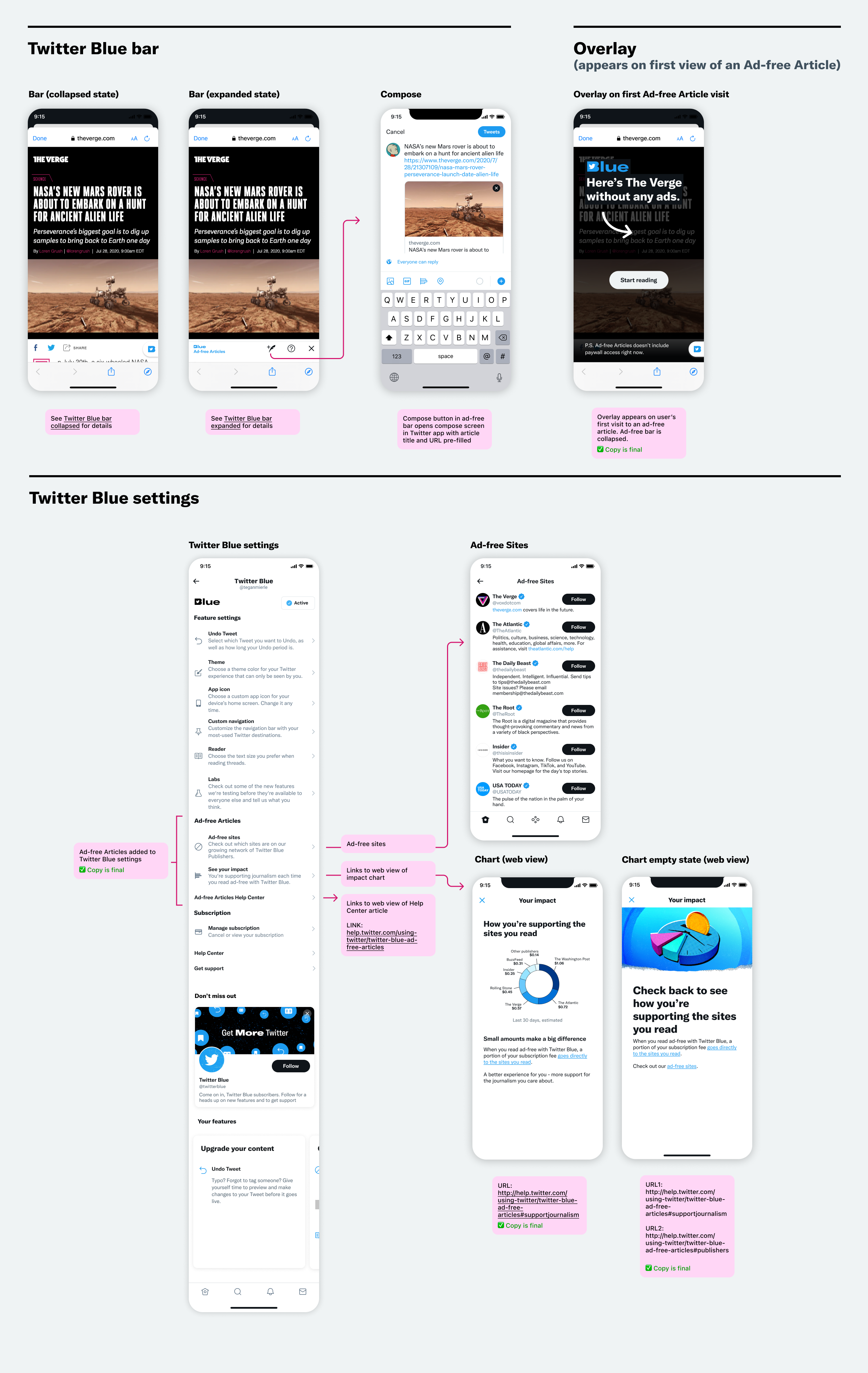
First, let’s look at Ad-free Articles. Instead of logging into Scroll, Blue users would now click on specially-labeled articles in the Twitter timeline to launch the ad-free experience.
Part of the work was explaining this new feature inside of Twitter. One way I did this was by explaining the product within the main Figma file. This helped build understanding and support as the work was shared.
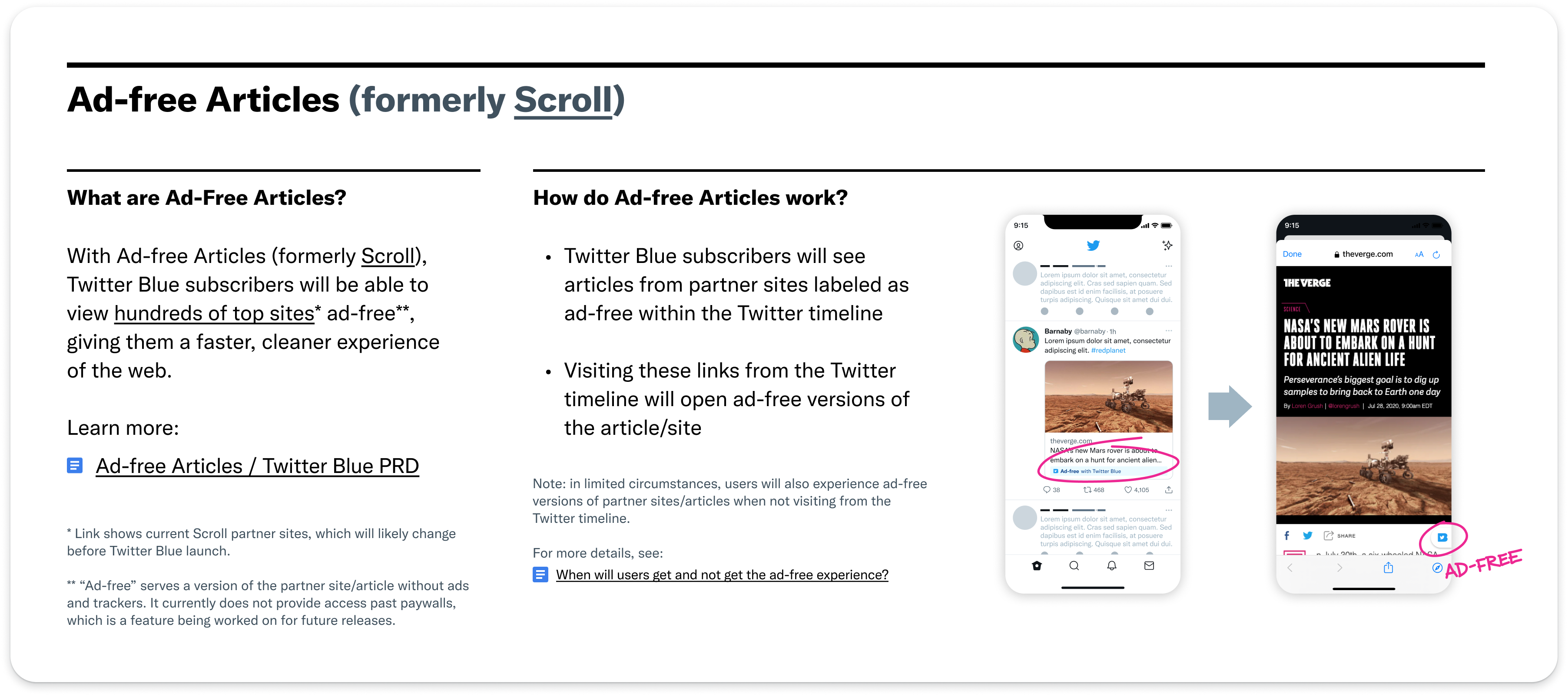
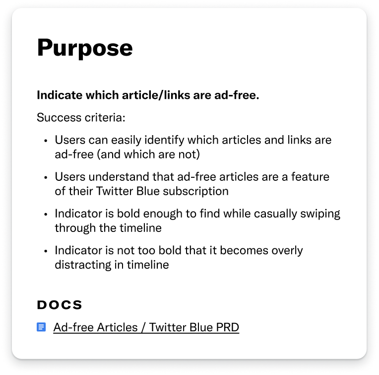
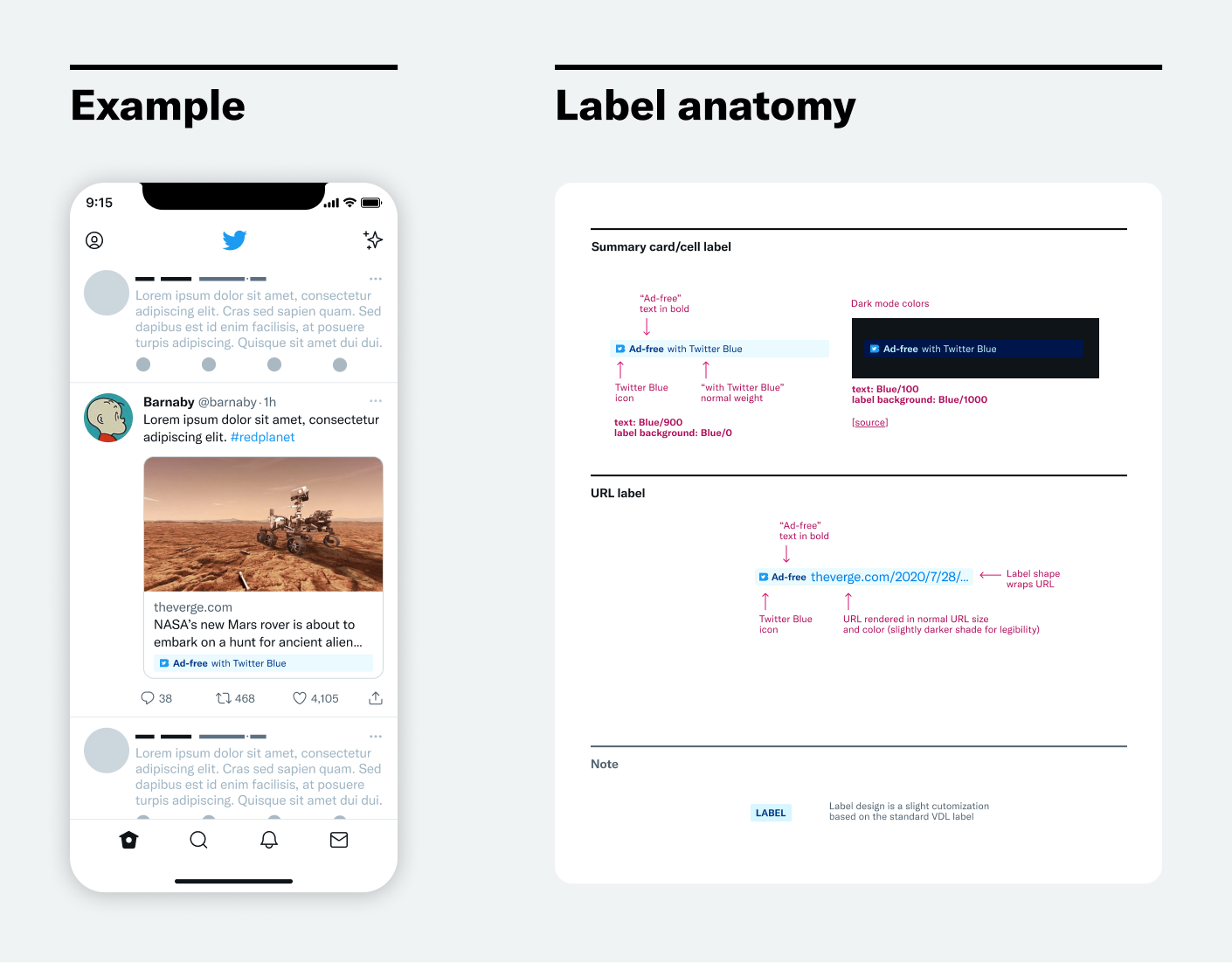
The main UI challenge was to create a labeling system to identify ad-free links. The goal for this label was to identify ad-free articles without being distracting.
To accomplish these goals, I designed a label based on Twitter’s standard label design. It was slightly altered and adapted so that it could work in multiple applications across Twitter, from summary cards to tweet URLs.
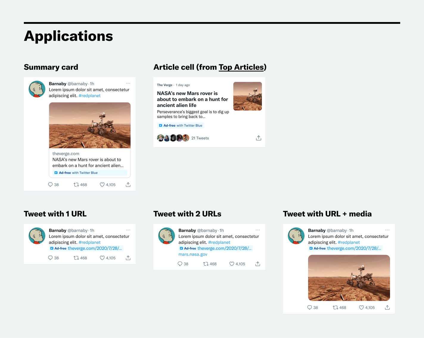
In addition to the label, the whole UX was considered. This involved how to seamlessly integrate the feature into the new Twitter Blue experience on all platforms.
Top Articles
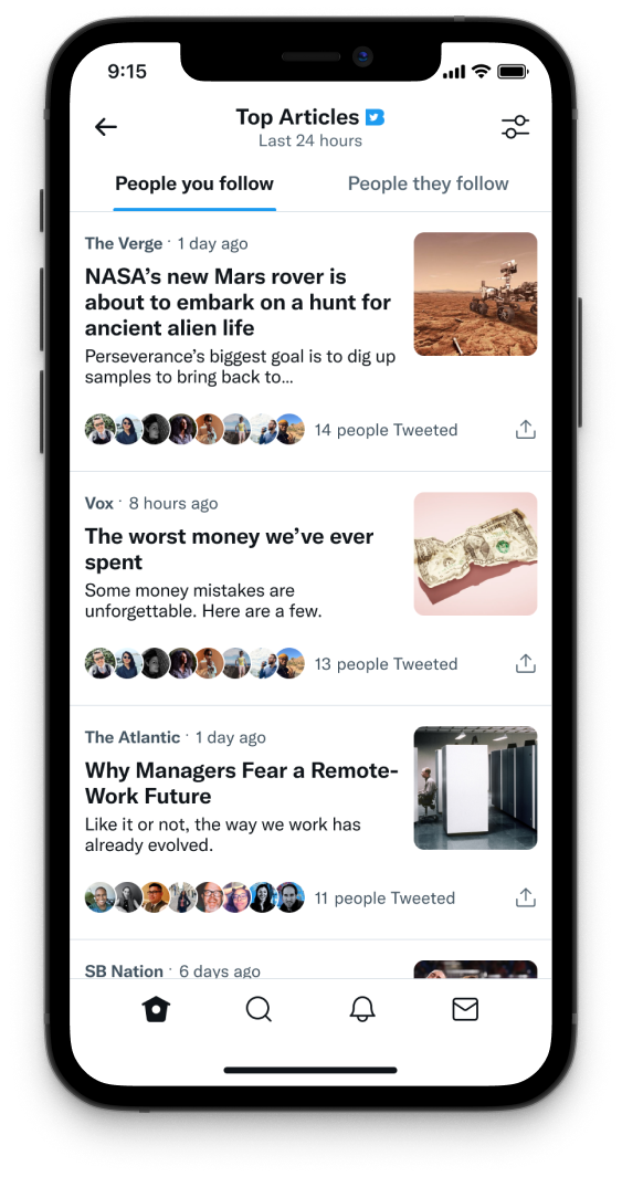
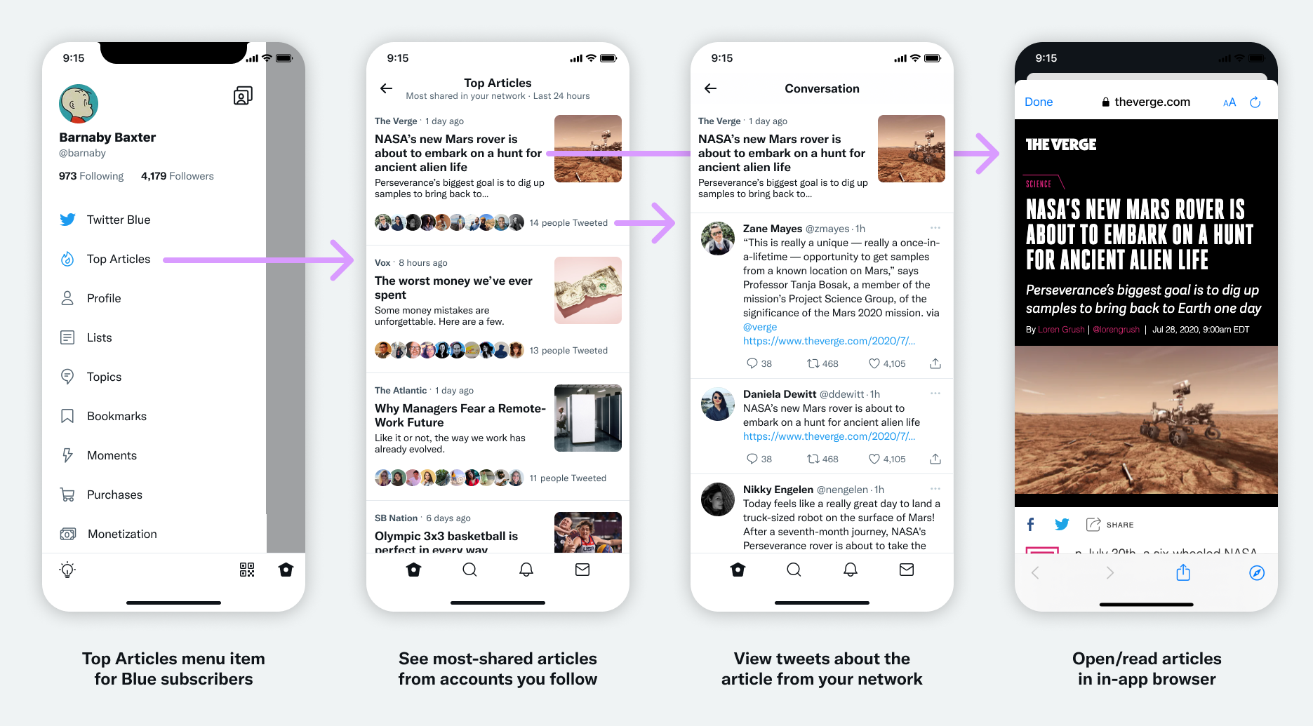
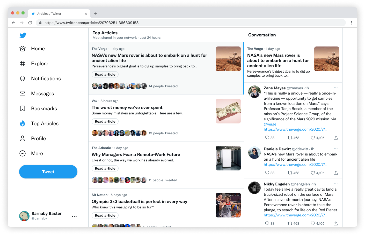
Next, let’s look at Top Articles. Inspired by 🦔 Nuzzel, Top Articles aggregates the most-shared articles from the people you follow.
I partnered closely with a PM to interview Nuzzel users about how they used the app. We used the insights from those conversations to set scope for the initial launch. Our goal was to deliver a complete experience, even though engineering constraints limited how many features we could build before launch.
By using standard components and layouts, we were able to deliver a complete experience on launch. Users were able to see a list of the most-shared articles from their network.
For the web, we reused a layout pattern from Messages, which helped save development time. We made it work by adjusting the width of the columns.
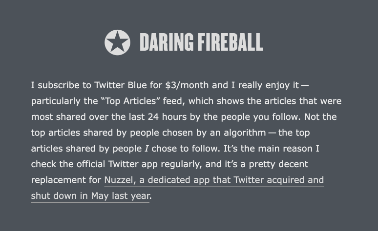
Despite the limited feature set, it was very well-received and generated a lot of buzz in the press and on social media. This was signal that our research had paid off, and we had chosen the right limited feature set for launch.
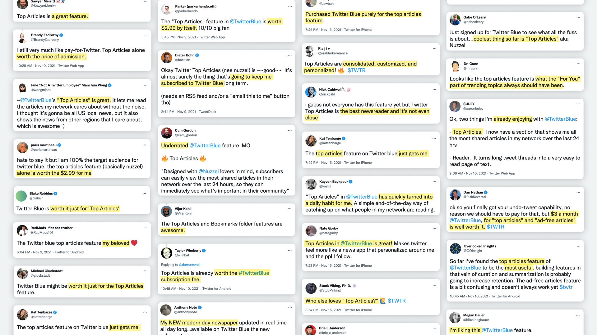
Particularly gratifying was seeing the reaction of journalists I follow. From our user interviews, we knew journalist and other news professionals were a big part of Nuzzel’s core user base. These users cared a lot about Nuzzel, and it made me feel good that we were able to ship a replacement that satisfied their core needs.
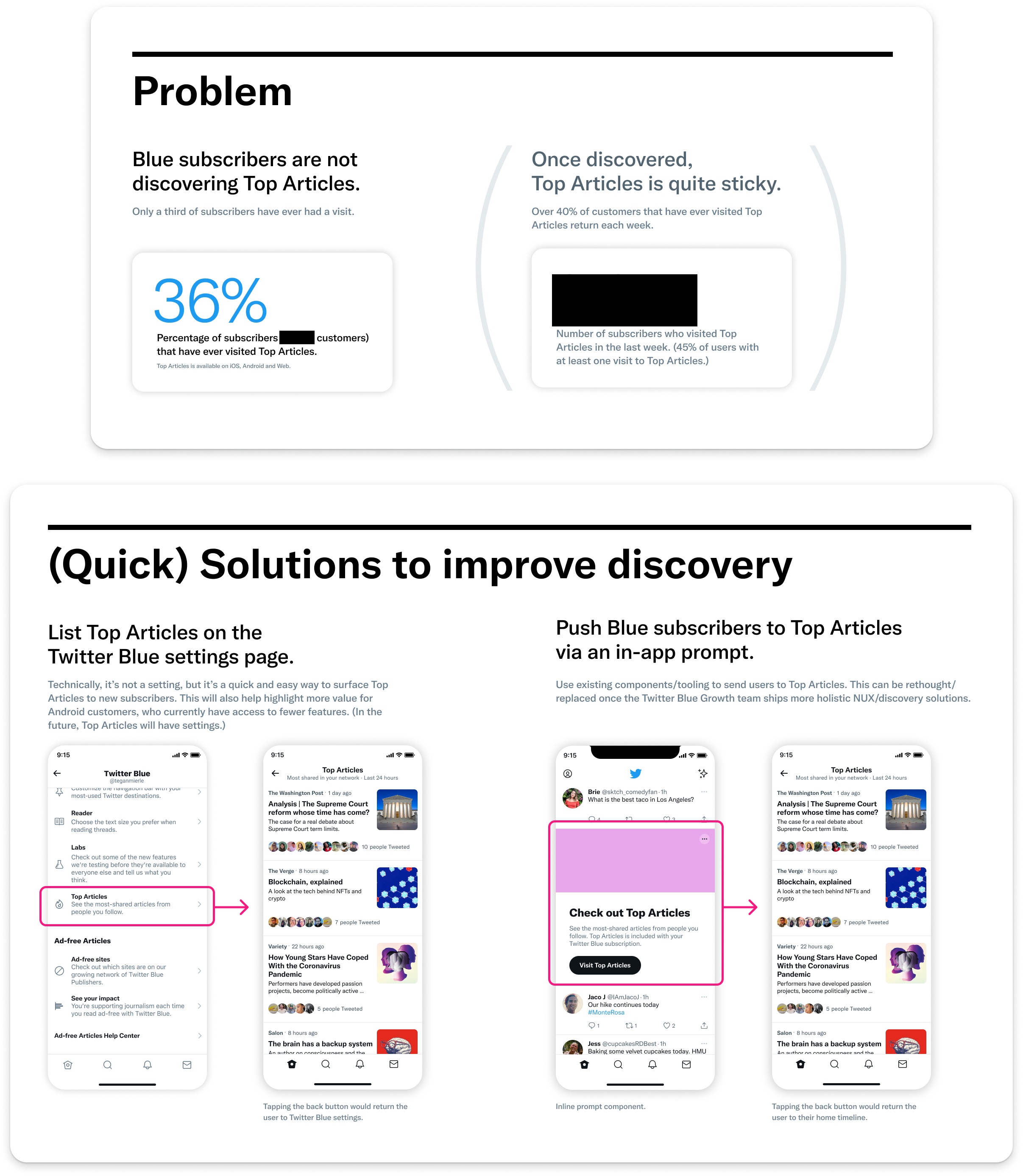
After launch, we iterated. To start, we did work to improve discovery of Top Articles.
We then did work to improve the experience. We knew that while we had shipped a complete experience, it was limited. We followed up with incremental releases that added new features.
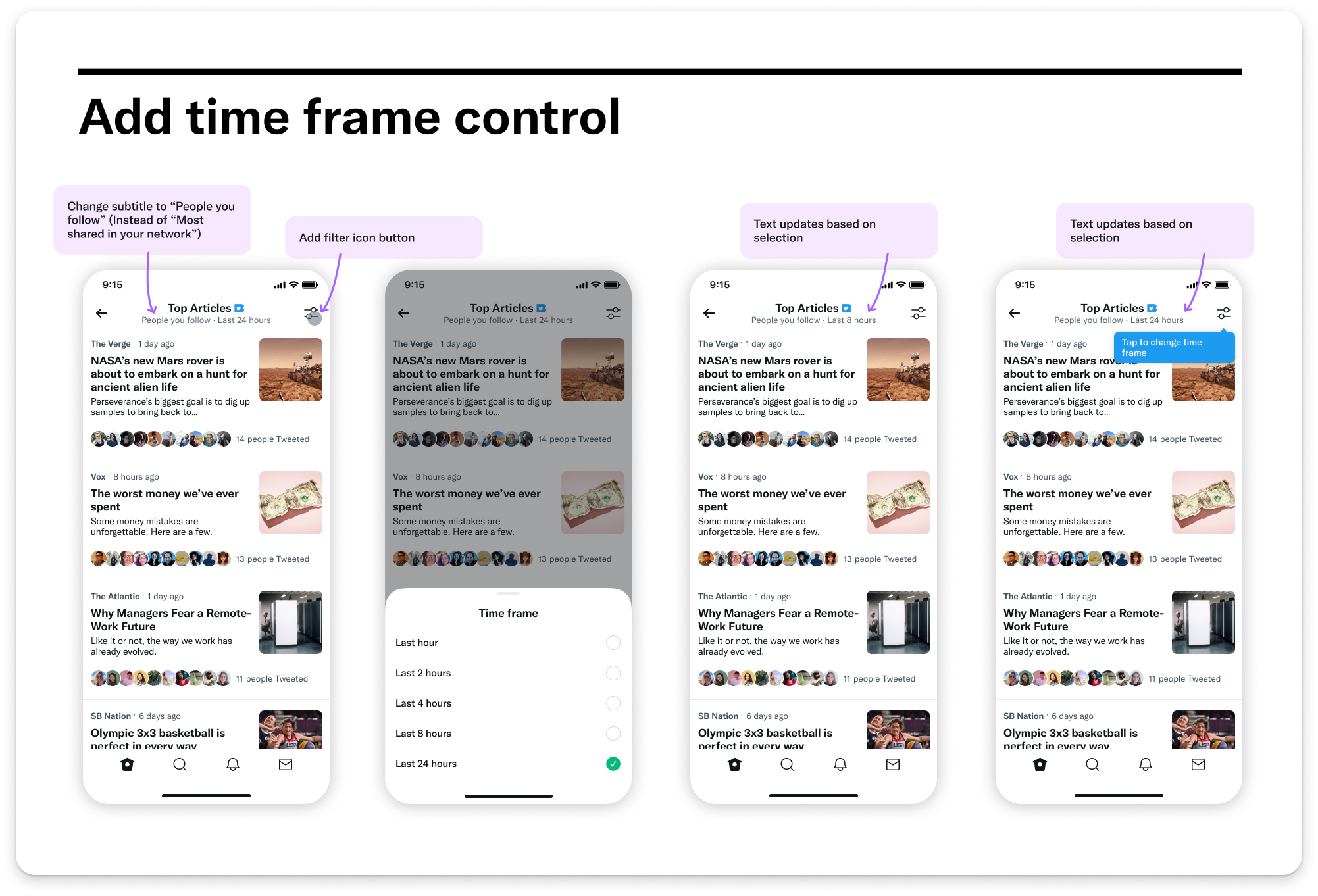
The first improvement we shipped was the ability to adjust the time period. This gave power users the ability to curate their Top Articles list by time periods shorter than 24 hours.
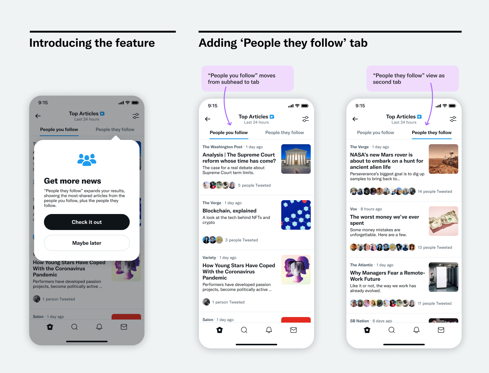
Then we shipped a feature called “People they follow.” It expands your results, by showing the most-shared articles from people you follow, plus the people they follow. This ensured people who didn’t follow a lot of accounts would have a good experience, while also making an interesting view for users who do follow many accounts.
Perhaps the most important quality of Top Articles is that it respects people’s attention. Because it is subscription-supported instead of ad-supported, we were able to ship a feature that helps people find what they want more efficiently and scroll less.