asimpleframe

Quoted: Jennifer Morla on Design Matters

During recent commutes to work, I’ve been listening my way through old episodes of Design Matters with Debbie Millman (iTunes / SoundCloud) – a podcast in which Debbie Millman interviews well-known designers. This past week, I listened to the Jennifer Morla episode from 2011. Jennifer Morla – President and Creative Director of Morla Design and recipient of the 2010 AIGA Medal – is full of design wisdom accumulated through years of experience. Below are some highlights from the episode that resonated strongly with me.

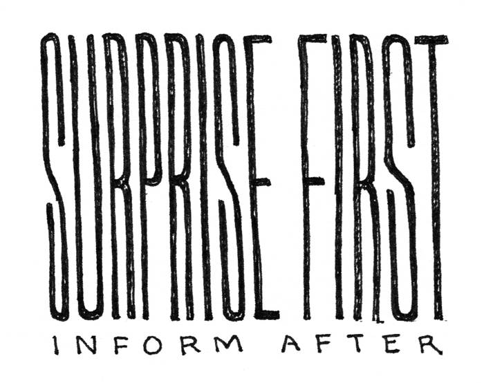
By surprising first and informing after. So, how you branch beyond your constituency is, really, doing an alternate view of what design is expected within that category. —19:30

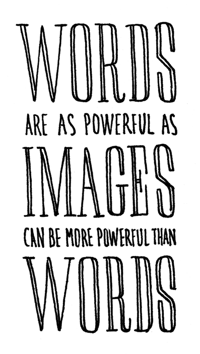
Oftentimes I say that words are as powerful as images, and images can be more powerful than words. Because I think that, especially young designers, they don’t realize how important words are, really, and how they can be the the actual structure to your piece or the concept to your piece. —20:26

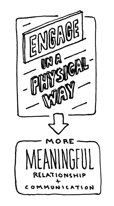
I think whenever you can engage the audience in actually a physical way, you will have more meaningful relationship and communication with them. —23:19

People love to be educated. They love to know things. I mean that want of knowledge certainly happened, let’s say, within the wine industry. … It’s that sort of education that brings value to the product itself. —26:32

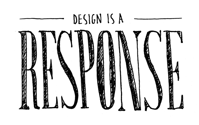
Art is very different than design beecause with design, there’s always two people involved. Somebody has to pose something to you and you are creating, somewhat, a response. It’s a response. I don’t even know whether it’s solving a problem. I like to say it’s more of a response to what’s being proposed. —31:06 

Tutorial: How to Create a Custom, Crisp Icon Font with IcoMoon App

By now, you’ve probably heard all about the great benefits of using icon fonts. You may have even used a service like Font Awesome or Symbolset to implement an icon font on your own site. But how do you go about creating an icon font from scratch using your own custom icons and ensure that they render crisply? This tutorial will answer just those questions – providing some fundamental background knowledge as well as the specific steps to create your own custom icon font.

Overview

The process for creating our custom icon font will involve two tools. First, we’ll use Adobe Illustrator to draw our custom, vector icons. Second, we’ll use the IcoMoon App (an online tool for creating icon fonts) to transform those vectors into the font files and css needed to implement our icon font on a website.

It should be noted that there are other ways to create custom icon fonts. You can manually create a font using a font editor like Glyphs combined with Font Squirrel’s Webfont Generator to create the needed web formats and code. You can use Font Custom if you prefer the command line. However, using IcoMoon App is by far the easiest, most powerful, and cheapest (it’s free!) way to create a custom icon font. This is especially true if you want your icons to render crisply – which brings us to the first step of creating our icon font.

Determine Your Crisp Size

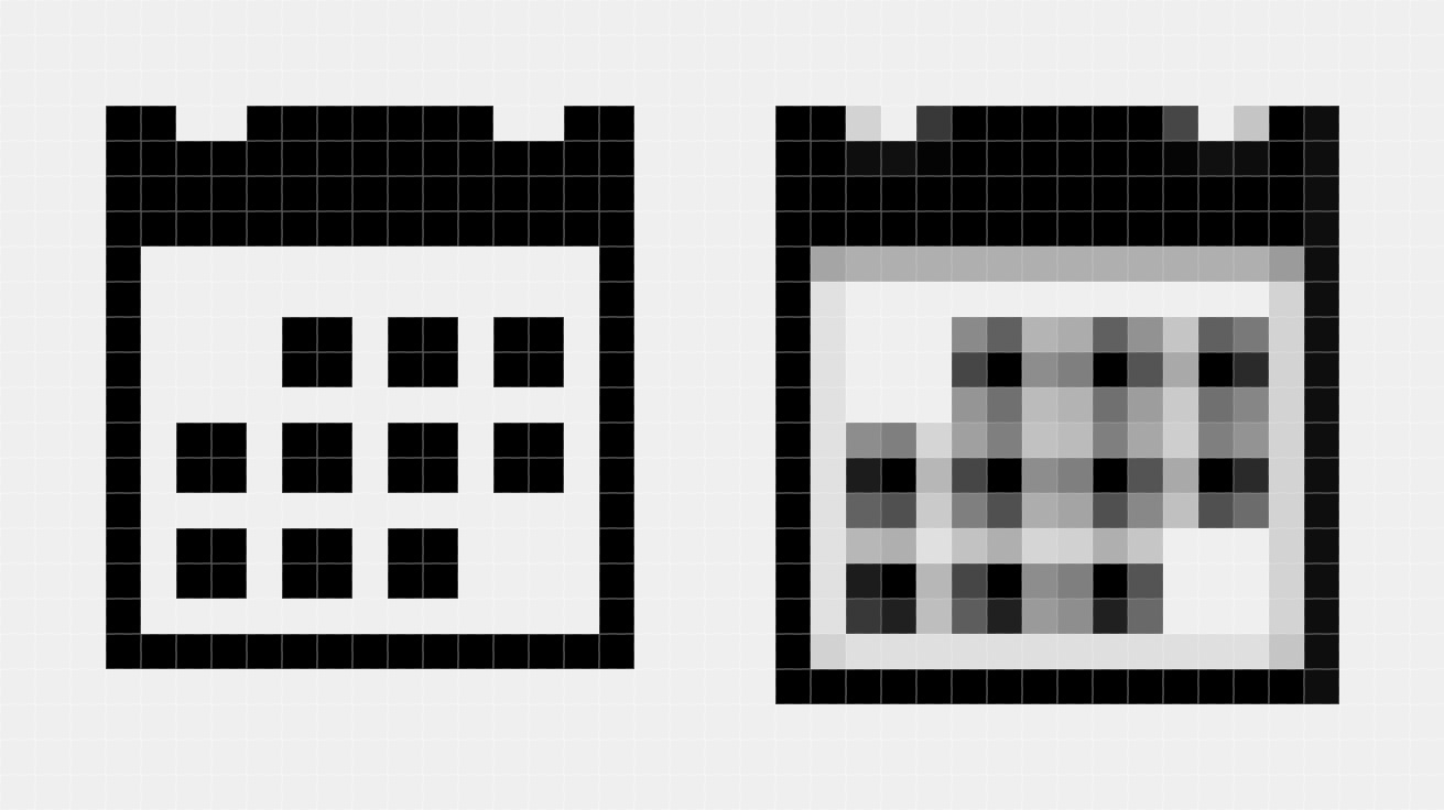
What does it mean for an icon to be crisp? Essentially, it means that the icon renders sharply when displayed at a small size. This is determined by how the vector outline of an icon aligns to the pixel grid of the screen when it’s displayed.1 In this case, a picture is worth a thousand words:

Keyamoon’s calendar icon looks crisp and fuzzy at different sizes

As you can see, the icon on the right appears fuzzy because its outlines don’t align to the pixel grid. The icon on the left, on the other hand, appears crisp and sharp as it aligns exactly to the grid.

Is it possible to ensure that the vector shapes of your icon font align to the pixel grid? The answer is yes, but only at one particular size and its multiples. IcoMoon terms this the “Crisp Size.” At 16px, the most common Crisp Size, the icons will appear crisply with a font size of 16px, 32px, 48px, etc.2

To determine the best Crisp Size for your icon font, consider the intended size and usage of your icons. For example, Font Awesome uses a Crisp Size of 14px so that the icons align well next to lines of 14px text (Bootstap’s default font size).

Draw Your Icons

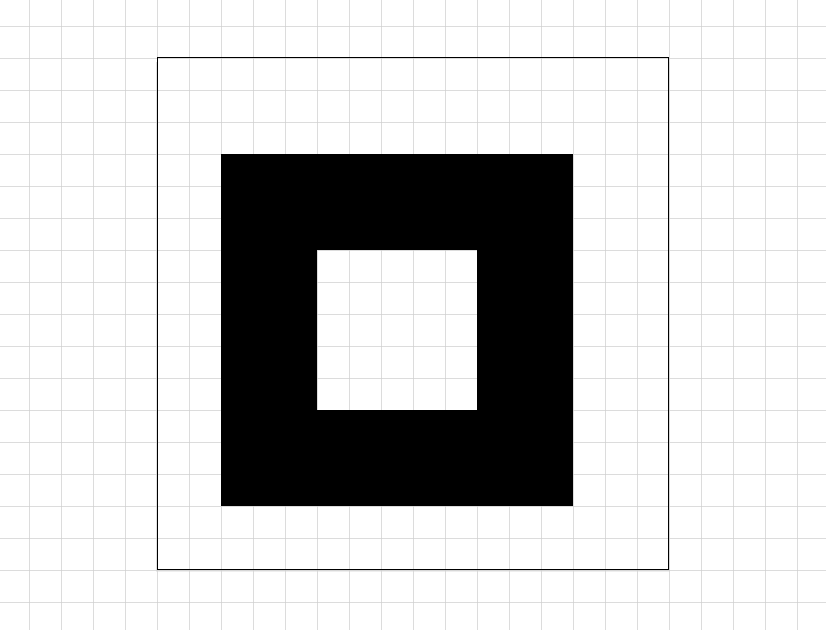
With your Crisp Size determined, the next step is to draw your vector icons in Illustrator. As an example, I’ll use the article end mark I created for A Simple Frame, which has a Crisp Size of 16px.

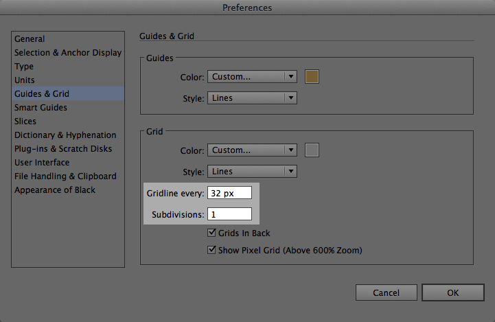
First, create a new artboard with a size of 512px × 512px (IcoMoon App’s default font em size).3 Next, set the document grid to represent pixels. To do this, divide the artboard dimensions by the Crisp Size. In this case, 512 ÷ 16 = 32. Enter this number in Preferences > Guides & Grid > Grid > Gridline every.

Setting up the grid in Illustrator

Also, set the grid subdivisions to 1.4 This will result in a document perfectly gridded to your Crisp Size.

Custom end mark icon drawn in Illustrator and aligned to the grid

Draw all your icons in this manner, and export them from Illustrator as svg files. Be aware that the name of your svg files will be used as the names of your icons once imported into IcoMoon App (though they can be edited and changed once imported).

Import Icons into IcoMoon App

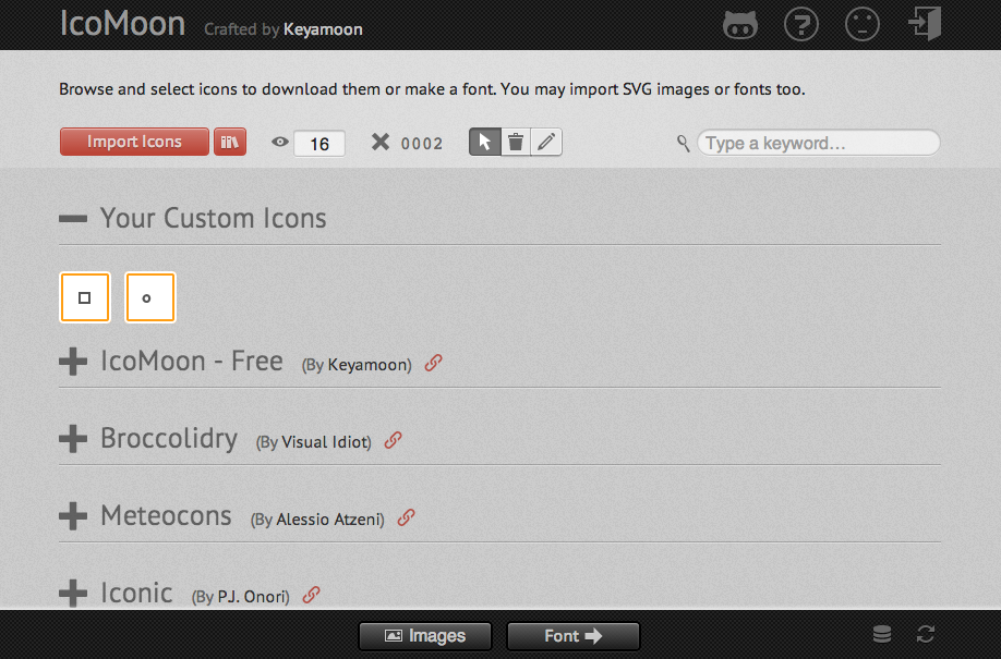
With svg files in hand, you’re ready to import your icons. Open IcoMoon App, click “Import Icons,” and select your svg files. Your icons will now appear under Your Custom Icons.

IcoMoon App with custom endmark and bullet icons selected

Note that you can change the preview size of your icons. Set this to the Crisp Size of your font to make sure your icons are drawn correctly and appear crisp. Also note that you can edit and delete icons using the respective tools in the menu bar. Edit can be a very helpful tool to nudge your icon a pixel or two within the square grid if a minor adjustment is needed.

Adjust Font Settings

Now it’s time to create a font from your imported icons. Using the select tool, click to select each icon you would like to include in your icon font. Next, click the Font button at the bottom of the page.

Preferences

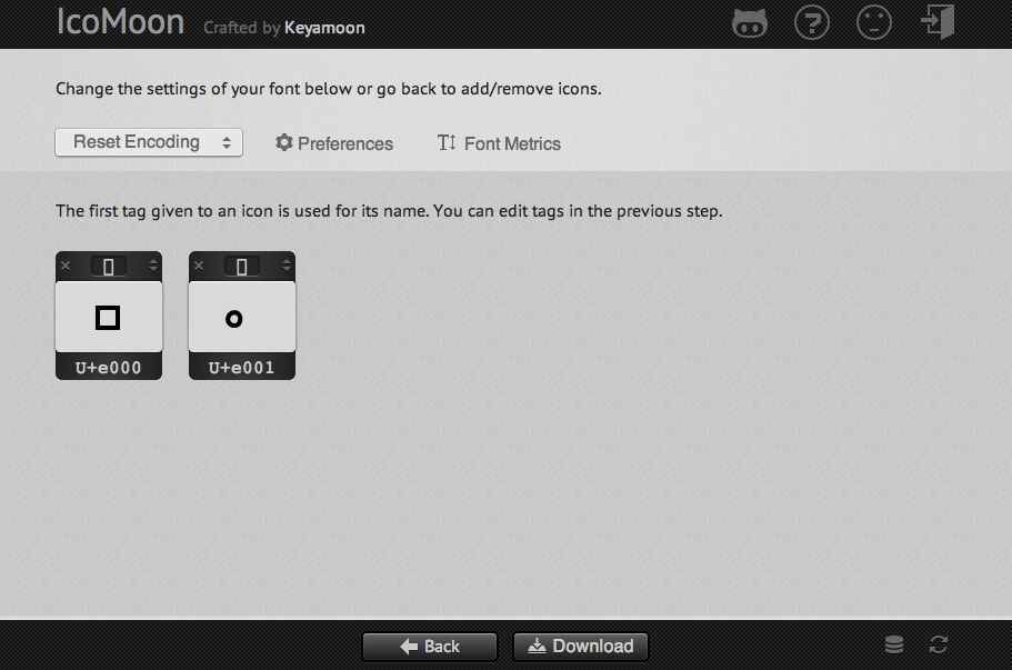
You should now see a preview of all the icons to be included in your font. As an example, we’ll use the icon font I created for A Simple Frame, which contains only two icons – the previously mentioned end mark and a custom bullet.

IcoMoon App’s font creation screen

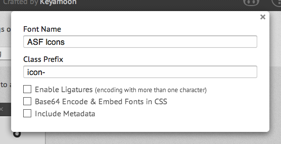
The first order of business is to adjust the settings for your font. Click the Preferences button to name your font and set a class prefix.

IcoMoon App’s Preferences menu

The class prefix refers to the css class names that will be generated. By default, it will use the name of your svg file (which imports into IcoMoon App as a tag) prepended with “icon-“. You can also edit the font metadata if you wish.

Font Metrics

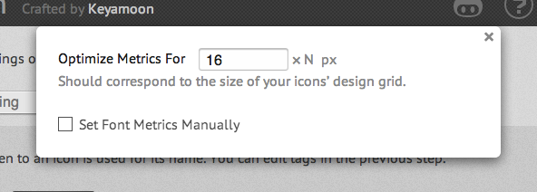
Next, click the Font Metrics button and input your Crisp Size in the “Optimize Metrics For” field.

IcoMoon App’s Font Metrics menu

This is very important. If it is not set correctly, your icons will not appear crisp at your Crisp Size. IcoMoon App also allows you to set Font Metrics manually. Though that is beyond the scope of this tutorial, this is a very powerful feature. It allows you to tweak parameters like the relative height of the baseline, which can be helpful in ensuring your icons align to baseline of your text.

Set Unicode Values for Each Glyph

Each glyph of your icon font will now need to be assigned a Unicode value. Although it can get a bit technical, it’s important to have a basic understanding of Unicode to ensure you set up your icon font correctly.

About Unicode Values

Unicode is a map of code points that correspond to characters used in alphabets. For example, the Unicode for a lowercase “a” is “u+0061.” Every font assigns this same Unicode value for its lowercase “a” character. That way, when you press the lowercase “a” key on a keyboard (no matter what font you’re using), a lowercase “a” appears on your screen.

The Importance of Setting Correct Unicode Values

Since icon fonts consist of symbols, it’s important that these symbols aren’t assigned Unicode values reserved for letters. As Chris Coyier points out on CSS-Tricks:

the letters become “content” and a part of the semantics of the document. Or worse, read outloud by screen readers.

Essentially, you want to avoid using Unicode values for letters, because your icons are not letters, and you don’t want them to be read in your html as such. Fortunately, there are Unicode values reserved for commonly used symbols as well as custom symbols. All that’s left now is choosing the right ones.

How to Choose Correct Unicode Values

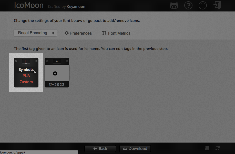
If your icon maps to a commonly-used symbol that already has a Unicode value, it’s best to map it there. IcoMoon App makes this easy to do. To see if you can find a Unicode match for your icon, click the menu arrows on your glyph and select “Symbols” from the list.

Opening the symbols menu

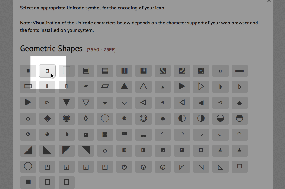
This opens up a grid of Unicode symbols. Find the one that matches your icon, and select it. For example, I found a match for my end mark symbol under “Geometric Shapes”.

Try to match your icons to appropriate Unicode symbols

If you can’t find a match for your icon, have no fear. There’s a block of code points in the Unicode map reserved for custom characters and symbols. It’s called the Private Use Area (pua) and ranges from U+E000 to U+F8FF. IcoMoon App also makes it easy to assign these values (which are assigned by default) by selecting “pua” from an icon’s menu. With all Unicode values assigned, you’re now ready to download your custom icon font.

Download Fonts and CSS

Click the download button to download your icon font package. Included in the downloaded files are everything you need to implement your new icon font. The Fonts folder contains all of the different font file formats required by different browsers. It also contains a .dev.svg file that can be imported back into IcoMoon App to edit your icon font at a later date.

The style.css file includes the @font-face rule that references all of the font files in the fonts folder. Additionally, it contains the css for two different methods of implementation – data attributes and class selectors. In HTML for Icon Font Usage, Chris Coyier explains in detail the implementation of the data attribute method and why he favors it over using class selectors.

Also included in the downloaded package is an index.html file that displays a preview of your font as well as a .js file for supporting IE7.

Start Using Your New Icon Font

Now that you have all your files and know what they do, all that’s left is to copy the files to your own server and start using them (just make sure to update your @font-face rule to point to the location of the fonts on your sever).

Speaking from experience, IcoMoon App makes the process of creating custom, crisp icons accessible, easy, and fast. It simplifies and automates much of the process while also providing the ability to tweak advanced settings and parameters. It’s definitely the best tool out there right now for creating custom icon fonts.


  1. This is only an issue on standard-resolution displays (72dpi). At small sizes, there simply isn’t enough resolution for the icons to render well. On high-resolution displays, like the retina display on an iPhone, it’s a nonissue. There’s so much resolution that it really doesn’t matter how the icon aligns to the grid.

  2. As font-size increases (and thus the number of pixels), it matters less and less if your font-size is a multiple of the base Crisp Size.

  3. IcoMoon App’s default em size can be changed in the Font Metrics menu. For more information about font em sizes, see Pixel Perfection on the Glyphs blog.

  4. Some icons in your icon font file may need to be optimized for a larger size than your Crisp Size. A common scenario for this is embedding a logo as a glyph in your icon font. To do this, you can adjust the number of  grid “subdivisions” in your Illustrator file to the factor of magnification you intend to use for your finished icon. So if your subdivisions are set to “2”, every grid subdivision would represent a whole pixel when the font is displayed at twice its base Crisp Size.

Sketchbook Notes, Volume 1

Over the past three years, sketchbooks have become an integral part of not only my creative process but my life. Their pages contain a record of the thoughts floating around my brain at different points and times. In particular, they highlight things I’ve read or heard that I found meaningful and worth the time to record. In this post – and any that may come in the future – I will share some of my notes and sketches, along with source links and minimal commentary, in the hopes you find them to be meaningful and worth your time as well.

Below are highlights from the notebook I carried in my pocket from January to May of this year.

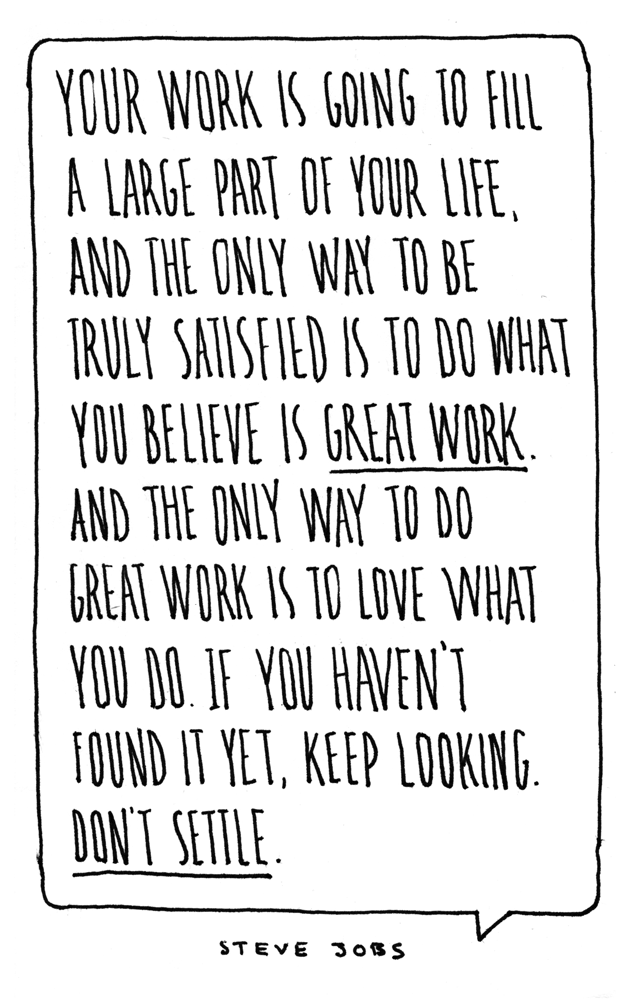
Don’t Settle

I came across this quote by Steve Jobs in an ad in Offscreen Magazine. It really resonated with me. Work is such a large part of our lives; shouldn’t we strive to make it great?

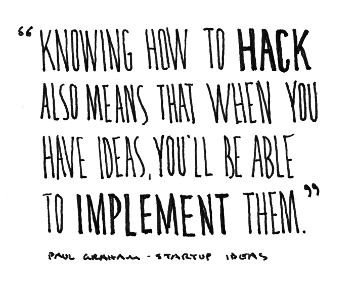
The Advantage of Knowing How to Hack

This quote came from Paul Graham’s How to Get Startup Ideas. Having the skills to hack together a prototype is a real advantage in making your ideas happen.

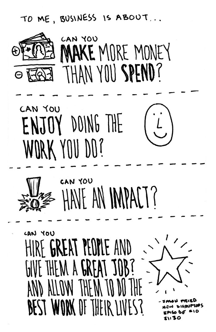
What Business is All About

When I hear Jason Fried speak about how to do business, I often find myself nodding in agreement with his ideas and philosophy. I heard this summary of what business should be about on the The New Disruptors (31:30).

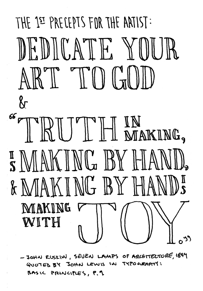
The 1st Precepts for the Artist

In Typography: Basic Principles, John Lewis cites this quote from John Ruskin’s work The Seven Lamps of Architecture. It touches something profound about what it means to be human and to create.

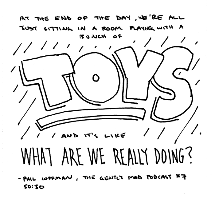
At The End of The Day, We’re Just Making a Bunch of Toys

Phil Coffman asked this question on The Gently Mad (50:30). He gives voice to my own frustrations and desire to seek out meaningful work.

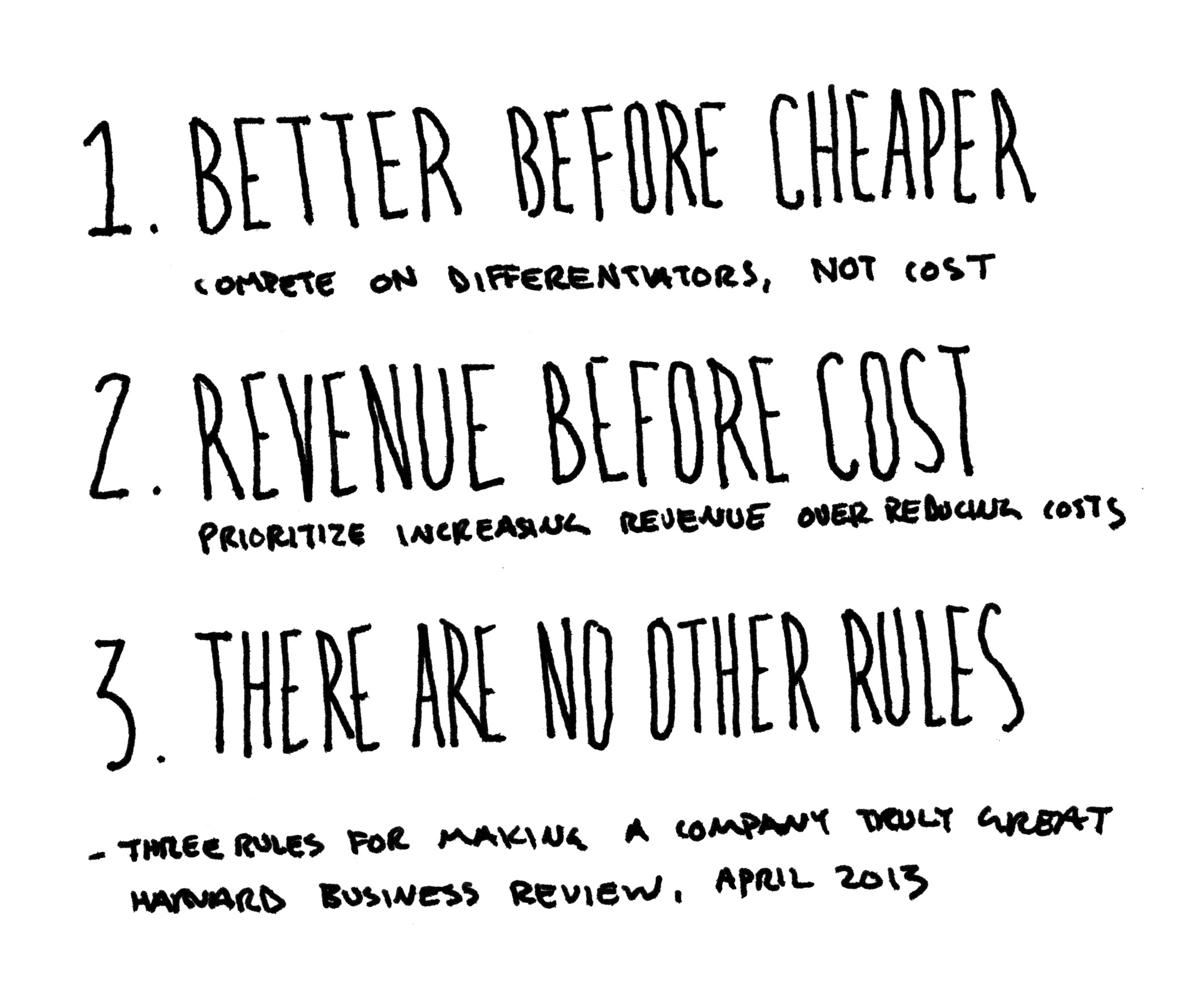
Three Rules for Making a Company Great

Confession: I didn’t actually read the Harvard Business Review article that posited these rules. I thought the rules themselves were both self-explanatory and profound.

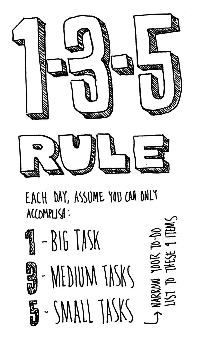
The 1-3-5 Rule

I encountered this piece of productivity advice on 99u. I’ve tried it out to varying degrees with my own to-do lists.

7 Productivity Tools & Tips to Increase Focus

Distraction and interruption are two of the biggest enemies of productive, deep work. Working at a computer all day, I fight them constantly. I need not provide a litany of example distractions. You know them well if you work on a computer. Here are the most helpful things I’ve adopted into my own workflow to be more focused and productive at work.

1. Turn Off Notifications

There are a surprising number of notifications set to “on” by default. Realize this, and intentionally decide which are important enough to warrant the interruption of your work. For me, this is Calendar and Messages. Calendar notifications remind me when I need to be somewhere. Messages is necessary for work communication, though I will turn it off if I really need to focus. What’s the moral of the story? Don’t let your computer’s default settings decide when you should be interrupted. You decide.

2. Email: Check at Set Times, Batch Process to Inbox Zero

Don’t constantly check email. Don’t even think of leaving it open all day. Once you’ve turned off all email notifications and badges, be disciplined enough to only check it at set times during the day. For me, this means twice a day – once in the morning and once after lunch. Define what times are right for you.1

When you do check your email, batch process it down to inbox zero. Essentially, this means following these three rules:

  • If an email can be dealt with in less than 2 minutes, deal with it.
  • If an email will take longer than 2 minutes, write down a to-do and move it to an “Actionable” folder for later reference.
  • Once dealt with, move email to an archive folder. (Don’t waste time sorting into folders. Use search instead.)

3. Use Isolator App

Isolator is a simple Mac app that hides everything on your screen except the app you’re working in (and the menu bar). It’s amazing how much this tool helps me focus on the task at hand. For more, read Unitasking by Trent Walton.

4. Set Second Monitor Wallpaper to Black

If you have a second monitor and use it part of the time, set its wallpaper to black. That way, when it’s not in use, it’s invisible. It won’t visually compete with the work on your primary monitor.

5. Add Empty New Tab Page Plugin to Chrome

By default, a new tab in Chrome displays a grid of your most frequently visited sites. For me, this screen serves as a menu of distraction rather than a helpful shortcut. Chrome was telling me where to go when I should have been in charge. There’s no preference to turn it off, so download the Empty New Tab Page plugin to restore focus to your browsing.

6. Use Pocket to Save Interesting Links for Later

Don’t go down the rabbit hole offered by the interesting but irrelevant links that inevitably pop up during the day. Don’t even keep them stored in open tabs in your browser. Get them out of sight and out of mind. Use Pocket or a similar tool to save them for later.

7. Work at Your Workstation, Get Distracted in Your Distraction Chair

Set up habit fields. Reserve your workstation for work. Designate a different space for casually browsing the Internet or checking out all the interesting links you saved in #6. What’s the advantage? Over time, you will condition your own behavior. By doing only work in your workspace, you’ll be less prone to distraction while working. This takes discipline to implement, but the advantages are worth it.


  1. See the bullet points under “Strategy 1” in this article for some helpful tips in defining your own times to process email.

The Making of A Simple Frame, Part 3

This is the third and final article in the series The Making of a Simple Frame (see Part 1 and Part 2) in which I explore the creative process of designing this site. In this article, I will share the thinking behind some of the decisions that inform the site’s visual design and layout.

Designed to Be Memorable

Paramount in building any brand is choosing a name upon which to build it. I decided early on not to use my own name. Previously, I had been using markdschafer.com (as markschafer.com was already taken), but it was clunky, unmemorable, and hard to spell. Thus, after jotting down idea after idea, I arrived at the name A Simple Frame.1 Once the name was settled, I began exploring how to represent it visually.

Brand = Type + Color

The fundamental elements of brands (especially online) are typography and color. Designers from Edenspiekermann pinpoint the importance of typography online in a video produced by Typecast:

Typography is really, really important because oftentimes it’s the only way to really convey the brand in the interface.

In the same way, color can also be used to convey a brand in an interface. Additionally, in a world of responsive design and ever-changing screen sizes, typography is the primary way to speak with a unique voice:

Type adds character to a message. It’s a very good means to express something that goes like [sic] between the lines and it shows so much about personality – about where you’re coming from when you say something.

Type is a way to communicate under the surface. Even if you are unaware of its presence, type subtly adds character to a text. In a similar fashion, color can induce mood and add personality. As I explored the branding A Simple Frame, I thought primarily in terms of type and color.

A Typographic Journey

The typeface I chose to bring personality and character to the brand of A Simple Frame is Alright Sans from Okay Type. The path to finding it, however, was a bit roundabout. To make a long story short, I became infatuated with Okay Type’s Harriet during my early design explorations. After realizing Harriet, though gorgeous, was not the right voice for A Simple Frame, I discovered Alright Sans while researching other fonts created by Jackson Cavanaugh, Harriet’s designer.

Upon finding Alright Sans, I knew I had found my voice. Alright Sans is an elegant sans-serif that isn’t too stiff or uptight. It has a large x-height which lends itself to on-screen display. As the officially description notes, “it has just the right amount of warmth to convey a serious-yet-friendly tone.” It also includes a very complete character set and wide range of weights. This gave me confidence that it would be able to grow with the brand and handle more complex type needs in the future.

At the end of the day, I chose Alright Sans because its character and personality just felt right to me. It has the right combination of elegance and warmth. It’s modern without being too cold. It’s simple in all the right ways without being too bland. It typifies my design taste, making it the perfect voice for a A Simple Frame.

Color Me Hot Pink

The other main component of brand and interface online is color. This decision was much easier and more straightforward than the type, as I already had a color in use from my previous site that I wanted to carry forward.

The color is hot pink, and the explanation is quite simple. I like it, and it’s memorable. In fact, it was my favorite color as a kid. Not only do I have a history with hot pink, I especially love it today for its memorable and fun qualities. Paired with more understated typographic design, it adds just the right amount of personality and unexpected excitement.

Designed to Get Out of the Way

As Dieter Rams famously stated in his “ten commandments” of good design: “Good design is as little design as possible.” There is so much visual clutter in today’s world, simple and unobtrusive design stands out. In designing this site, I strove to add only what was necessary and remove all else.

Content is King (Really)

This is a phrase heard often in the web design world, and it is quite true. A person will endure a poorly-designed website if it contains the content they are seeking. The inverse is not true. A person will not use a site, no matter how well-designed it may be, if it does not contain the content they are after.2 In practice, unfortunately the content of a site is too often treated as an afterthought – both in its creation and presentation. For A Simple Frame, I spent significant amounts of time writing things like the about page. I also focused my visual design efforts on making each page a pleasure to read.

Focus on the Reading Experience

In his Web Design Manifesto 2012, Jeffery Zeldman keyed in on one of the big problems in web design – how the design of many websites obscures the content by offering terrible reading experiences:

… how pathetic much of our web design is when our visitors increasingly turn to third party applications simply to read our sites’ content.

I couldn’t agree more. A primary goal for this site was to create a layout conducive to reading. I carefully considered all the small typographic choices like font size, line length, and line spacing that contribute to a pleasing reading experience.3 Ideally, this site facilitates reading in such a way that the layout recedes into the background and becomes invisible as you engage with the content.

Minimizing Clutter

One additional aspect of optimizing the reading experience was to reduce any extraneous clutter. This meant no sidebar, no social sharing buttons, etc. It also meant considering how to deal with the necessary clutter, if you will, of the site’s navigation interface. My first explorations set the navigation at the top in close proximity to the site’s name, as is standard practice. However, I liked the page better when it wasn’t there. It felt like too much clutter before getting to the content of the page itself.

My final solution was to move the navigation menu to the bottom of the page in a persistent bar. It is not as intuitive as having navigation at the top, but I was willing to make this trade off in favor of less clutter on the page. The site title, which links to the home page, remains as the only persistent element at the top.

Designed to Change

There’s nothing like living with a design for a while and using it in the real world to understand the implications of decisions made during the design process. As I now use the site and update its content, I’m continuing to evaluate and evolve it.

Experimentation as a Goal

This site is a great place to try new things. I’m not beholden to a client or any outside stakeholders – allowing me to experiment quickly and freely. For example, I’m continuing to evaluate the navigation at the bottom of the page. How could it change to be even less intrusive but more useful and intuitive? Design decisions are always calculated tradeoffs. By using the design in the real world, I am able to test my decisions, experiment, and grow to be a better designer.

Granting Permission to Iterate and Evolve

In order to try new things, one has to have the ability to fail, learn from the experience, and create a new solution based on lessons learned. I believe the best design process involves iteration and evolution. The iPhone’s hardware, for example, has continually been refined and improved with each new release, but remains true to its original form. I will evolve this site over time, as I continue to experiment, learn, and refine.

The Advantage of Being Small

The idea of overnight success can be enticing, but it often brings more harm than good. As Jason Fried notes in Don’t Exaggerate Your Size, being small is a good thing:

Being small is nothing to be insecure or ashamed about. Small is great. Small is independence. Small is opportunity. Celebrate it.

Operating on a small scale, as this site is now, is very freeing. I can make changes and mistakes without the pressure of a large number of people watching. I can write without the pressure of a large readership, as I develop my style and improve my skills. Our culture says bigger is always better. Quite simply, it’s not.

Conclusion

This post brings an end to The Making of A Simple Frame series. It has provided a good opportunity for me to reflect on my own process and share some of the lessons I’ve learned. At the very least, it should provide an interesting reference point to revisit in the future as the site grows and evolves over the coming months. Stay tuned.


  1. See “The Name” in Part 1 for the quote that inspired the name.

  2. I would actually argue that in order for a site to be “well-designed,” it must contain quality content. The design of a website hinges around its content.

  3. Of these, font size is by far the trickiest to get right on the web. For good reads on the subject, see Oliver Reichenstein’s The 100% Easy-2-Read Standard and Nick Sherman’s Responsive Typography is a Physical Discipline, But Your Computer Doesn’t Know It (Yet).

The Making of A Simple Frame, Part 2

This article is the second in a series on The Making of A Simple Frame in which I offer a behind-the-scenes look at the creation of this website. In the first article, I discussed three big ideas that shaped the creation of A Simple Frame. In this article, I will explore the design process and some of the specific tools used to create the site.

Design Process (No Photoshop)

This is the first website I’ve designed without using Photoshop or Illustrator to make a mockup first. The design process started with rough ideas recorded in my sketchbook. I wrote notes and drew sketches as I thought of them over a period of months prior to starting work on the site. When the time came to sit down and begin the actual work, I had a nice collection of ideas to reference as a starting point.

My early notes and sketches all centered around making as simple a site as possible. Typography was also paramount in my mind. I knew I wanted the design to be almost solely composed of type. Type would provide the foundation and the main structure. As such, I began exploring typography right away.

In-browser Typography

To explore the typography of the site, I opted to work in the browser instead of Photoshop. There were several reasons for this. For one, Photoshop is a poor environment to set type. It’s just not suited to the task at hand. It’s time-consuming, difficult to edit styles, and offers less control than a program like InDesign that is built for setting type.

Additionally, I chose not to work in Photoshop because it is an abstraction. What you see in a Photoshop comp does not accurately reflect the final product – what you see in a browser. The letterforms don’t even look the same as they do in a browser.1 At the end of the day, it doesn’t matter how good your type looks in Photoshop. No one sees it. What matters is what people actually see is the browser – the live, coded typography.

Tools for Setting Type in the Browser

I explored typography within the browser in two different ways. The first way was using Typecast. Typecast is an online tool that lets you set type using an InDesign-like interface within a browser window. You can also edit the code directly if you wish. The typesetting tools are easy-to-use and extremely well executed, but what really makes the service special is its library of web fonts. Typecast partners with major webfont providers like Typekit and Fonts.com so that you can experiment with literally thousands of webfonts, all within the browser. It allows you to truly try out a webfont before purchasing a license. I experimented with a number of different fonts using Typecast as a first step in my design process.

The second way I explored typography within the browser was writing html and css in conjunction with webfont trials from Webtype. Webtype is a webfont provider from Font Bureau that provides high-quality webfonts. What’s great is that they offer 30-day trials of any fonts in their library. This allowed me to do more in-depth experiments on my own server writing simple html and css pages. Instead of creating multiple Photoshop comps, I created multiple live webpages as my design explorations. This was a great way to work, as it ensured that what I was building and seeing was going to be the actual, final product.

Arriving at the Final Design

Although I never created a mockup in Photoshop, I did reference a print document that I had typeset for a previous project as inspiration. After completing some initial freeform explorations, I typeset a sample article page and worked through multiple iterations until I had a solid base from which to build out the rest of the design. From there, I added other page elements and templates, switching back and forth between paper sketches and in-browser page designs.

In the end, eschewing Photoshop in favor of the browser proved to be a good experiment for my design process. There are two key takeaways I hope to implement more in the future. One, starting with typography is essential. After all, type is the main element of most webpages. Two, working in the browser as early and often as possible is very advantageous. Whether it be with a tool like Typecast or simply coding rough pages, working in the browser allows you to remove abstraction and work with the true medium of the web during the design process.

Choosing a CMS: How I Fell in Love with Kirby

When I first began thinking about designing a new site, I started keeping my eyes out for possible cms options. My first thought was to use WordPress and start with a very minimal theme like Starkers as a base. I wanted to start with as little as possible and build it up to only what I needed. WordPress is powerful and flexible, but it’s definitely not minimal. The more I thought about it, WordPress began to seem like overkill. Ideally, I wanted a platform that was minimal, speedy, friendly (to a non-developer type), and enjoyable to use. The question was whether or not such a platform existed.

Next, I ran across static site generator Jekyll. Here’s the official description:

Jekyll is a simple, blog-aware, static site generator. It takes a template directory containing raw text files in various formats, runs it through Markdown (or Textile) and Liquid converters, and spits out a complete, ready-to-publish static website suitable for serving with your favorite web server.

In other words, Jekyll can transform a folder on your computer that is specially formatted into all the files needed to serve a static website. Whereas WordPress and other dynamic sites process everything on the server using a database and php, Jekyll processing everything on your computer beforehand and requires no database. The result is a static site that is efficient and speedy.

I really liked the idea of Jekyll, especially its simplicity and efficiency. However, it looked to be geared more toward developers than designers. Jekyll-Bootstrap describes why someone might like to use it:

… if you like to keep things simple and you prefer the command-line over an admin panel UI then give Jekyll a try.

I like keeping things simple, but I definitely don’t prefer using the command-line. The more I dug into Jekyll, the more hesitant I became about trying it. Even so, I was still thinking I would use Jekyll – that is, until I met Kirby.

Get Kirby

What is Kirby? The official tagline sums it up best:

Kirby is a file-based cms: Easy to setup, easy to use, flexible as hell.

Essentially, Kirby works by taking files on your server set up in a specific way, and processes them using php to build your site, without the need for a database. I think of it as a happy middle ground between WordPress and Jekyll.

What does it mean to be “file-based”? Practically speaking, this means that each page is represented by a folder, and each folder contains all the content for the page. For example, an article page folder on this site contains a text file with the article title, text and metadata as well as any images included in the article.

As the tagline states, one of Kirby’s virtues is its flexibility. It’s very easy to set up different page templates that make use of custom fields. Custom fields for different types of text-based content are created simply by defining them in a page text file by writing the name of a field followed by a colon. Fields are separated by lines of four dashes. You can then use the Kirby api to easily include the data from these fields in your templates. It’s a powerful and flexible system. Most importantly, however, it’s very intuitive and easy to use.

Here are several more things I like about Kirby:

  • You can write your content using Markdown.
  • It is free to try.
  • It costs only $39 for a single site license.
  • It’s developed by a single, design-minded developer – Bastian Allgeier. This makes the product very focused and elegant.
  • The documentation is good, and it’s simple enough to wrap your mind around pretty quickly.

I’ve become a big fan of Kirby after using it for this site. I could write much more about it, but that’s beyond the scope of this article. For now, do yourself a favor and check it out if you haven’t already.

Software

During the creation of A Simple Frame, I tried out a number of different apps to work with before arriving at my current lineup. The three main types of tools I use are a code editor, an ftp client, and a text editor.

Code Editor

As I began doing my in-browser design explorations, I tried out several code editors. The first was Sublime Text. It’s a powerful editor and seems to be the tool of choice for most serious coders today. It has a lot of features and is very customizable. The features I found to be most helpful were its code completion and multiple selection features. Its the fastest and most intuitive tool I’ve used for the work of writing html, css and php.

That said, I decided it wasn’t the best tool for me. For the kind of editing I was doing, I was only scratching the surface of Sublime Text’s full feature set. This isn’t necessarily a bad thing, but it proved to be more complex of an editor than I need. The price point also reflects this, being priced at $70. Finally, though it is very customizable, customization was necessary to make it look the best. At the end of the day, I didn’t want to spend my time tweaking, theming and customizing a tool I wasn’t going to use everyday. In the future, I will most likely revisit Sublime Text, especially if I find myself doing more coding.

The second editors I tried was Coda 2. The concept of Coda is to consolidate the coding process into one window. Instead of having a bunch of different windows and applications to do different tasks, Coda handles everything. It’s an ftp client, editor and reference library all in one. Like Sublime Text, Coda is rich with features – a lot of which I wasn’t going to use. Also, the file-based nature of Kirby made it more intuitive in my mind to use different applications to do different tasks. In other words, Coda’s all-in-one philosophy didn’t fit the workflow I had in my mind for Kirby. I love the design and attention to detail in Coda. In the end however, I also decided it wasn’t the right tool for me.

Perhaps surprisingly, my current code editor of choice is the unassuming Textastic, a “simple and fast text editor for the Mac.” I discovered it after downloading Textastic for iPhone so I could make edits to the site on the go. Its best feature is its simplicity. Unlike the other editors I just described, it lacks advanced features. It has syntax highlighting and code completion but not much else. Because of this, the UI and options menu are reduced down to only what is necessary. I find this minimal approach enjoyable and refreshing. It’s a tool that does what I need it to do quickly, nothing more, and gets out of the way so I can focus on my work.

My only complaints with Textastic are that the code completion is not as slick as Sublime Text and several keyboard shortcuts standard in other editors are either missing or different. If I was writing code every day, I don’t think this would be my editor of choice. For occasional editing, however, it can’t be beat for its speed, simplicity, and value (it costs $6). For my current needs, it’s my go-to editor.

FTP

As Kirby is a file-based cms, I wanted to find an ftp application that would fit in naturally with a file-based workflow. I first tried out Transmit, after discovering the Transmit Disk feature, which allows you to mount ftp directories as remote disks directly in Finder. In trying this feature, however, I found it to be a bit sluggish. Like the first code editors I tried, Transmit also packs a lot of features that I wouldn’t be using.

I really liked the idea of Transmit Disk, however, and began looking to see if other ftp clients offered a similar feature. This brought to mind Interarchy, an ftp application I had acquired in a previously-purchased software bundle and forgotten about. After finding my license code, I gave it a shot and was pleasantly surprised. The interface is very simple, and closely resembles a Finder window – perfect for the file-based Kirby workflow. Additionally, it has a Net Disks feature which allows you to mount ftp directories as remote disks directly in Finder in a similar way to Transmit.

As I just mentioned, Interarchy’s standard interface mimics that of Finder, making it ideal for editing file-based content. Even more than Net Disks, I found myself using the main interface. What makes it work especially well is the ability to tweak the settings so that double-clicking on a file will open it in an application of your choice according to file type, just like Finder. Interarchy acts as my “Finder” window and from it, I double-click files to open in their respective editing applications. This perfectly suited the I way I wanted to work with Kirby, making it my ftp client of choice.

Text Editor

If there’s a theme to my choices of software, it’s that I tend to value simplicity and a lack of unnecessary features. These qualities allow you to focus on the task at hand and not get distracted by the tool you’re using to accomplish the task. Also, these qualities promote positive feelings and enjoyment of use, as they are not cluttered by unnecessary interface elements. Perhaps the embodiment of these values is my text editor of choice. I’ve been a fan of it since it first launched, and I knew before I started it would be my main tool for writing. It’s called iA Writer.

The concept behind iA Writer is to take away all the features that you don’t need and leave only the essentials. In this case, the essential features are the ones the help you do one thing well and with more enjoyment: write. This means there are no controls to adjust the font or insert an image. All you can do is write, and it’s one of the most elegant and ejoyable applications I’ve ever used. It’s also a great fit with Kirby, as it utilizes Markdown for formatting. If you want to use a tool that encourages you to write, I couldn’t imagine a better one.

Wrap-Up

The creative process we follow and tools we use directly affect the shape and outcome of our work. It takes time and exploration, but finding the right ones can be richly rewarding – providing enjoyment while helping us create better work. I hope these thoughts aid in your own search for processes and tools to improve your work. If you have any favorites to share, please send them to me via Twitter.

In the next article in this series, I’ll write in depth about the visual design of A Simple Frame.
  1. Letterforms don’t look the same in Photoshop as they do in a browser because each uses a different anti-aliasing rendering engine for the type. This is the same reason type looks different between different operating systems and browsers. On a Mac, letterforms will look heavier in the browser than they do in Photoshop. It should be noted that the newest version of Photoshop includes a “system anti-aliasing” option that will more closely match how type appears in a browser.

The Making of A Simple Frame, Part 1

Any given design is the result of many small decisions that have been made by its creator(s). Not only is it interesting, but it is often illuminating to be given insight into the thought process behind those decisions – to see behind the scenes of the creative process. In this series of articles (of which this is the first), I will share a sampling of the ideas, tools, and processes I sought to explore while creating this website. To start, here are three big ideas that shaped A Simple Frame.

A Place to Write

I recently read The Great Discontent interview with Cameron Moll in which he gave some advice about writing that really stuck in my head. Specifically, this quote inspired me to create a site where I could write about design:

… find something you’re passionate about and write about that passion. There’s no better way to articulate what’s in your head than to get it on paper. … Think about any form of creativity—if you can write well about it, it changes the way that you see the world and amazing things can happen.

The thing I’m passionate about is design. I often find that I have more thoughts about design in my head than I am able to articulate conversationally to the people around me. This site is an intentional effort to create a place to publish my thoughts about design and get them out of my head. It provides the framework and the accountability to write regularly. My hope is that by writing, I will be able to learn more about design while synthesizing my point of view.

The Name

Names are very hard. Previously, I used the url markdschafer.com for my personal site. Admittedly, I didn’t do too much with it, but I wanted a better domain name to work with if I was going to invest more time in it. I wanted something that was easier to spell and more memorable. After jotting down different ideas over a period of time, I read an article that served as the inspiration for the new name.

The article is entitled Best New Year’s Resolution? A ‘Stop Doing’ List and was written in 2003 by Jim Collins, author of Good to Great. It’s an excellent article about saying no to things in order to focus on what’s important and make great work. Here’s the quote that grabbed my attention:

Looking back, I now see Rochelle Myers as one of the few people I’ve known to lead a great life, while doing truly great work. This stemmed largely from her remarkable simplicity. A simple home. A simple schedule. A simple frame for her work.

This gets to the heart of where I want to go as a designer. I want to create great work, and the path to get there is through focus and simplicity. This site is a simple frame for my thoughts and my work.

Limitations

To continue on the meaning of the name, a frame is also an image of limitations and boundaries. As stated under Principles on the About page, I believe that limitations breed creativity. Having limits to work within often pushes you to creative solutions you would not reach without constraints.

With this in mind, I’ve set out to create self-imposed constraints for this site. For example, I’ve set up the constraint that I will publish new articles four times a month – on the 7th, 14th, 21st and 28th. This constraint forces me to write with more regularity than I would otherwise. It also forces me to be somewhat intentional about the articles I post. Since I’m only posting four times a month, the form of articles will naturally be longer and more thoughtful.

The idea of a frame also brings to mind the French parenting concept of the cadre which Pamela Druckerman describes in her Wall Street Journal article entitled Why French Parents Are Superior:

… the French ideal of the cadre, or frame, that French parents often talk about. Cadre means that kids have very firm limits about certain things—that’s the frame—and that the parents strictly enforce these. But inside the cadre, French parents entrust their kids with quite a lot of freedom and autonomy.

As human beings and especially as children, we need limits to work within if we are to thrive. Without the frame, we are lost. Within its bounds, we are set free to explore, experiment and discover new things. This site is the frame. Within it, I hope to explore my own creativity, experiment with new ideas, and discover design in a new way.

In my next article in this series, I’ll write more about the specific tools and processes used in the creation of A Simple Frame.